Nick Deaver House
CONCEPT DESIGN:
When they were looking for an architect to create a modern home for their young family, the owners of this new house near Austin, Texas happened to come across Nick Deaver in a book called Not So Big House. Fortuitously, Deaver turned out to be based in Austin as well, and his practice champions the same principles of sustainable design and matching house size to need that were close to his clients’ hearts.
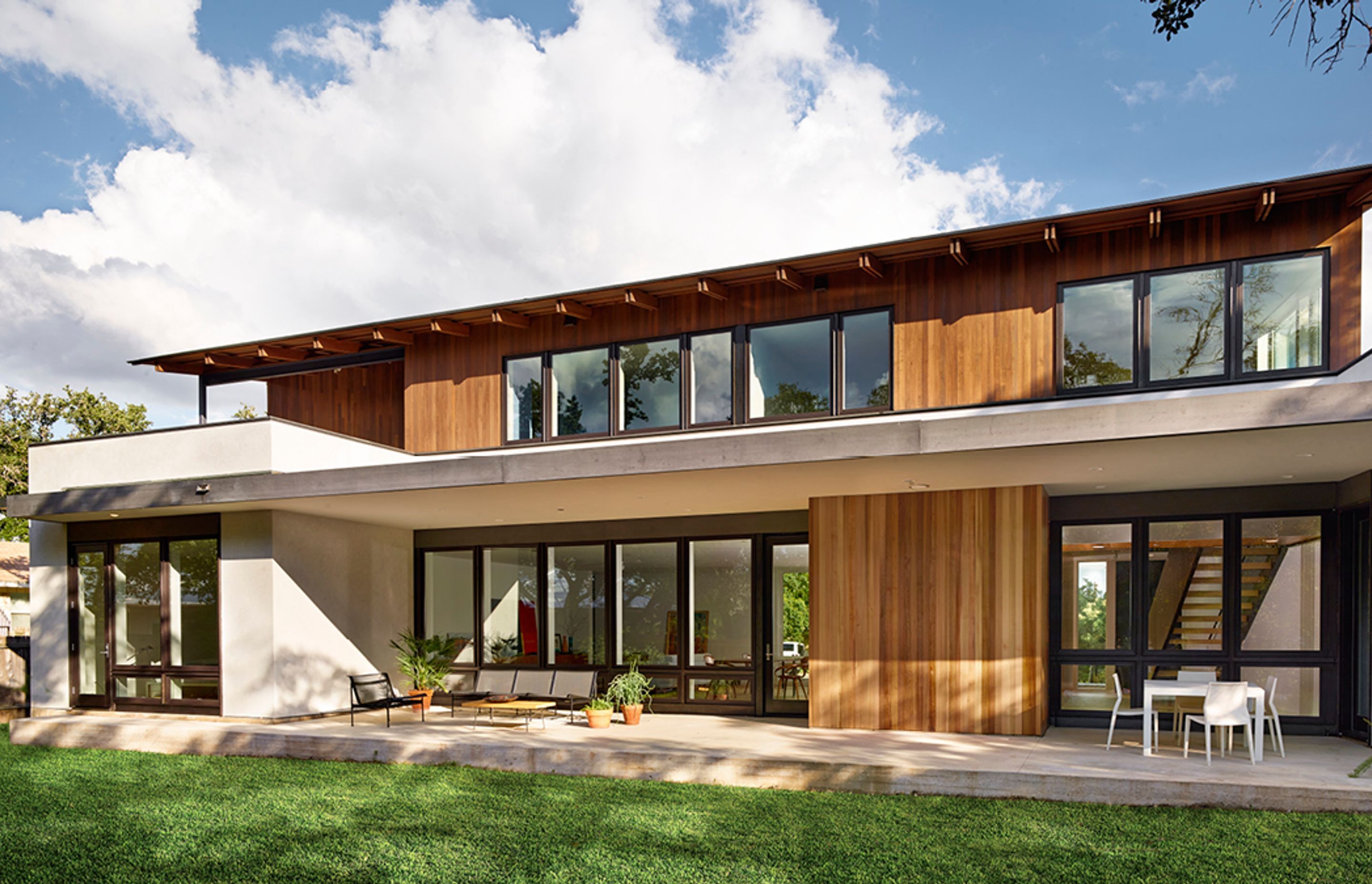
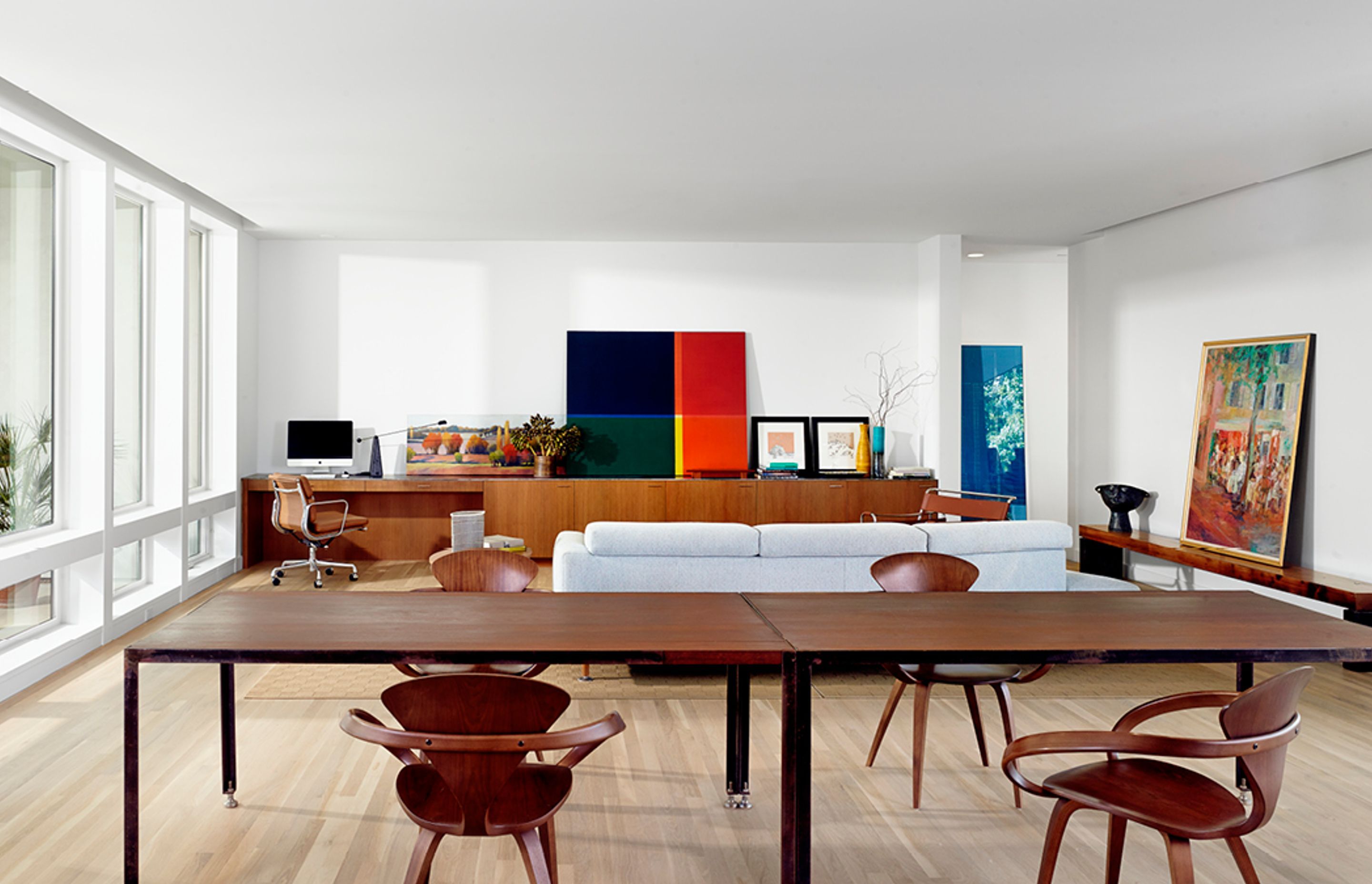
The property, situated in Rollingwood, an established, leafy township just outside Austin, had a landscape of generous lawns, large oaks and maple trees. Much of the design was dictated by the owners’ desire for the house to connect to the outdoors, in particular the balconies on the upstairs bedrooms and the open-plan layout of the kitchen and living spaces, which flow seamlessly out into the garden.
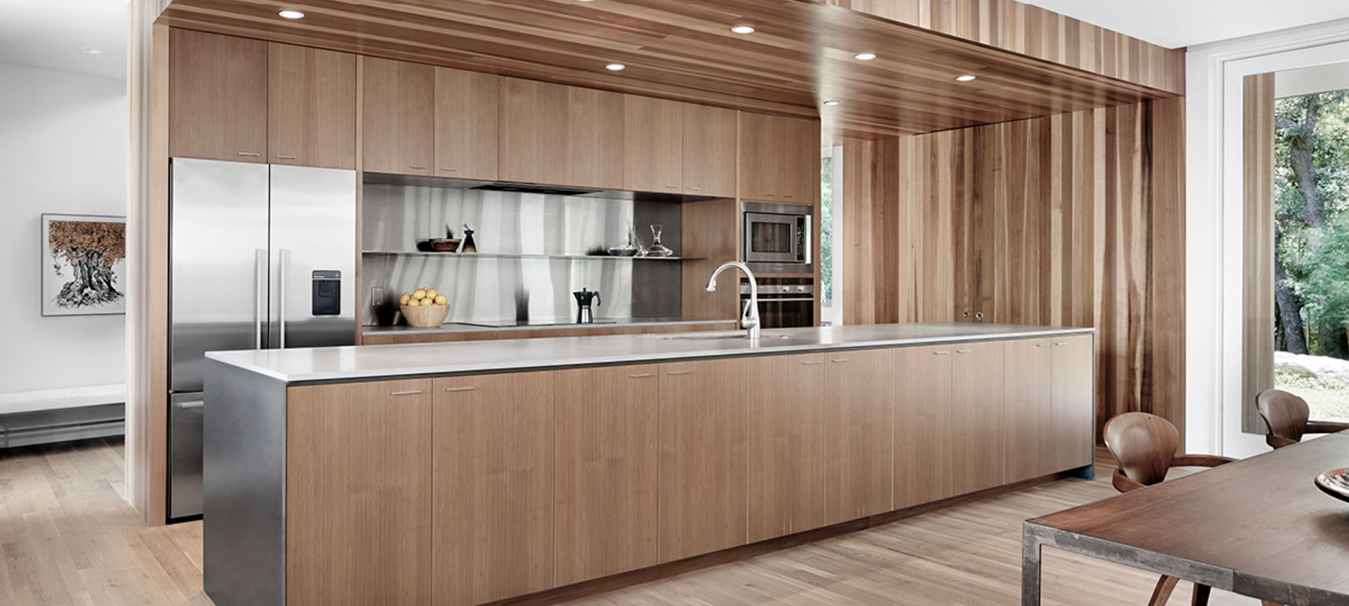
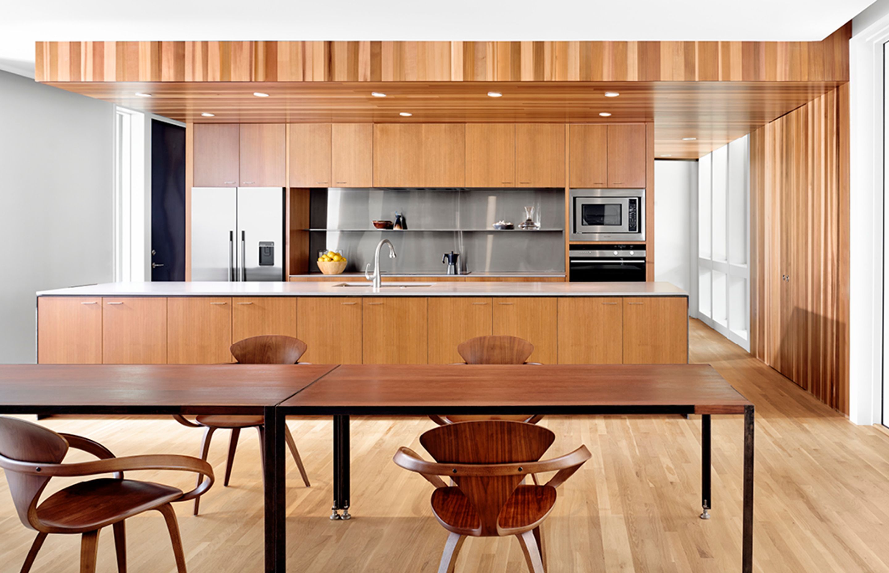
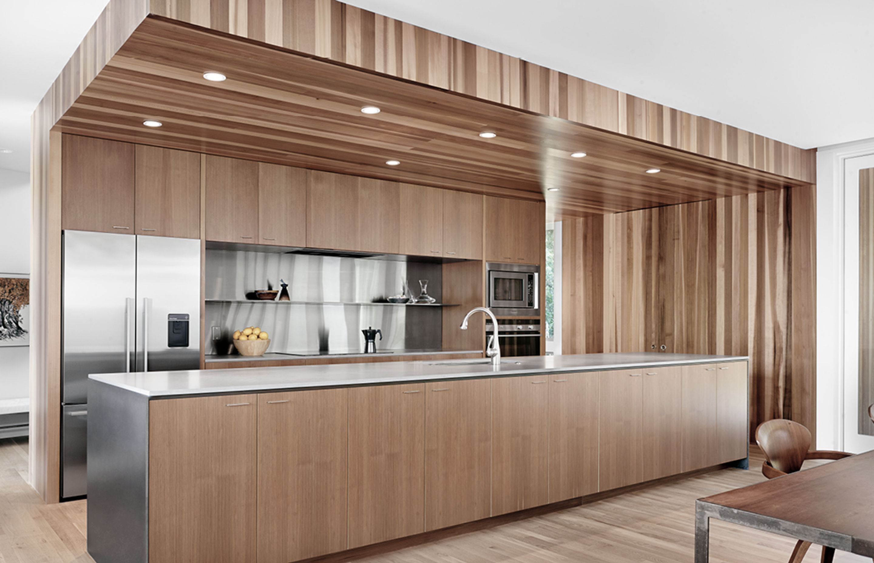
As part of his overall space-efficient approach, Deaver designed the kitchen and living areas as a combined work and entertaining zone. The kitchen is differentiated from the rest of the room by the beauty of its timber detailing, catering to dinner parties as well as everyday family breakfasts.
DEVELOPED DESIGN:
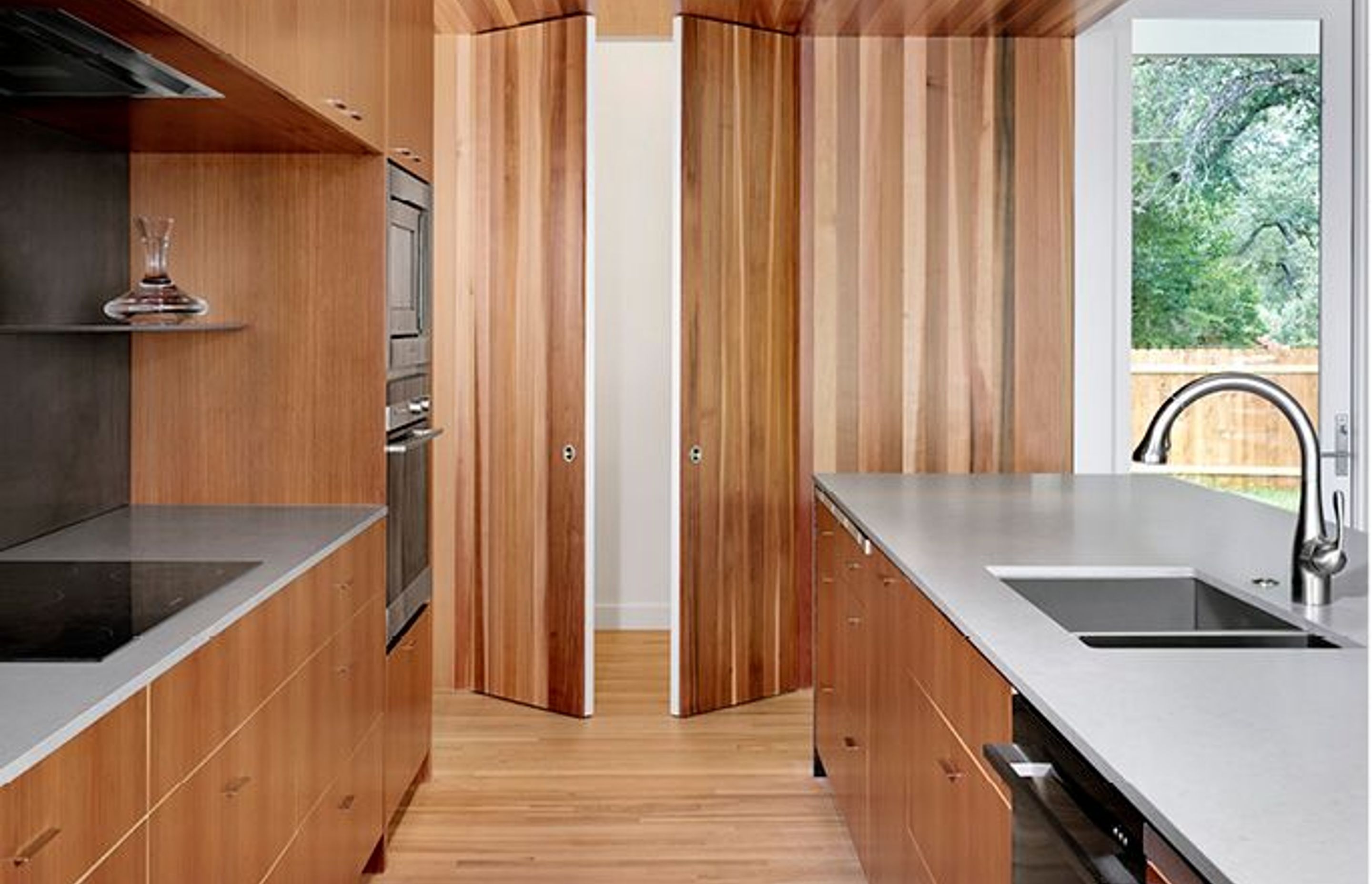
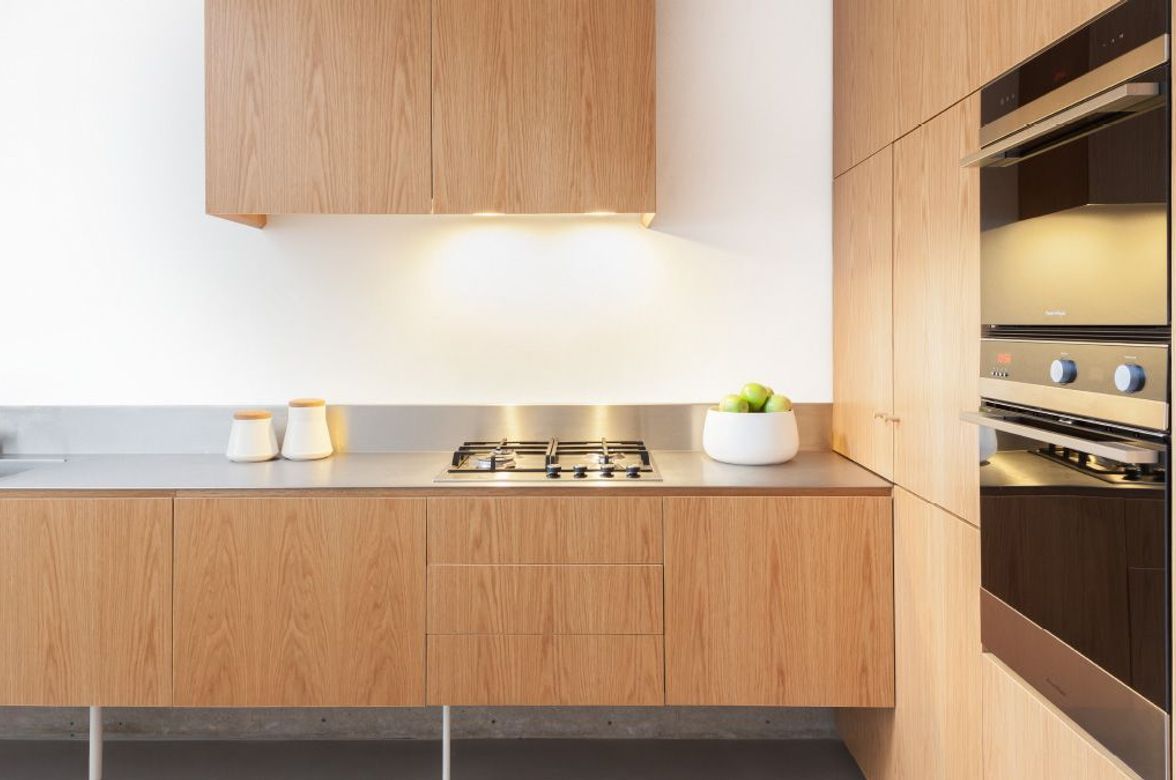
The architect visualised the red cedar container that holds the kitchen as an intricate Chinese box with an interior of finely crafted cabinetry. It creates a focal point in the house, drawing in both family and guests.
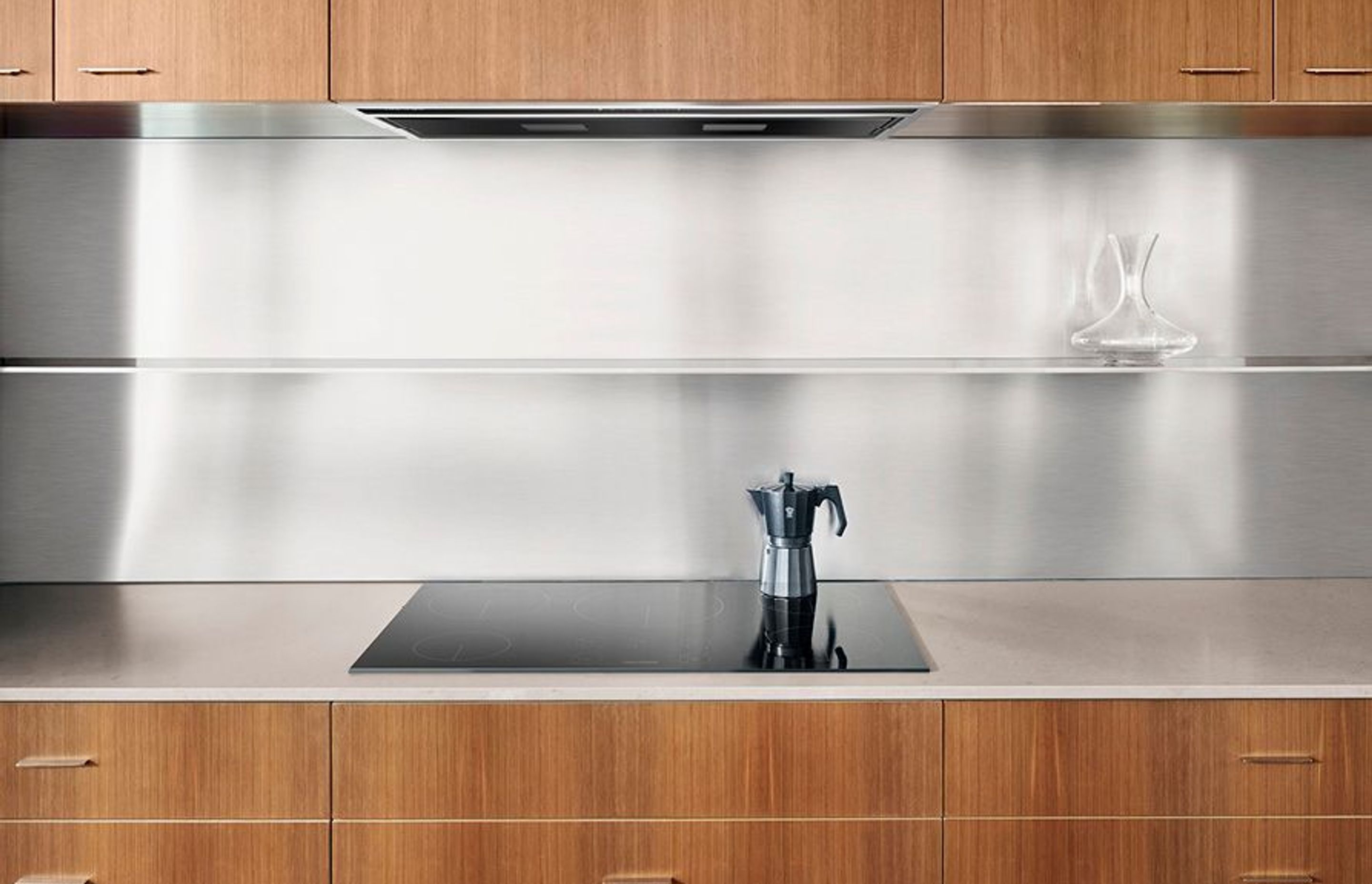
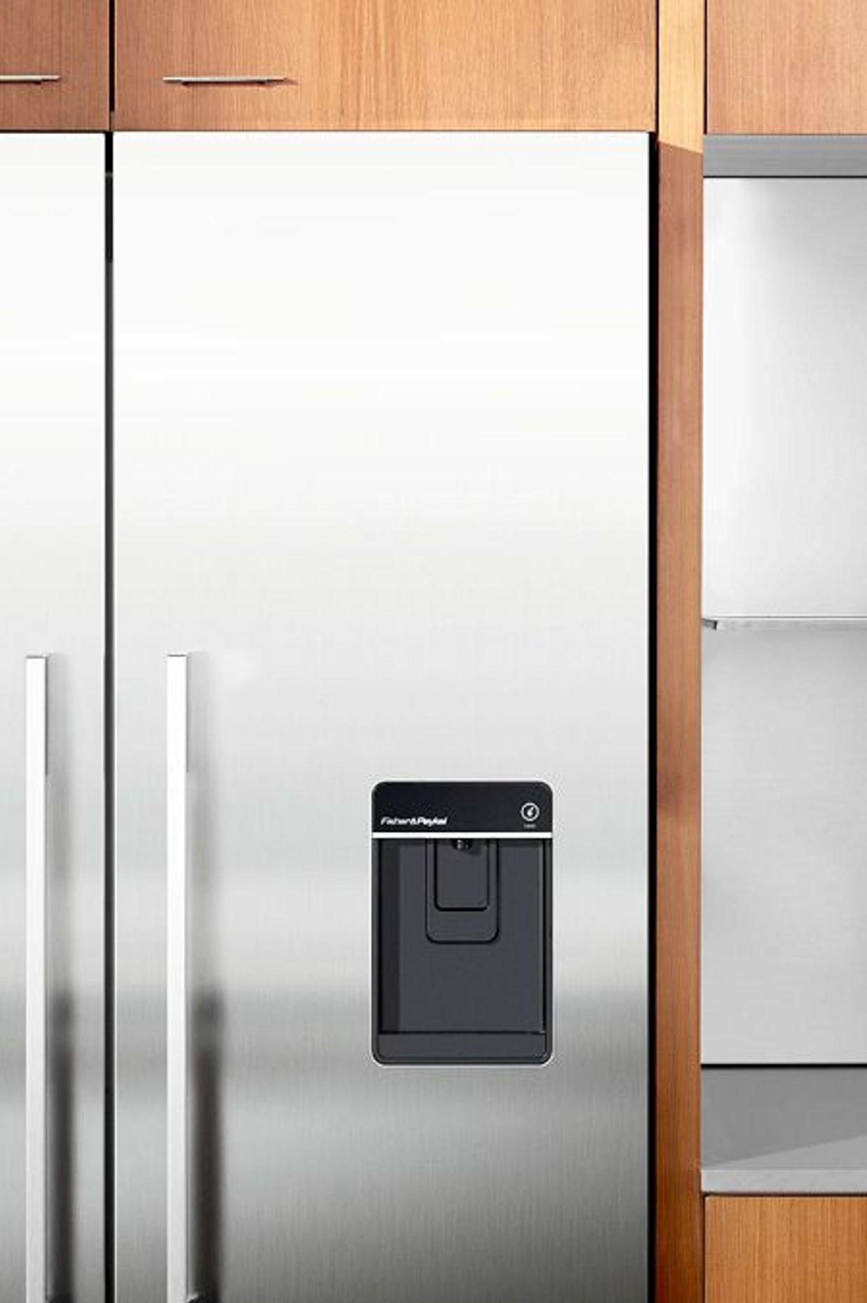
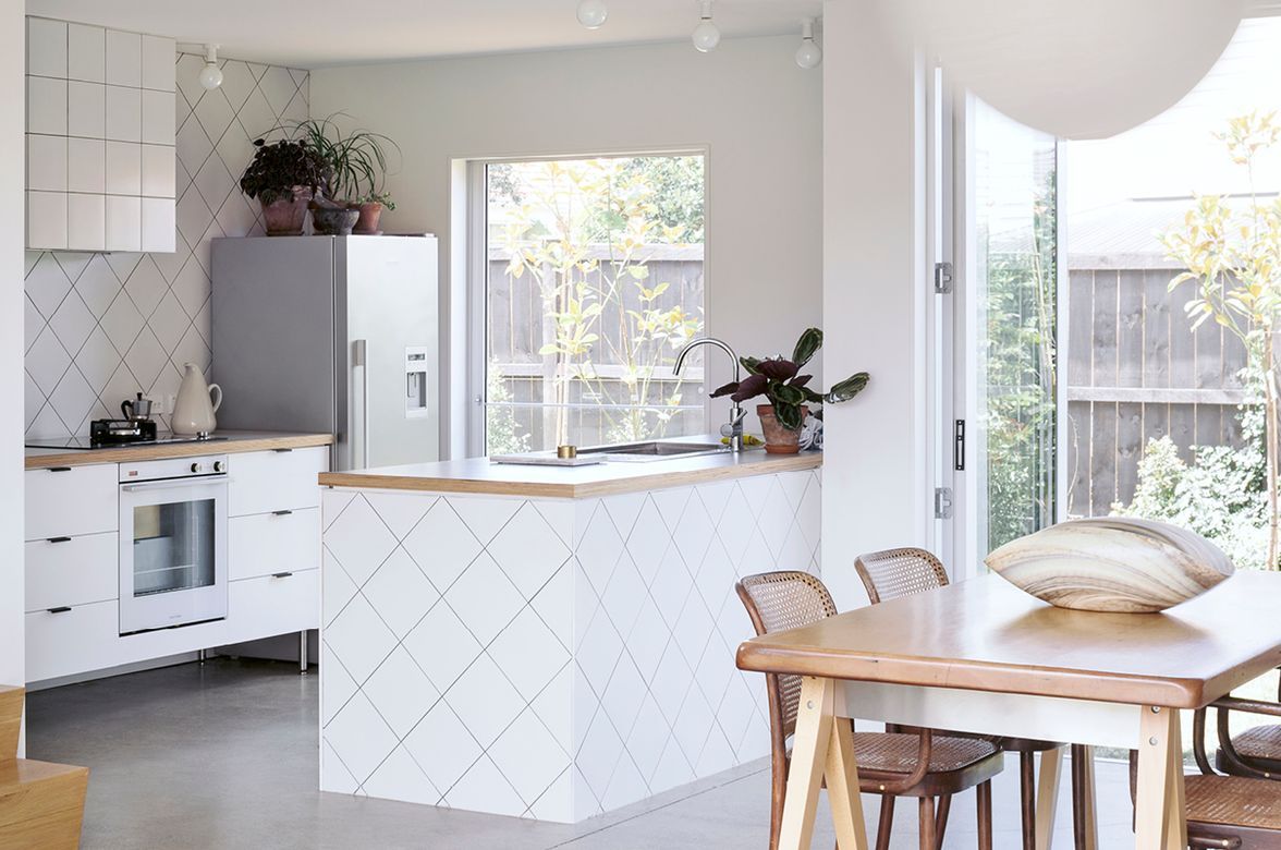
Other materials were taken from the exterior to support the kitchen’s connection to the outdoor areas, such as smooth, raw steel in the island, and light grey stucco that appears on the walls both inside and out. In addition, the timber box actually projects through a glass wall to house the pantry that sits just outside the building envelope. Inside, the kitchen layout focused on creating practical workspaces for two or more people to work comfortably together. “One of the ways we condense our kitchens is to focus on the number of high-quality workspaces you get — not the linear footage of countertop that we end up with,” says Deaver.
“We eliminate any countertop section less than 30 inches wide so that every open space can be a work area.” These countertops were laid out in two parallel rows (with the pantry at the far end) that, between them, hold all of the appliances and storage. The amount of under-bench and pantry storage reduced the need for cabinets at eye level, giving the space a much cleaner, less cluttered appearance. The “hidden” pantry is another space-saving feature. When shut, the doors are next to invisible, but fold back 1800 when open to lay flush against the walls so the owners have unimpeded access to the shelves inside. Once closed, the pantry effectively disappears again.
“We like to lay our kitchens out in such a way that we can maximise storage, and minimise the tricky configurations inherent to a more complicated geometry,” says Deaver. “For example, our kitchens tend not to have corner cabinets. There is such an industry built around how to access hard-to-reach spaces. Well, we like to avoid making those hard to reach places in the first place.”
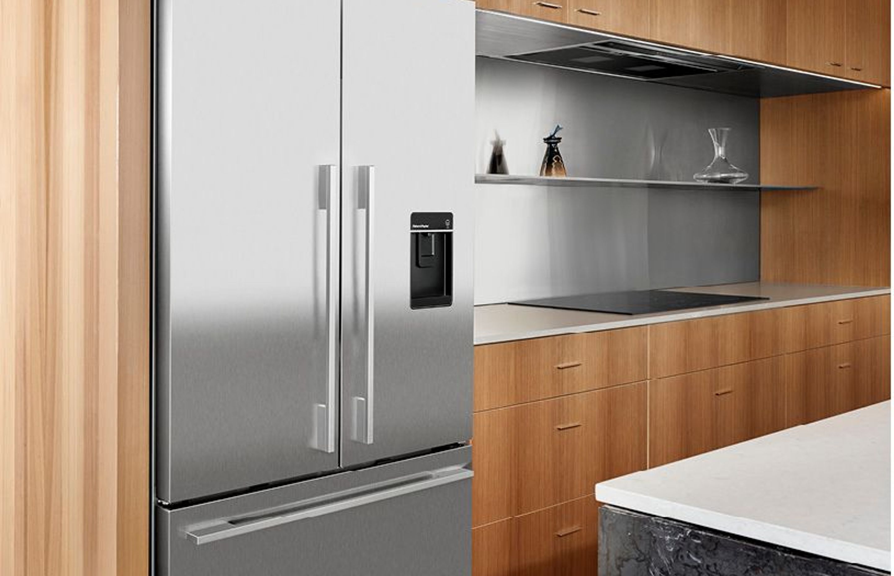
DETAIL DESIGN:
Deaver’s intentions to create clarity and simplicity within the kitchen led him to Fisher & Paykel appliances. “We have a similar design philosophy,” he says. “There is a clear discipline and attention to the line of the appliances, with their nice square edges, that allowed us to integrate them easily into the straight-edged geometries of this kitchen.” The architect wanted a strong, minimal materials palate of raw and stainless steel to complement the warm tones of the surrounding wood. The stainless steel appliances are balanced by the steel backsplash and hood, creating a cohesive composition throughout. “We chose to use stainless steel appliances early on,” he says. “The material is so serviceable, so it’s perfect for someone who does a lot of cooking and cleaning. In this kitchen, the materials were reduced down to just wood and stainless steel with their basic qualities highlighted.”
No project details available for this project.
Request more information from this professional.
Professionals used in Nick Deaver House
More projects by Fisher & Paykel Appliances
About the
Professional

Fisher & Paykel has been designing products to change the way people live since 1934.
Our design philosophy is underpinned by a curiosity about people — how they live, what they do and how they use things.
This approach has helped us understand the dynamic nature of modern living, and to challenge conventional appliance design to consistently deliver products that are intuitive, timeless, and beautiful to use.
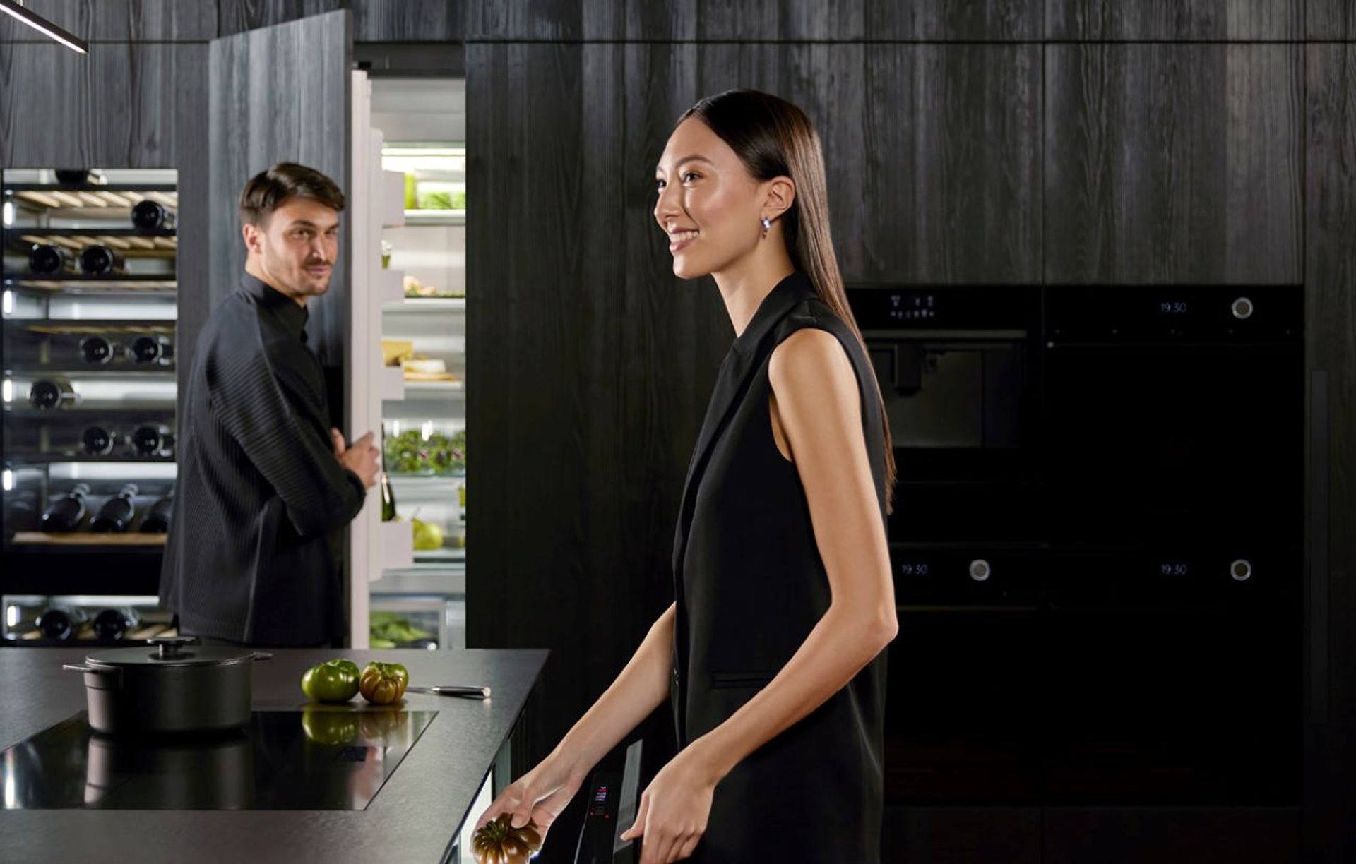
KITCHEN PERFECTION
At Fisher & Paykel, we design products according to three key principles — Ultimate Kitchen Solutions, the Beauty of Choice and Design Freedom — so you can create Kitchen Perfection.
ULTIMATE KITCHEN SOLUTIONS
To create the perfect meal, you need a suite of products working seamlessly together to create a beautiful kitchen experience. Cooking and cooling solutions that respect ingredients through the Mastery of Temperature. Exceptional dishwashing and ventilation solutions that deliver perfect results every time.
THE BEAUTY OF CHOICE
All homes are different, they demand different architectural and aesthetic responses. The Beauty of Choice is the ability to choose the perfect product style and integration option to create your perfect kitchen — for complete functionality without compromising design.
DESIGN FREEDOM
As the heart of the home, the kitchen serves as both a practical, multi-functional space and an architectural statement. Design Freedom is the ability to customise a kitchen layout with work zones that exactly suit how you want to live, cook and entertain, and personalise design details to achieve a highly considered, bespoke design.
- ArchiPro Member since2015
- Follow
- Locations
- More information
Why ArchiPro?
No more endless searching -
Everything you need, all in one place.Real projects, real experts -
Work with vetted architects, designers, and suppliers.Designed for New Zealand -
Projects, products, and professionals that meet local standards.From inspiration to reality -
Find your style and connect with the experts behind it.Start your Project
Start you project with a free account to unlock features designed to help you simplify your building project.
Learn MoreBecome a Pro
Showcase your business on ArchiPro and join industry leading brands showcasing their products and expertise.
Learn More
Manufacturers and Suppliers