
About
VZUG.
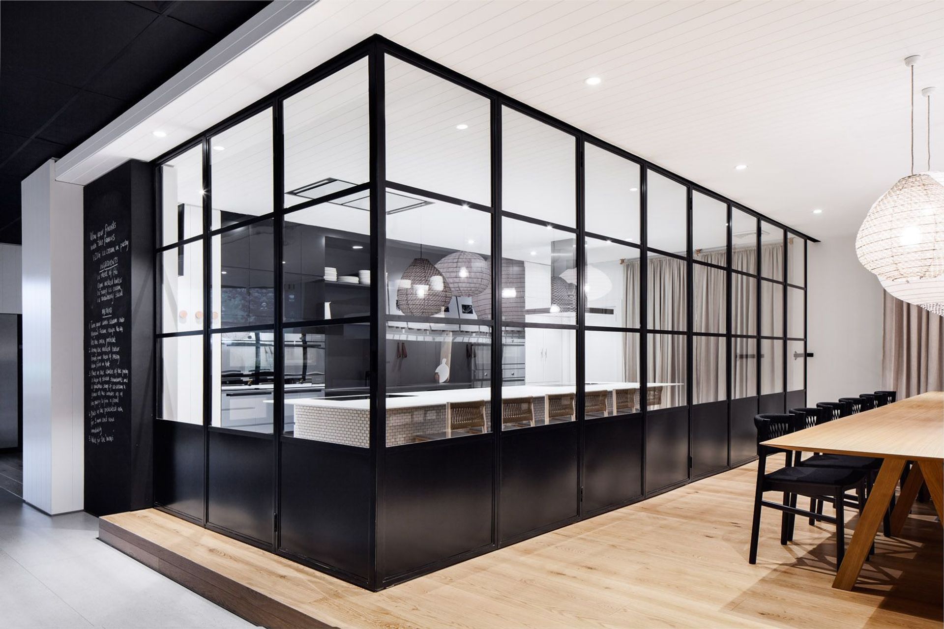
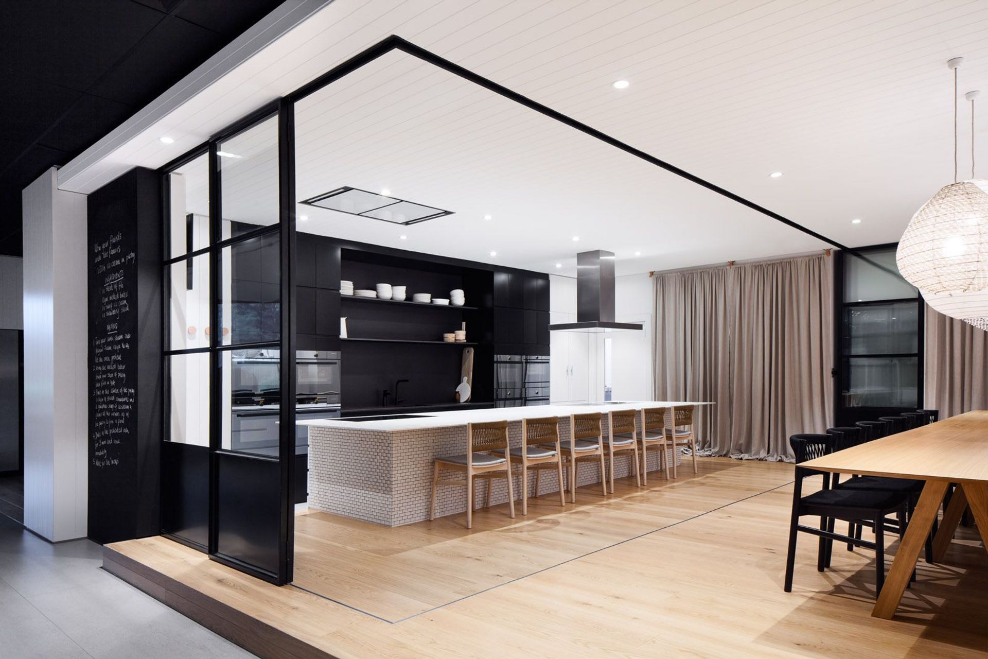
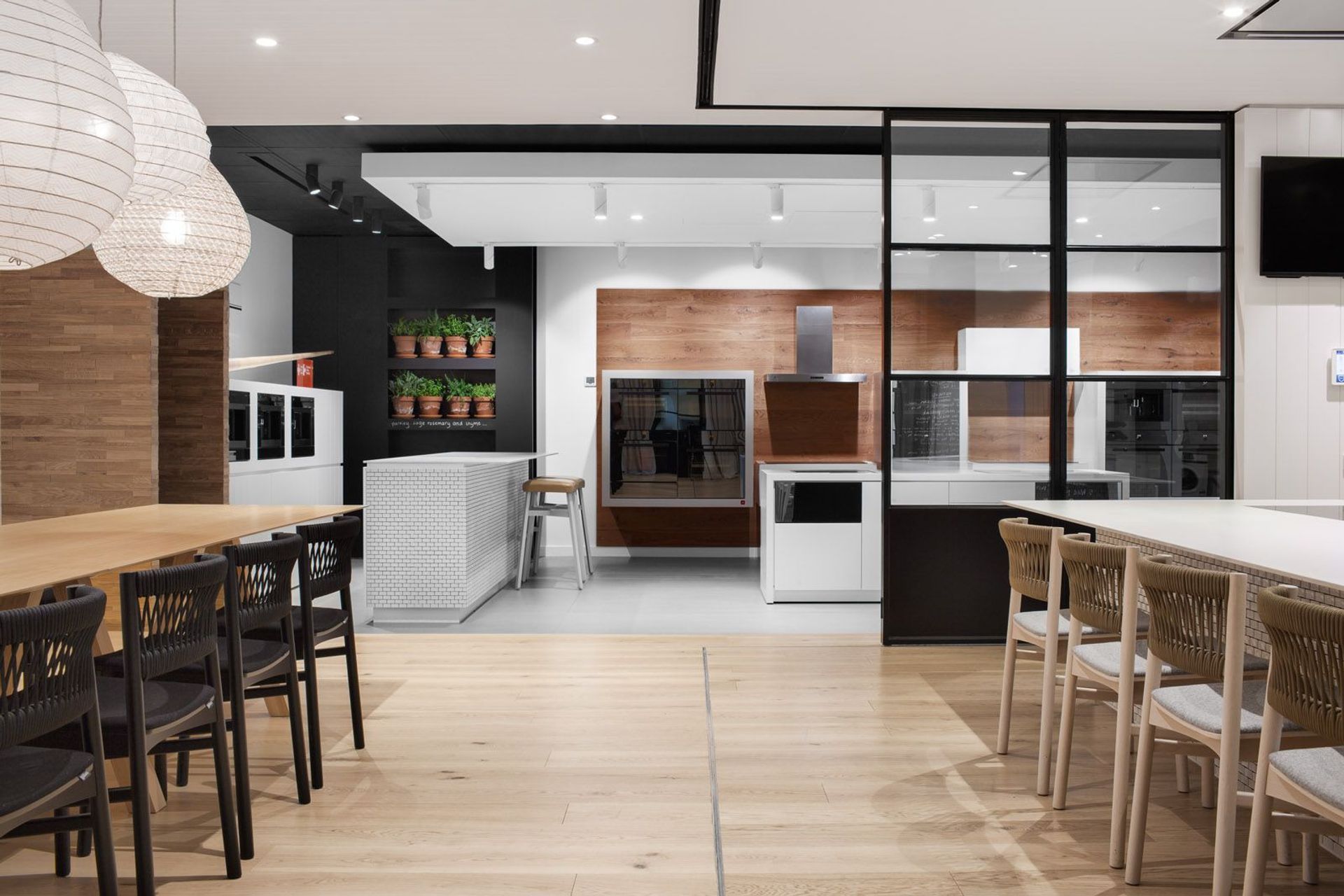
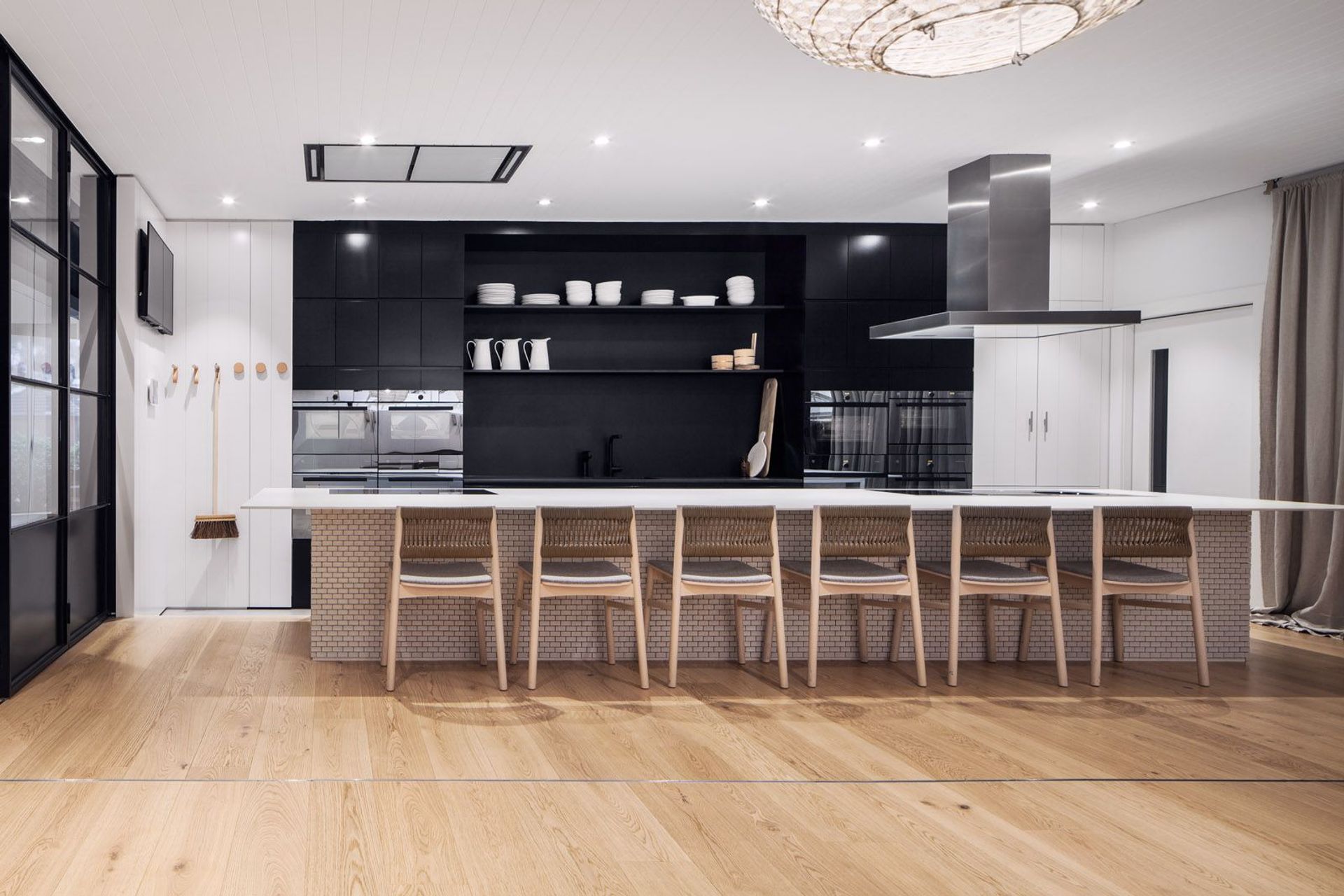
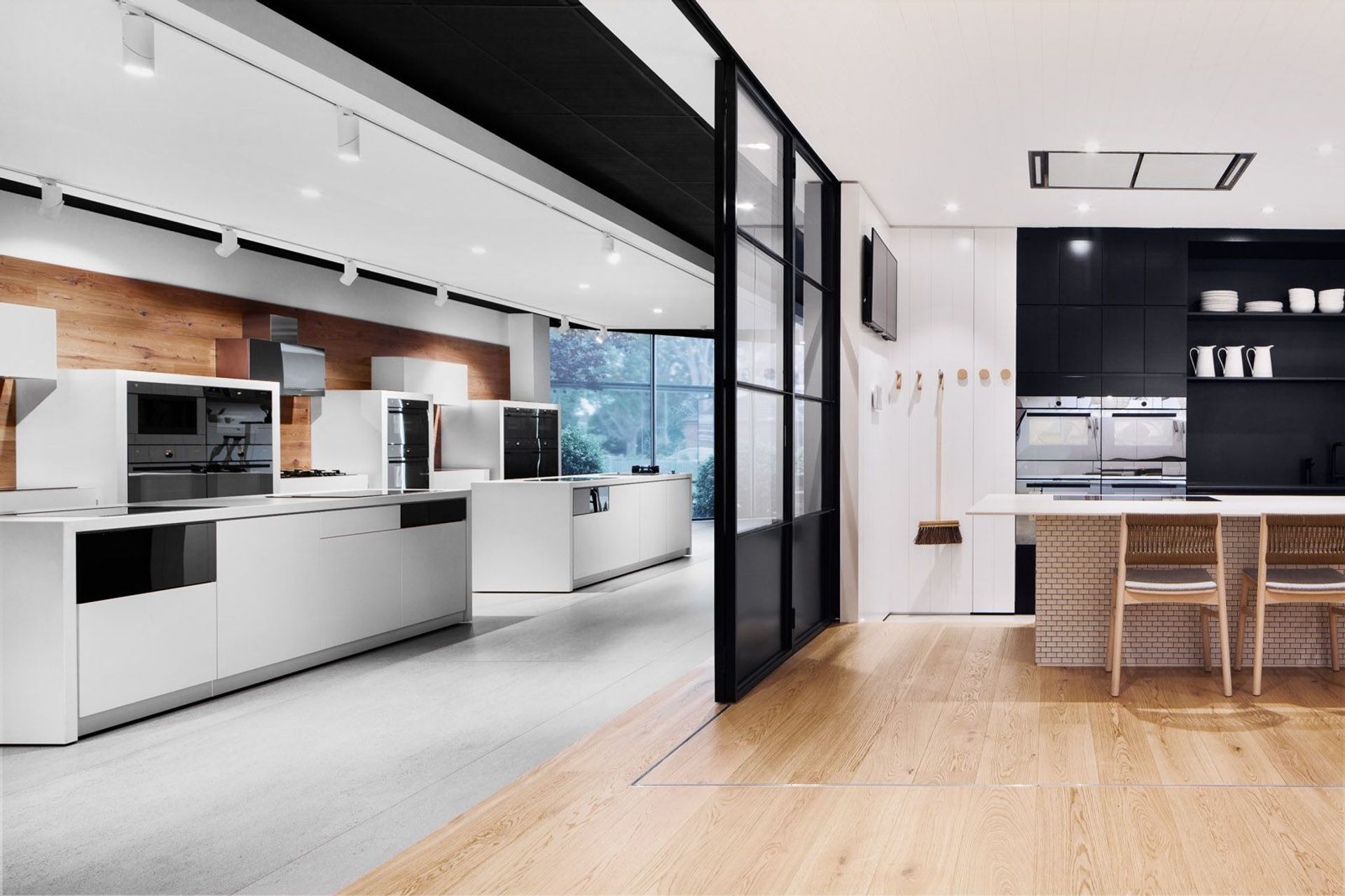
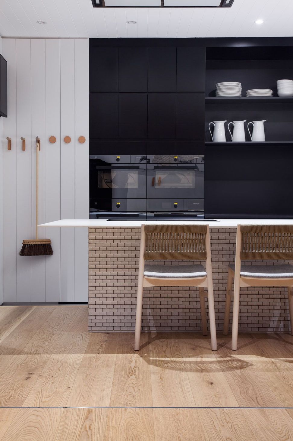
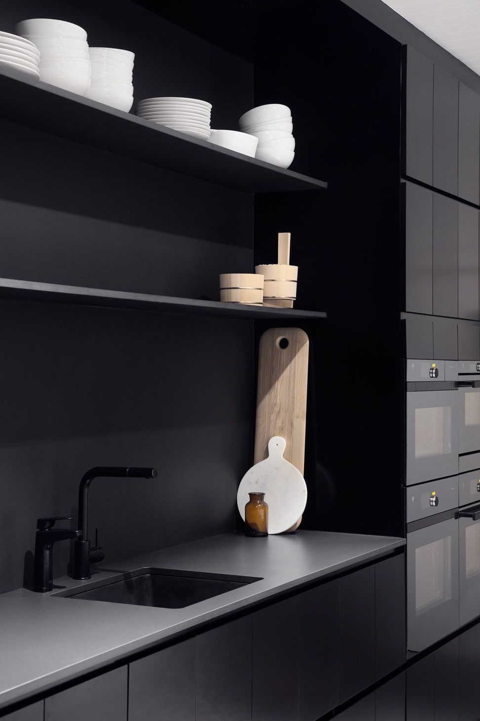
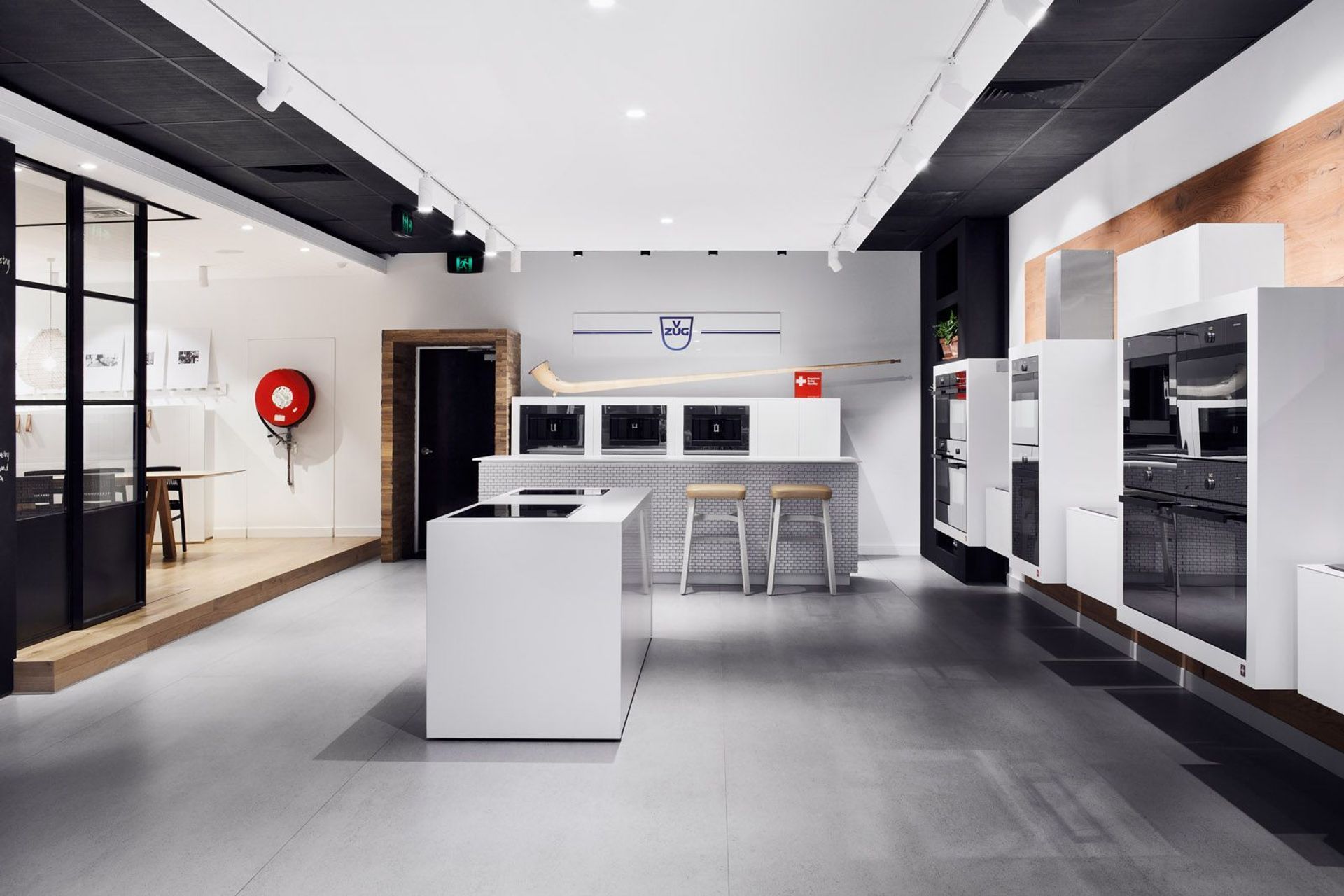
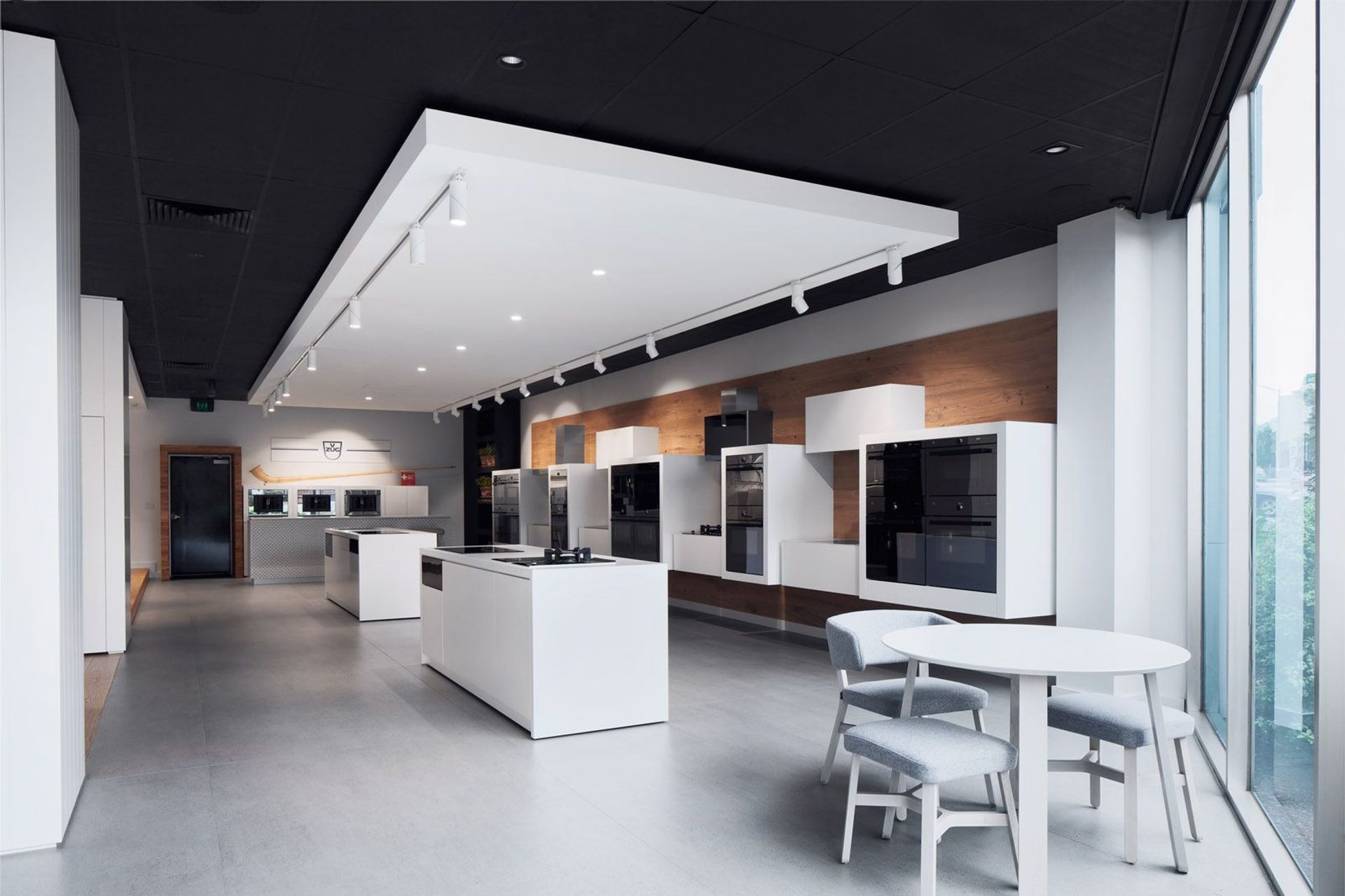
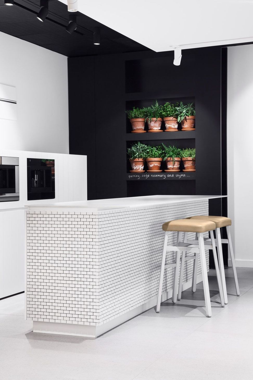
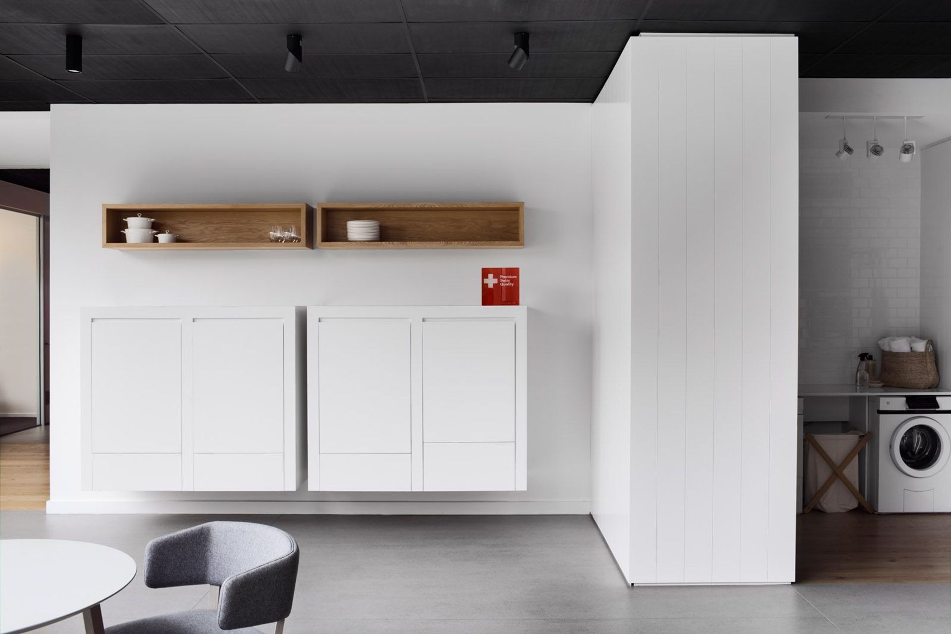
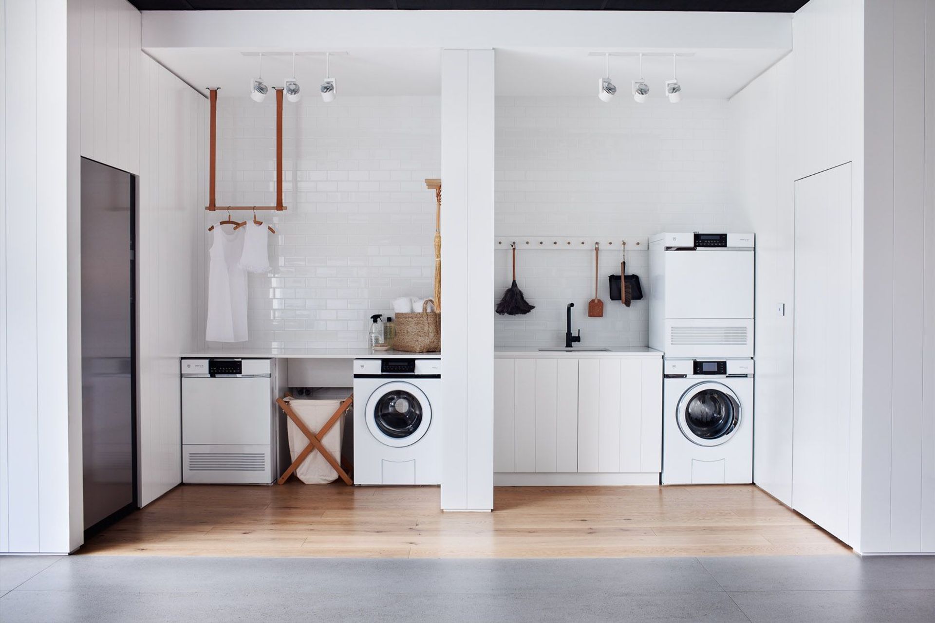
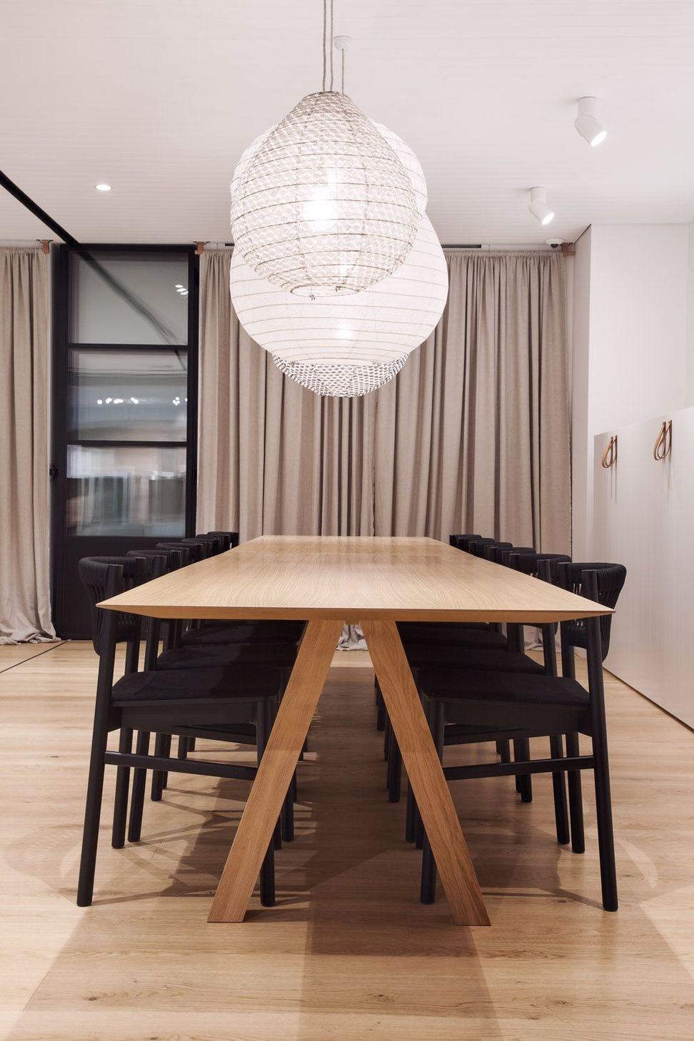
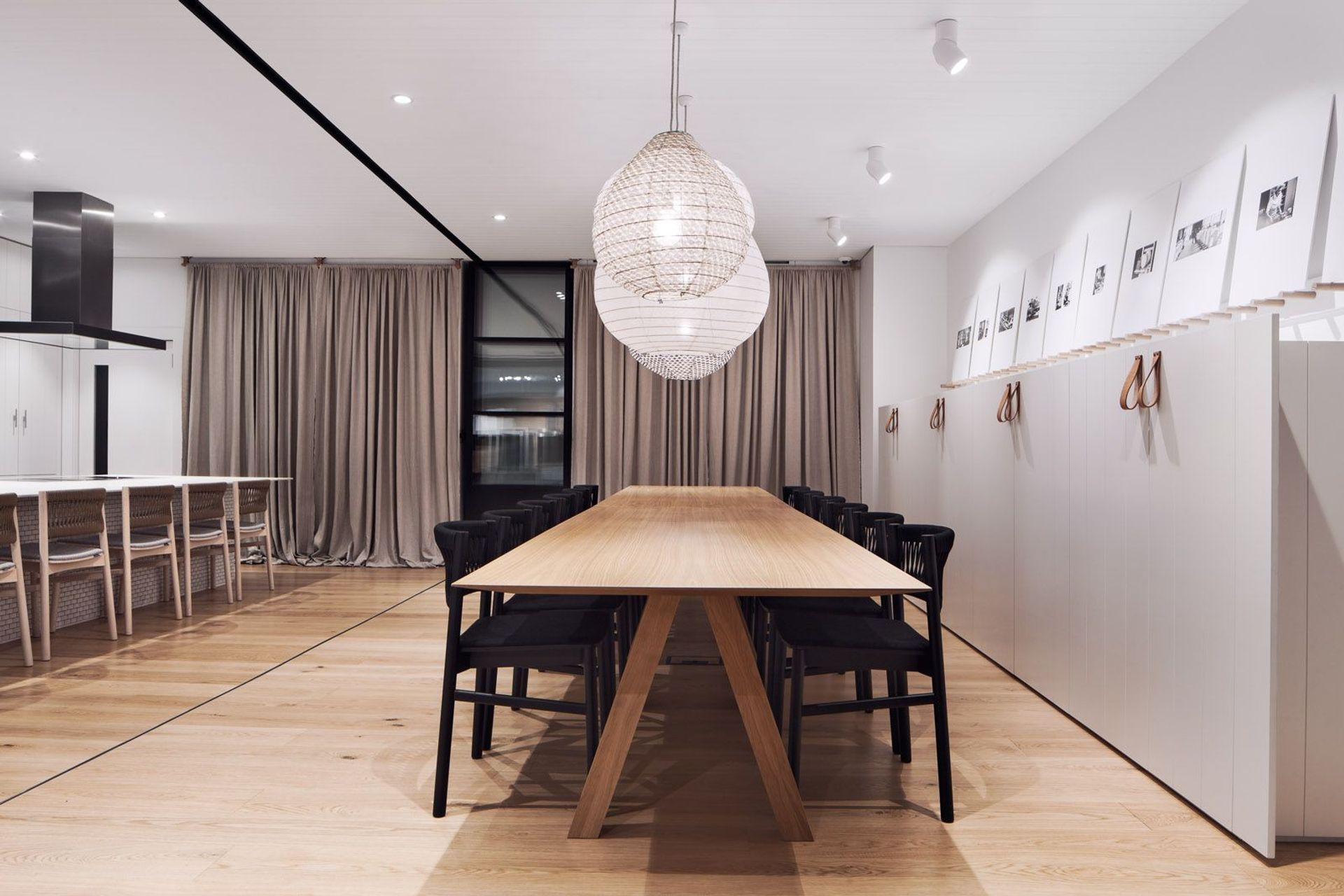
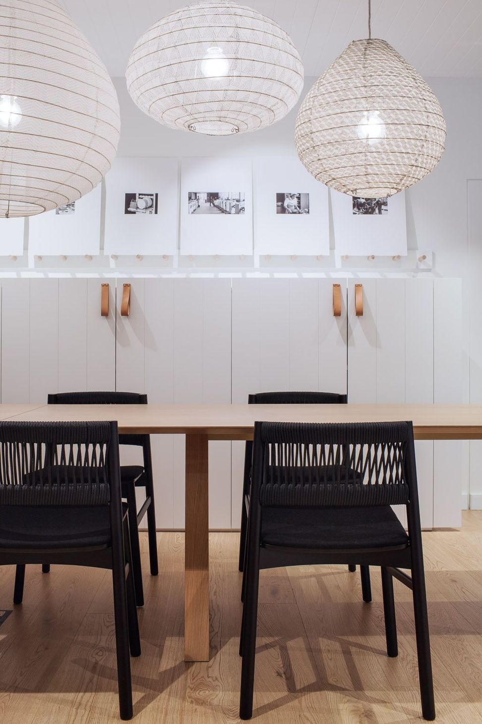
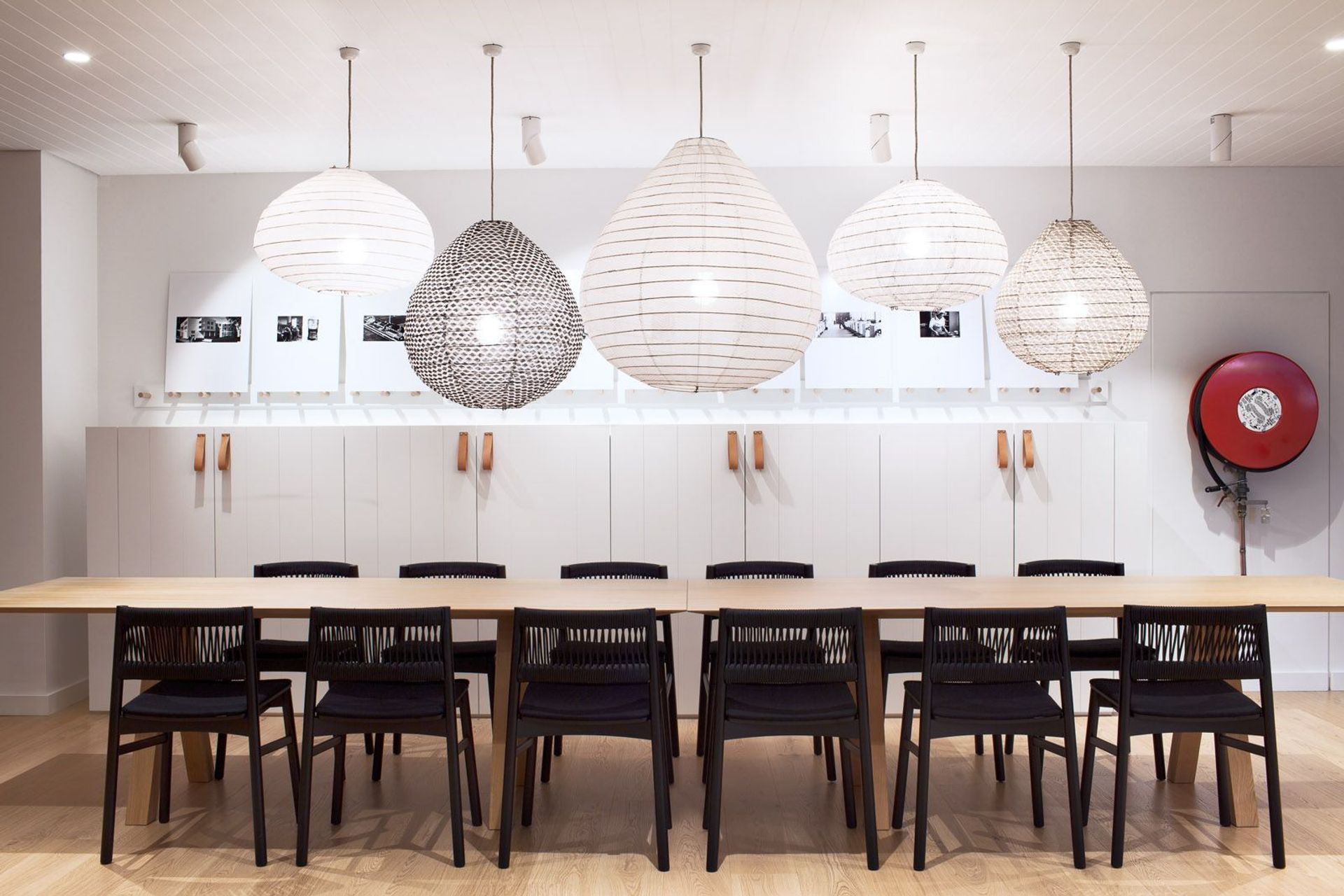
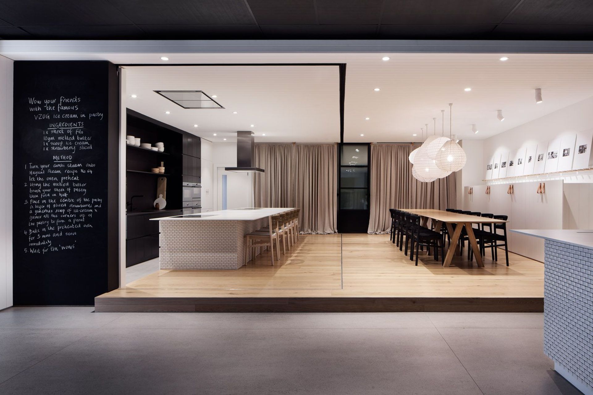
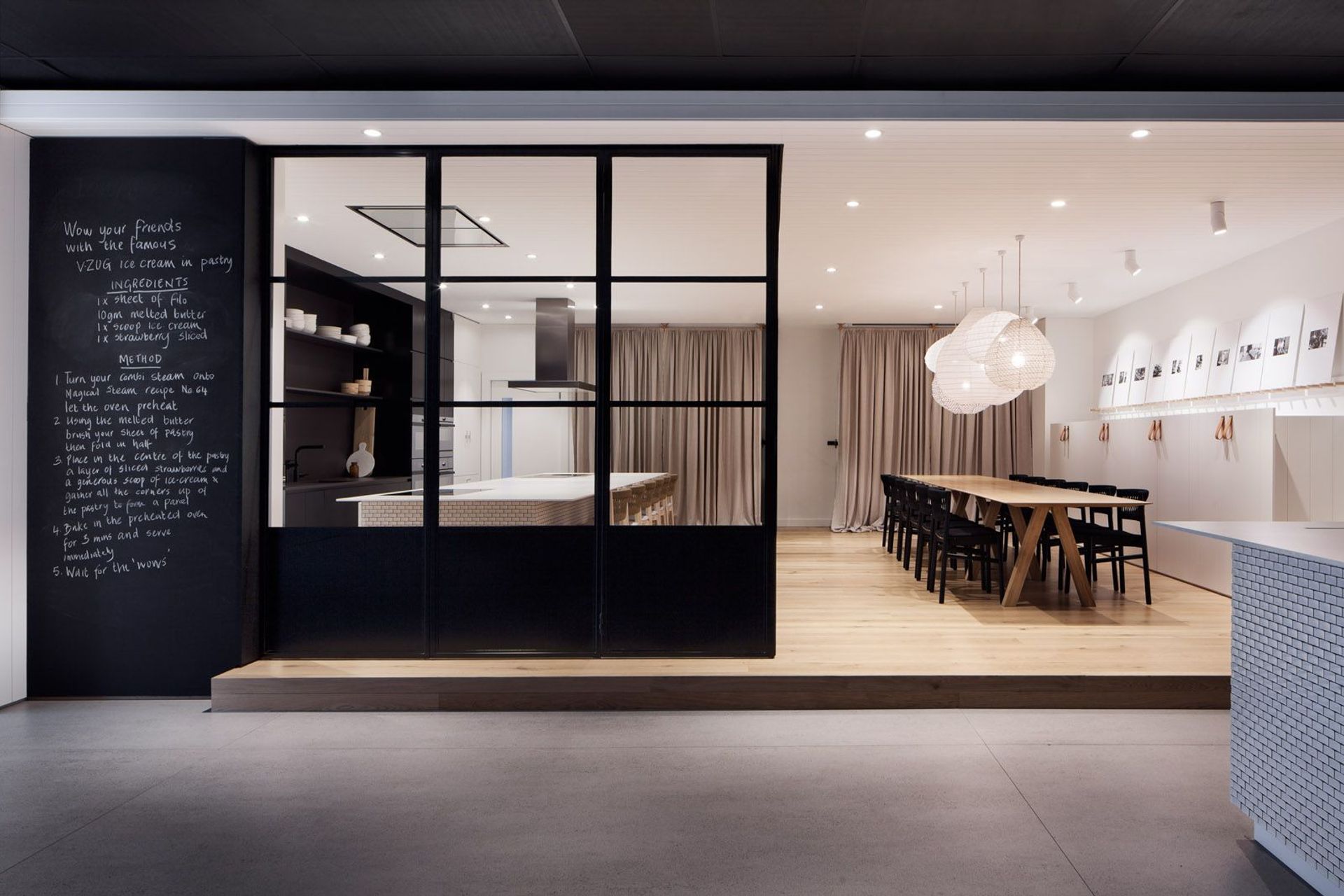
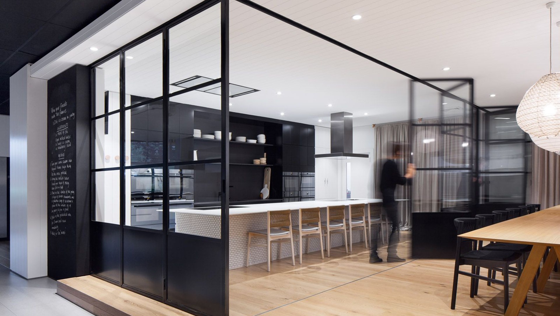
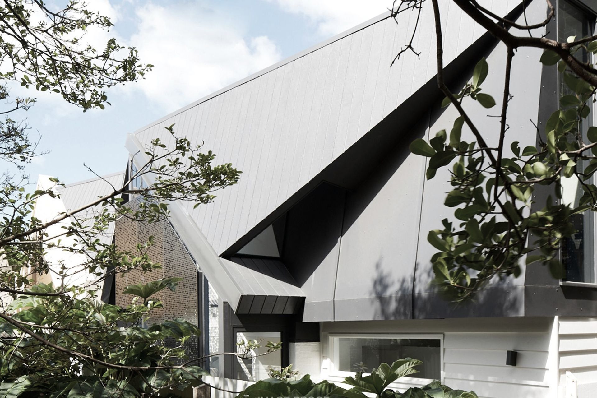
ArchiPro Project Summary - A sophisticated black and white showroom in Kew, Victoria, blending Swiss corporate identity with a warm, local context, featuring adaptable spaces and a focus on product presentation for an inviting customer experience.
- Title:
- VZUG
- Design & Build:
- Whiting Architects
- Category:
- Commercial/
- Interiors
- Photographers:
- Tatjana Plitt
Project Gallery

Views and Engagement

Inspired by this project?Visit Whiting Architects


Whiting Architects. Whiting Architects is an Architecture and Interior Design studio with over 25 years of experience.
Director Steven Whiting’s qualifications in both Interior Design and Architecture define the firms’ signature style and form a design philosophy that centers on the premise that there is no separation between disciplines.
The practice views each project holistically as Architects, Interior Designers, and willing collaborators with other disciplines. Producing work that transcends fashion and remains contemporary and robust for years to come.
Integral to their philosophy is the firms’ ability to consider all aspects of the design. Each project is explored thoroughly in 3D from concept to completion. Developed as an exterior object with corresponding interior volume complete with hard landscaping, finishes, joinery and furniture. Each project is a direct response to the site and existing conditions. As a result creating personalized, aesthetically beautiful, bespoke design solutions.
Year Joined
2023
Established presence on ArchiPro.
Projects Listed
12
A portfolio of work to explore.
Whiting Architects.
Profile
Projects
Contact


Other People also viewed


Why ArchiPro?
No more endless searching -
Everything you need, all in one place.Real projects, real experts -
Work with vetted architects, designers, and suppliers.Designed for New Zealand -
Projects, products, and professionals that meet local standards.From inspiration to reality -
Find your style and connect with the experts behind it.Start your Project
Start your project with a free account to unlock features designed to help you simplify your building project.
Learn MoreBecome a Pro
Showcase your business on ArchiPro and join industry leading brands showcasing their products and expertise.
Learn More