About
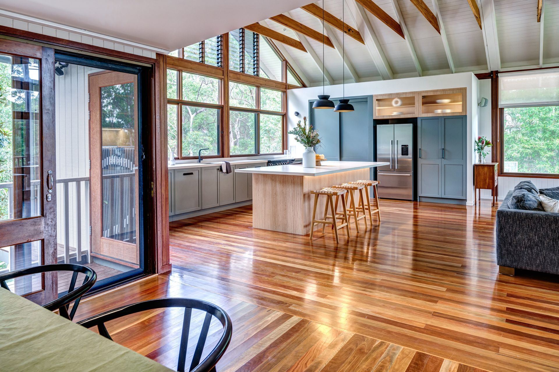
Warner Kitchen.
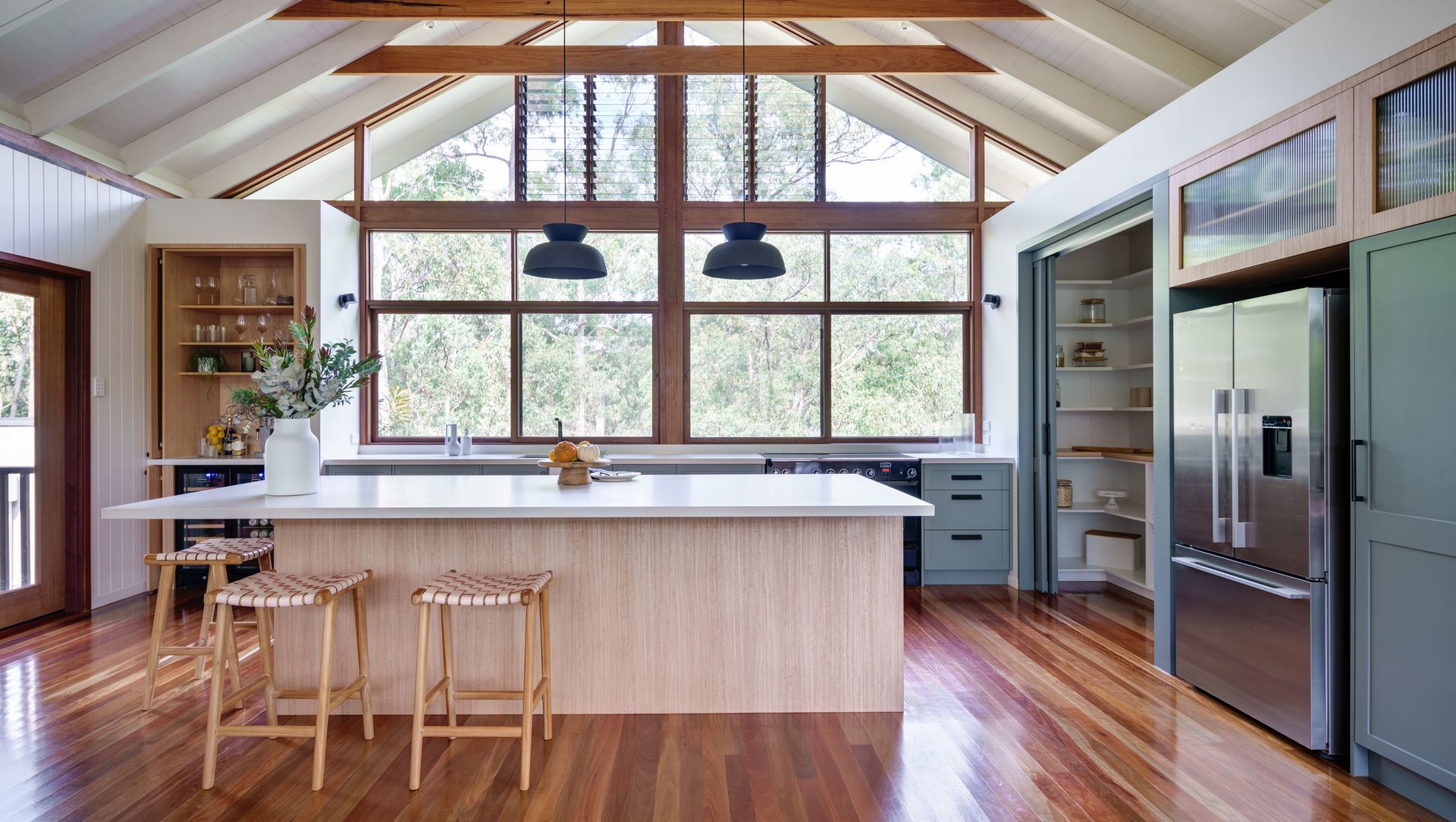
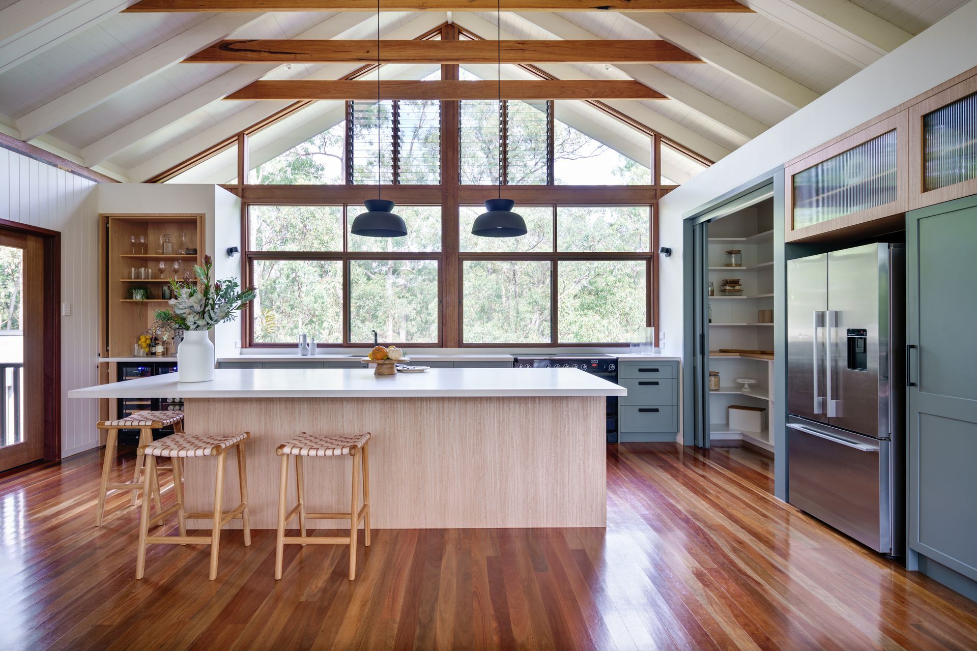
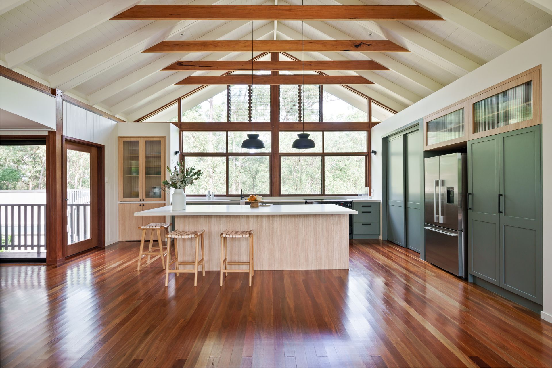
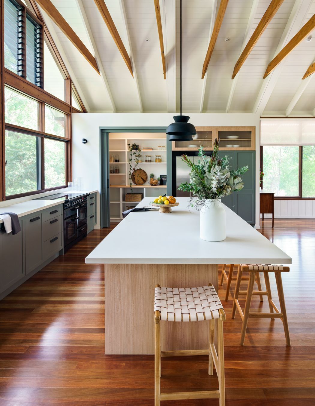
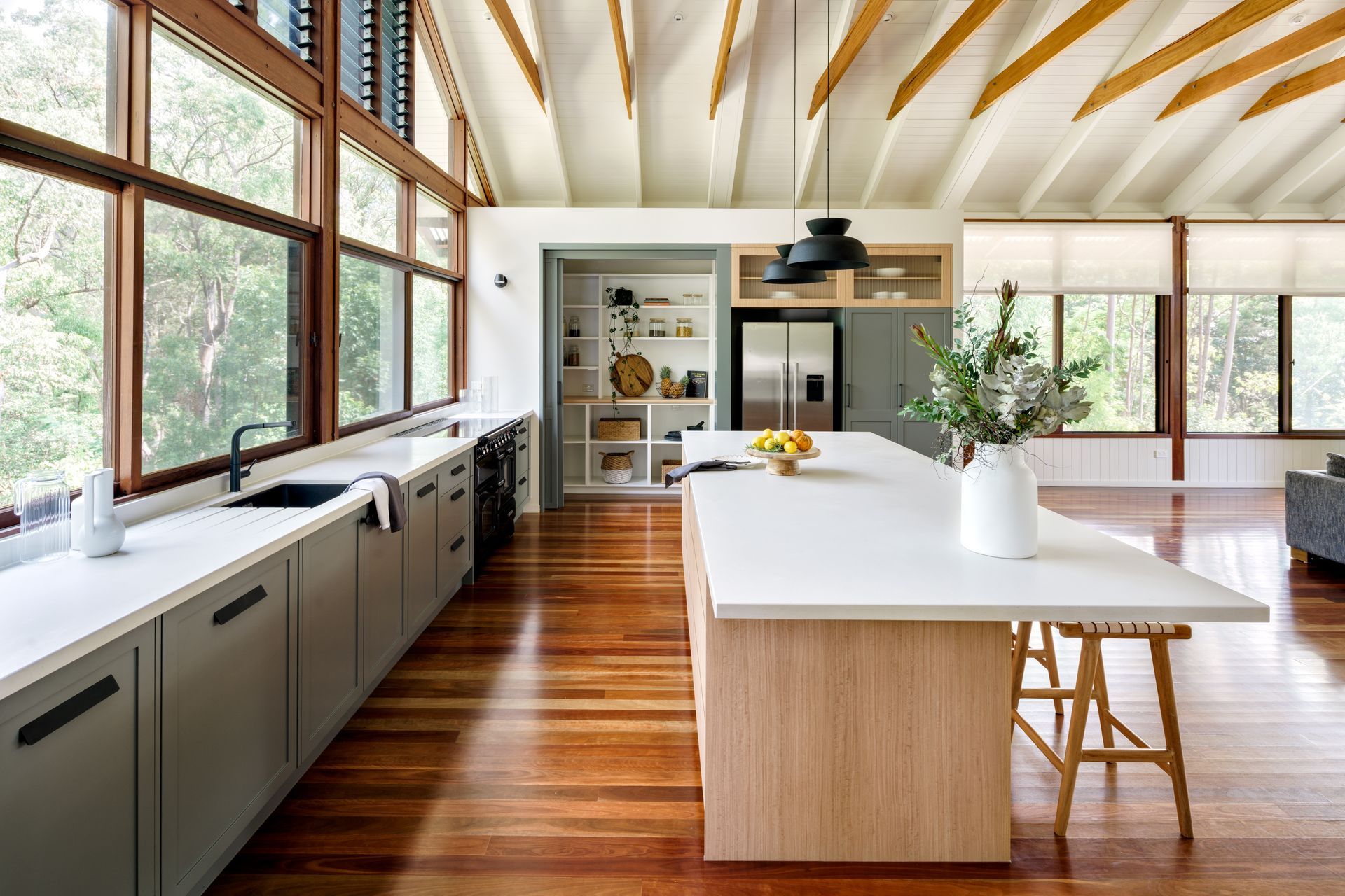
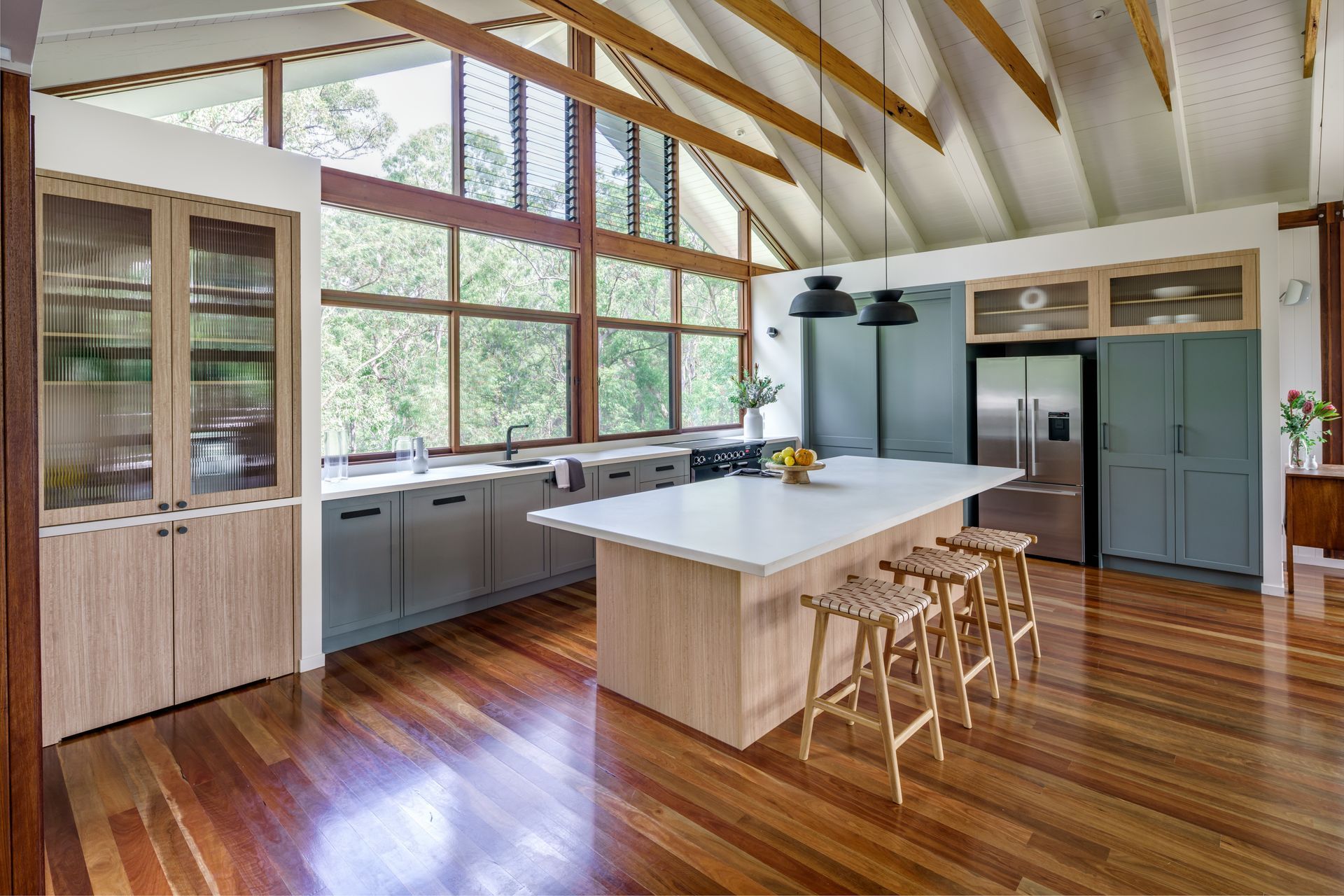
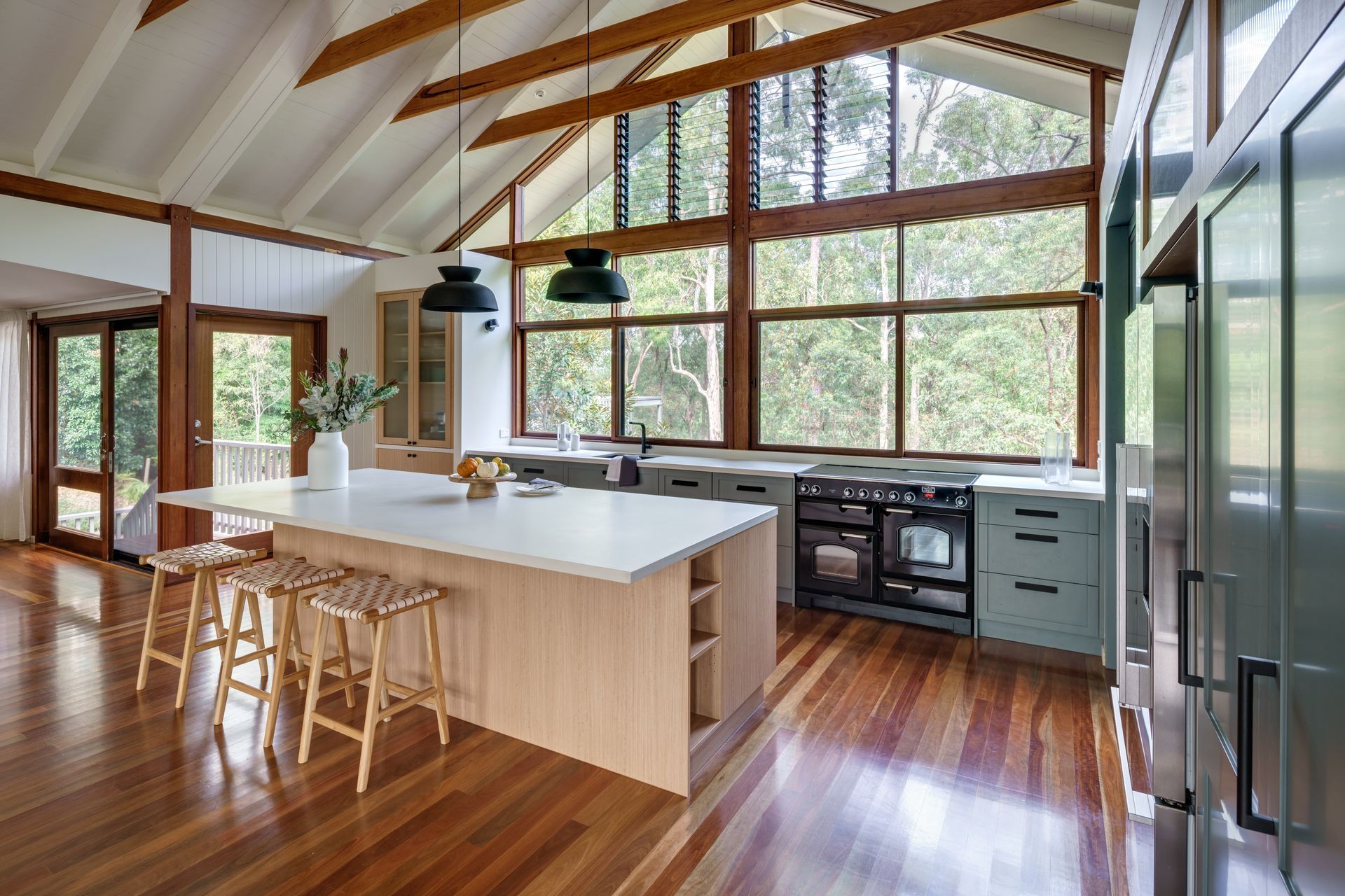
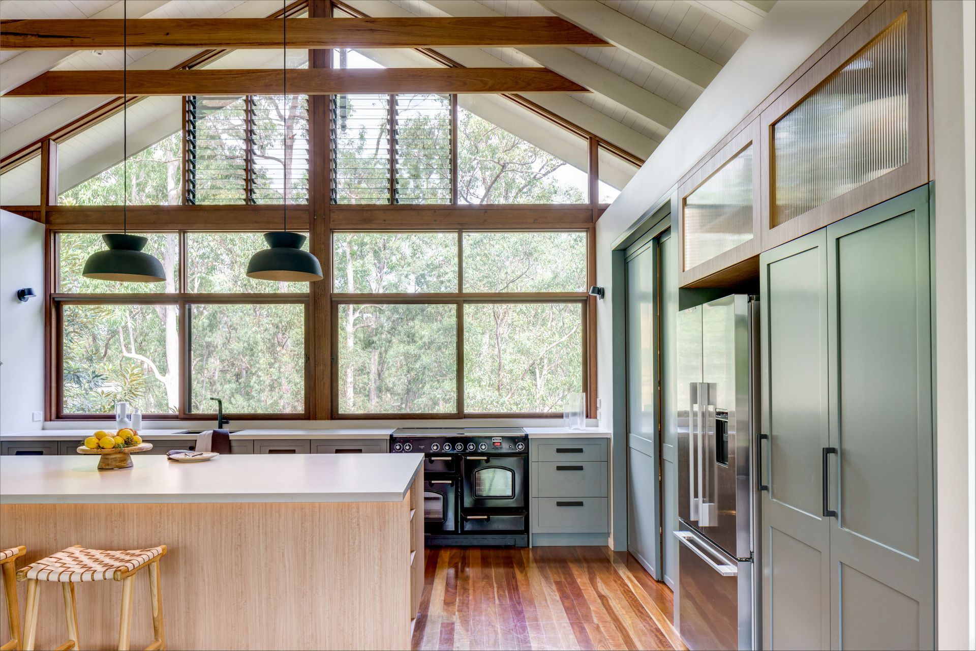
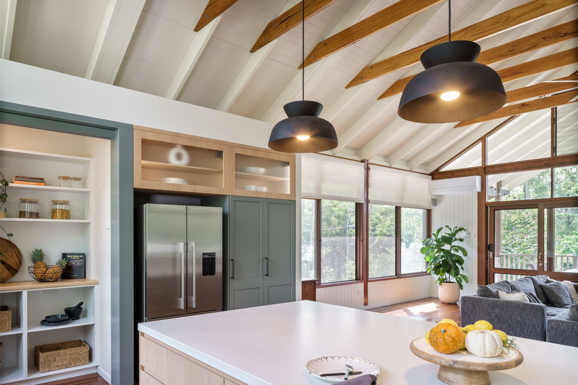
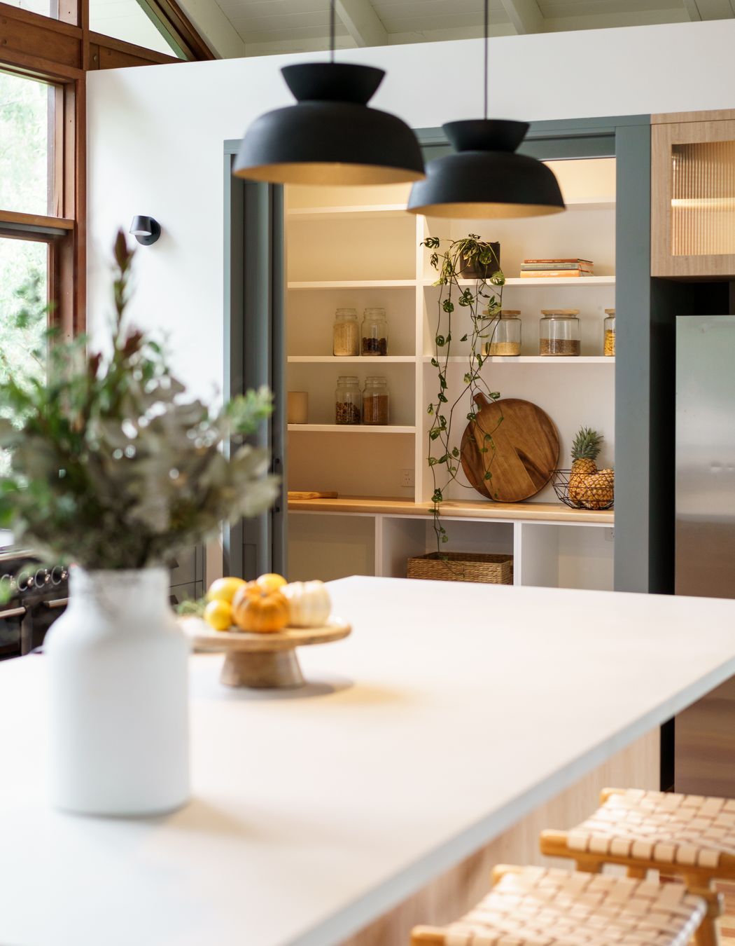
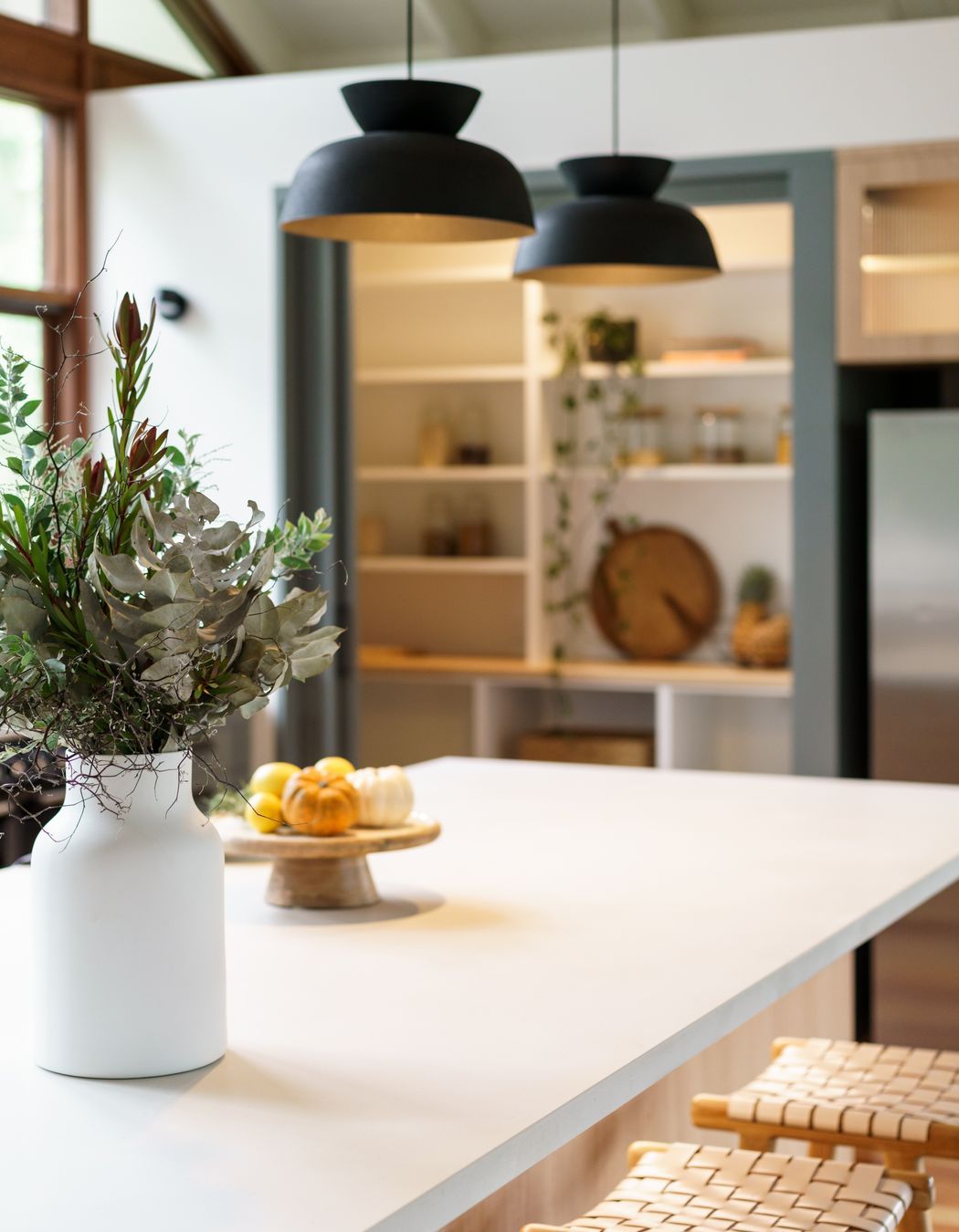
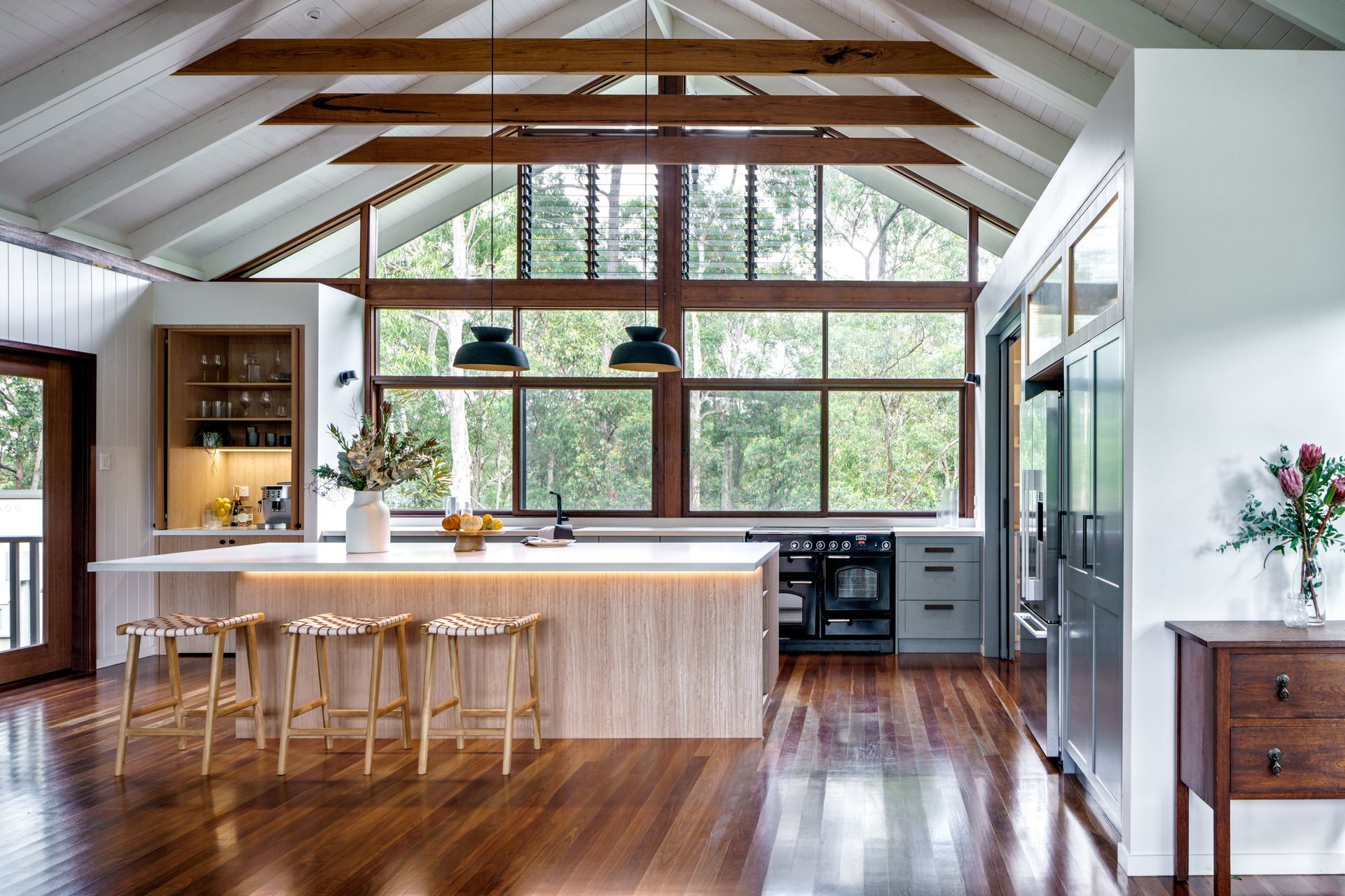
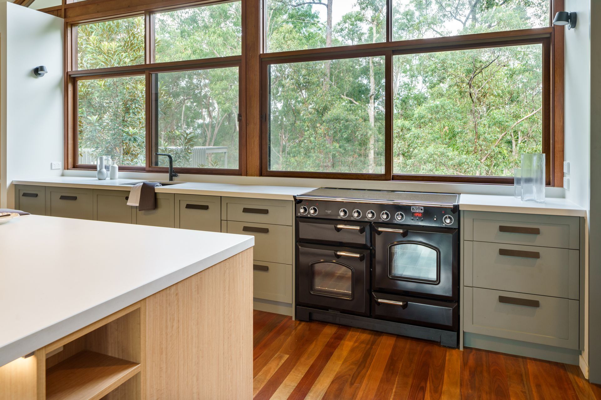
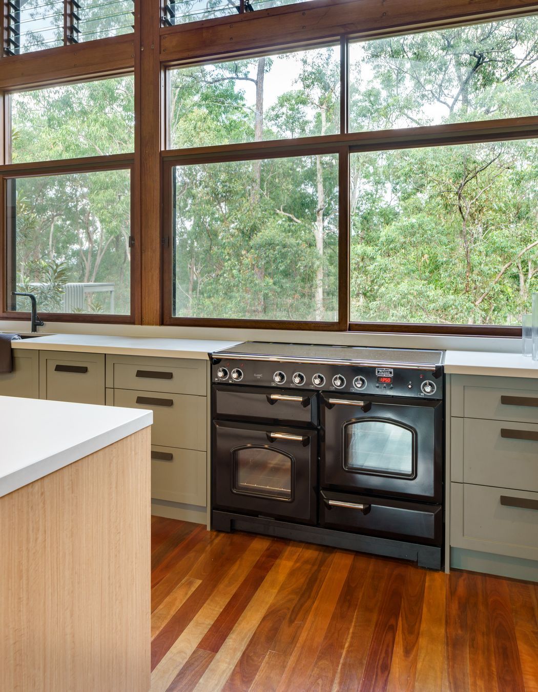
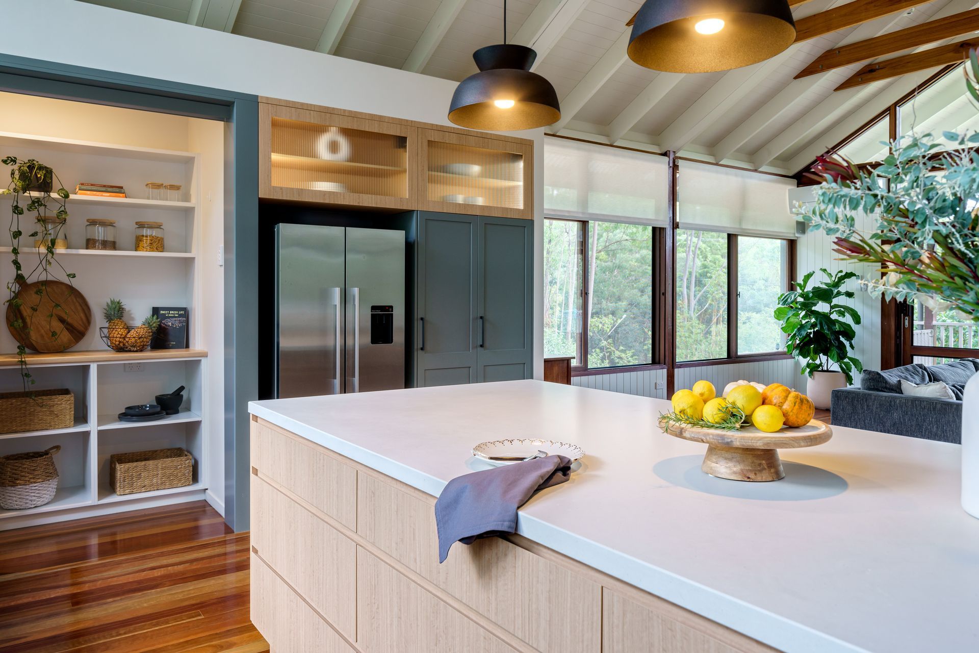
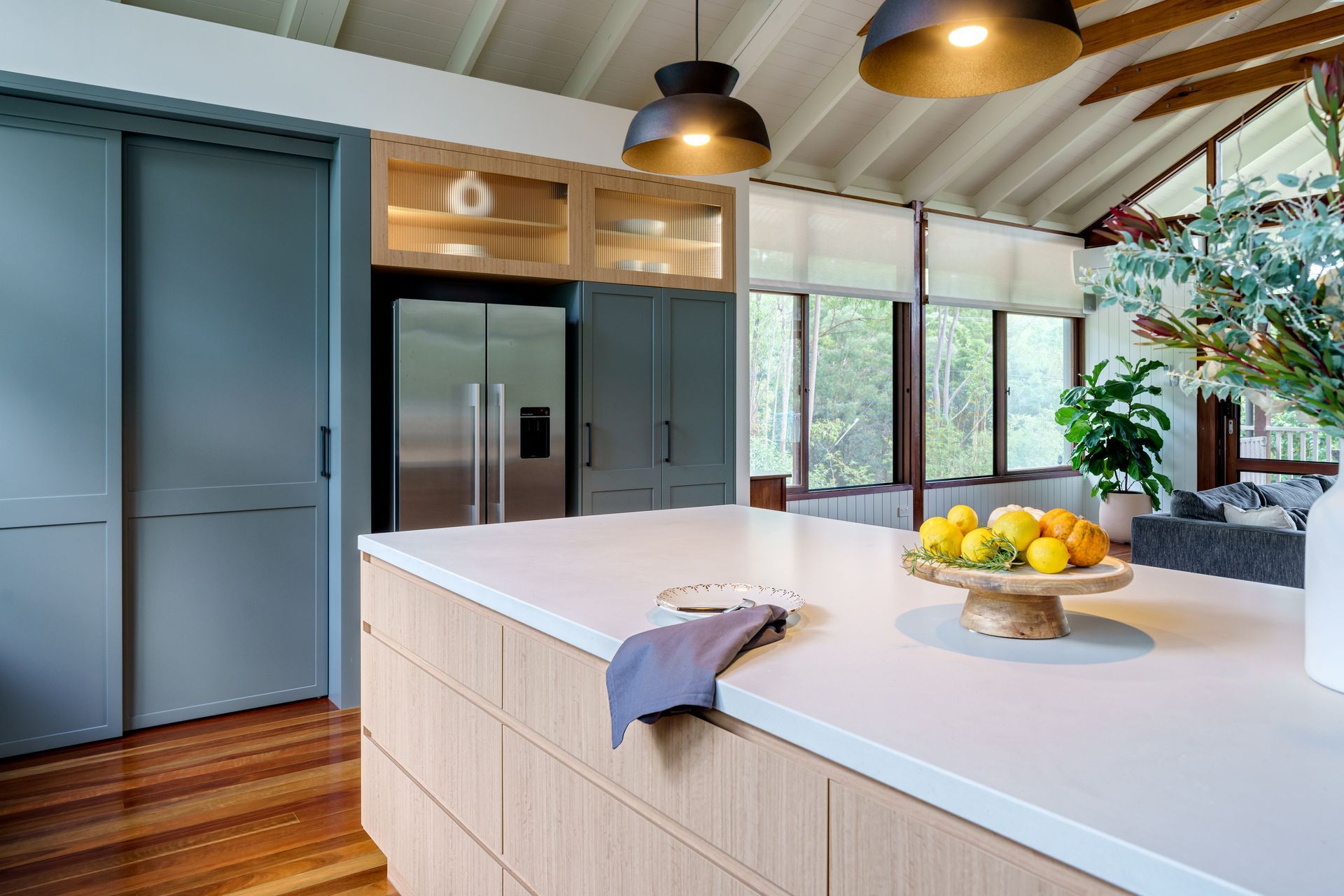
ArchiPro Project Summary - A spacious and functional kitchen designed for a family of four, harmoniously blending with the existing architecture and natural surroundings, featuring robust materials, an island bench, and a stylish drinks cabinet.
- Title:
- Warner Kitchen
- Building Designer:
- Jayne Air Building Design
- Category:
- Residential/
- Renovations and Extensions
Project Gallery
Views and Engagement
Products used
Professionals used
Jayne Air Building Design. Jayne Air is a multi-award winning Brisbane Building Designer and Interior Designer specialising in strategically crafting creative builds, renovations and stylings for commercial and residential projects with environmental consciousness and cultural awareness.
Welcome home
It’s my opinion that ground-breaking designs are the culmination of thoughtful strategies layered with bold creativity. They call for imagination, wild ideas and building upon the latest industry discoveries.
Modern, award-winning building designs and interior designs woven with your stories
Here at Jayne Air Building Design, I strive to offer you personalised service (that means 1:1 – yes, really).
I get to know you. Like, really get to know you. What you like. What you hate. And what you truly dream of – Plus all your little quirks. To create spaces that feel like you (or your community). Every. Single. Time.
It’s true. Here at Jayne Air Building Design, I believe the windows are the windows to your soul. A peek into your story – your world.
Who You Are
You want your ‘you-ness’ communicated through your liveable spaces, with subtle flair. I get that. Actually, I love that. No matter your budget, no matter your limits (we see you, pesky neighbour). Whether you’re a new family or a bustling school. Maybe you’re building a large aged care facility or a quaint studio teaching rugged mechanics their craft.
I believe all spaces deserve interesting materials, patterns, colours. To create spaces that feel like home and community. And spoiler alert: Great things can be achieved without a zillion dollar budget.
Year Joined
2022
Established presence on ArchiPro.
Projects Listed
4
A portfolio of work to explore.
Jayne Air Building Design.
Profile
Projects
Contact
Other People also viewed
Why ArchiPro?
No more endless searching -
Everything you need, all in one place.Real projects, real experts -
Work with vetted architects, designers, and suppliers.Designed for New Zealand -
Projects, products, and professionals that meet local standards.From inspiration to reality -
Find your style and connect with the experts behind it.Start your Project
Start you project with a free account to unlock features designed to help you simplify your building project.
Learn MoreBecome a Pro
Showcase your business on ArchiPro and join industry leading brands showcasing their products and expertise.
Learn More