Modernist Masterpiece banner

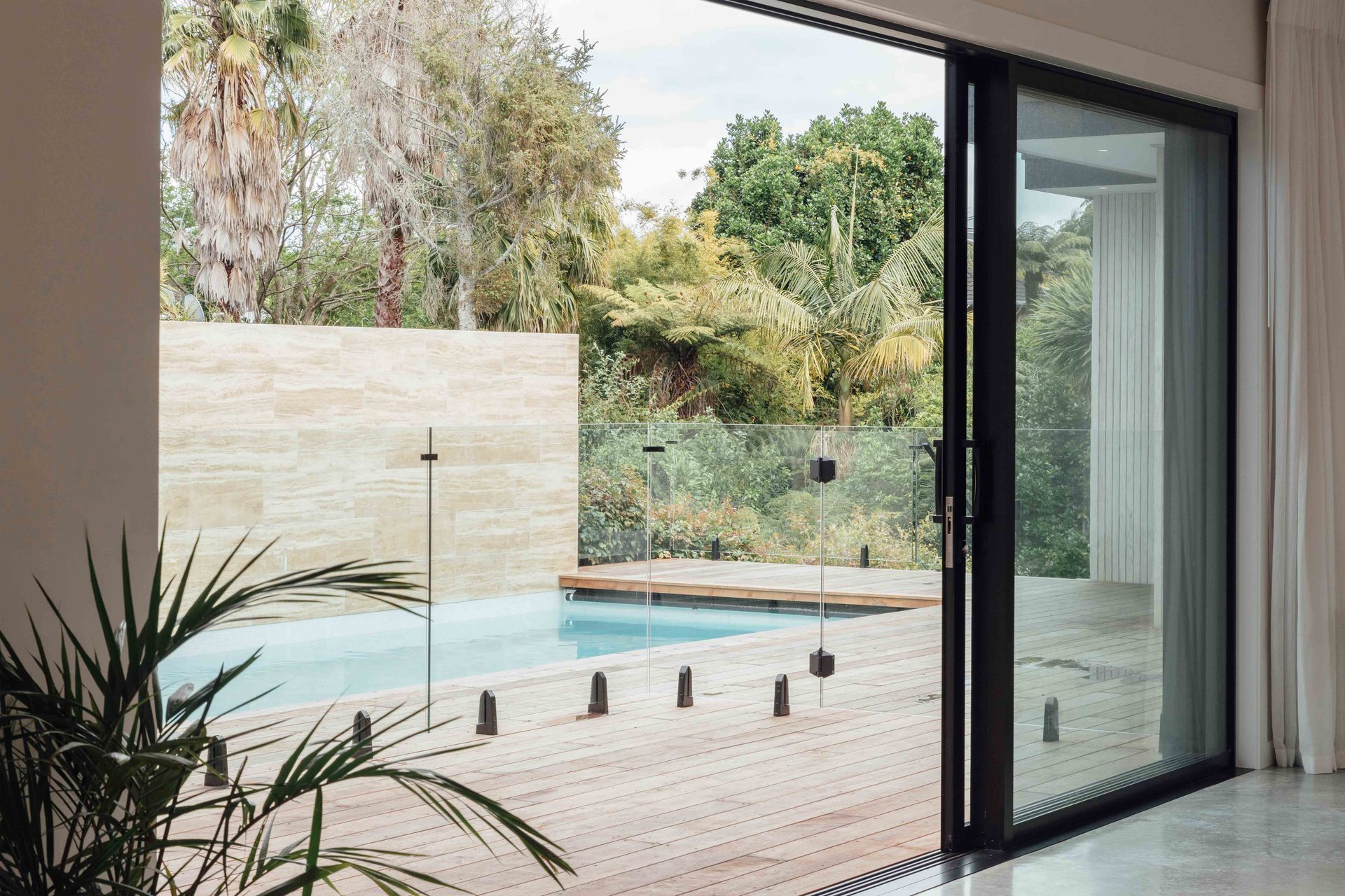
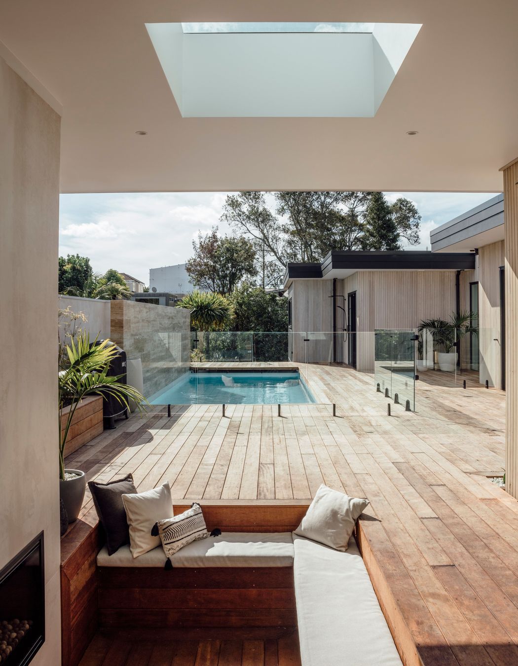
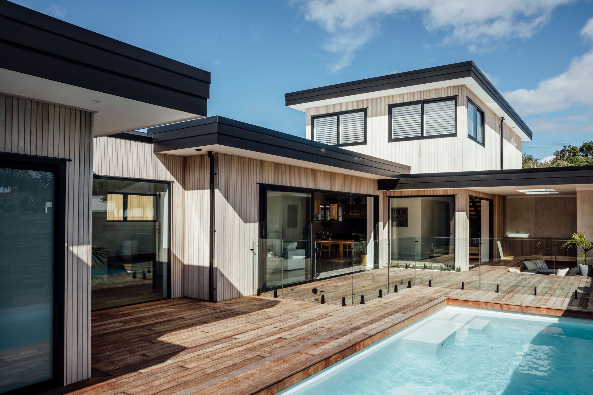
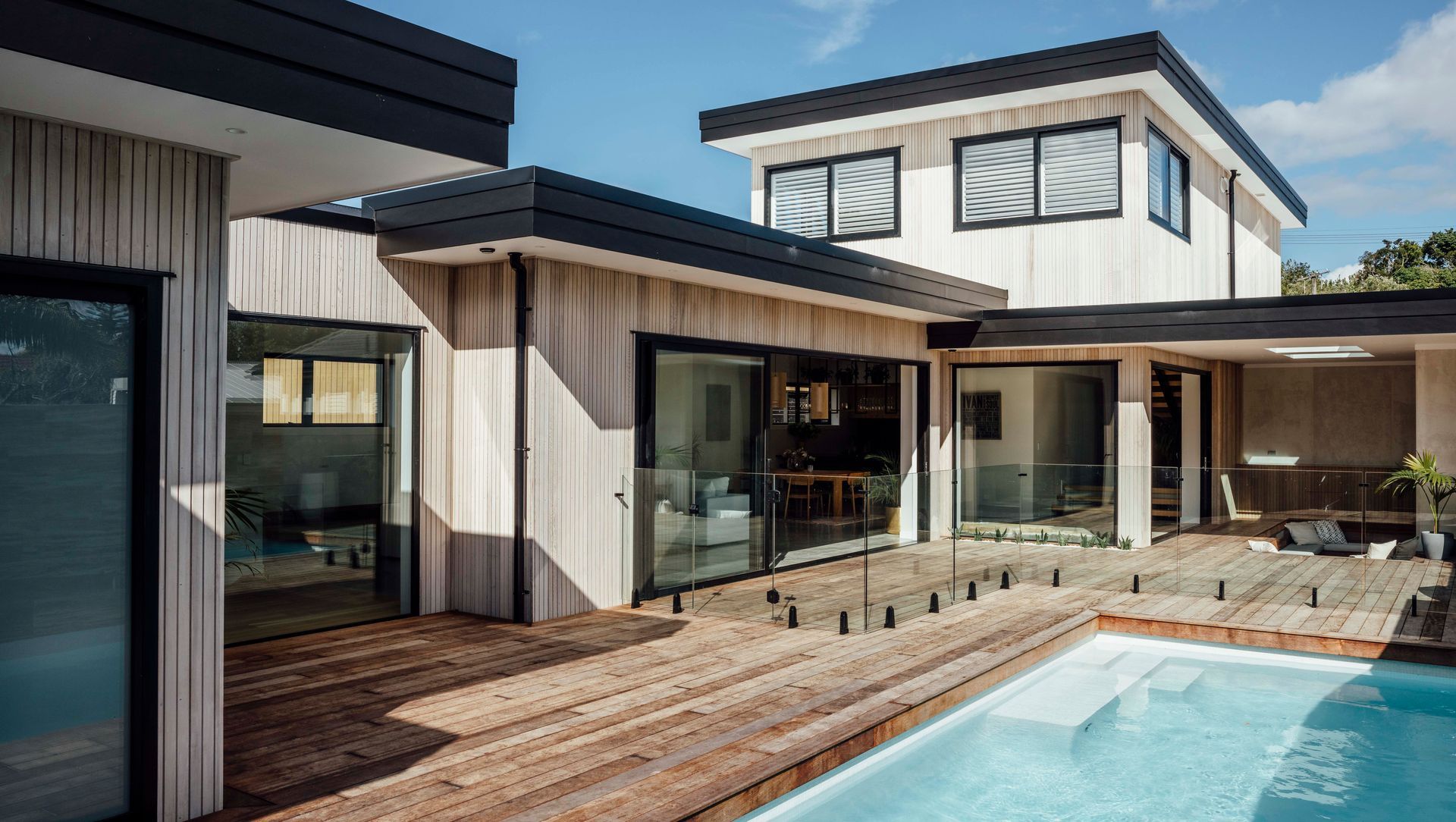
Courtyards may have existed since ancient times but the California modernists claimed this built form as their own when they wrapped a house around it and inserted a pool. This home, in Auckland’s Westmere, recreates that modernist feel with a courtyard that is just made for entertaining; the blue slash of pool is minimal and cool, a study in geometric precision against a granite-wall backdrop.

“We bought the property, with its existing house—a fairly run down 1940s weatherboard and brick home—and lived in it for a couple of years,” says Martin Wiltshire, Managing Director for David Reid Homes North Shore.

“The gently sloping 960sqm site was a rare find for the area and while it’s relatively narrow at only 18-metres wide, it offered not only a lot of potential but also an established bush backdrop. We carried out extensive site works to build up what became the middle section of the property to create the central courtyard area but went with the slope for about the first 40-metres and left the last 10-metres alone.”

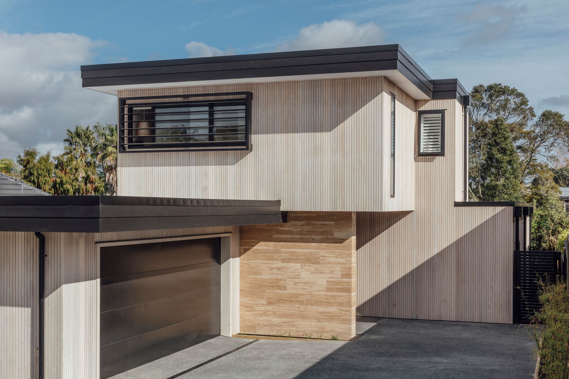
From the street, the home, with its horizontal roof planes, looks decidedly modern. The cladding of narrow cedar boards runs vertically in gentle counterpoint to the horizontal lines of the architecture.

“My wife had seen homes with a similar aesthetic in Central Otago and at Omaha and was really set on achieving something with the same kind of look and feel. We’ve kept the cladding materials to a minimum to ensure a clean, pared-back look.”

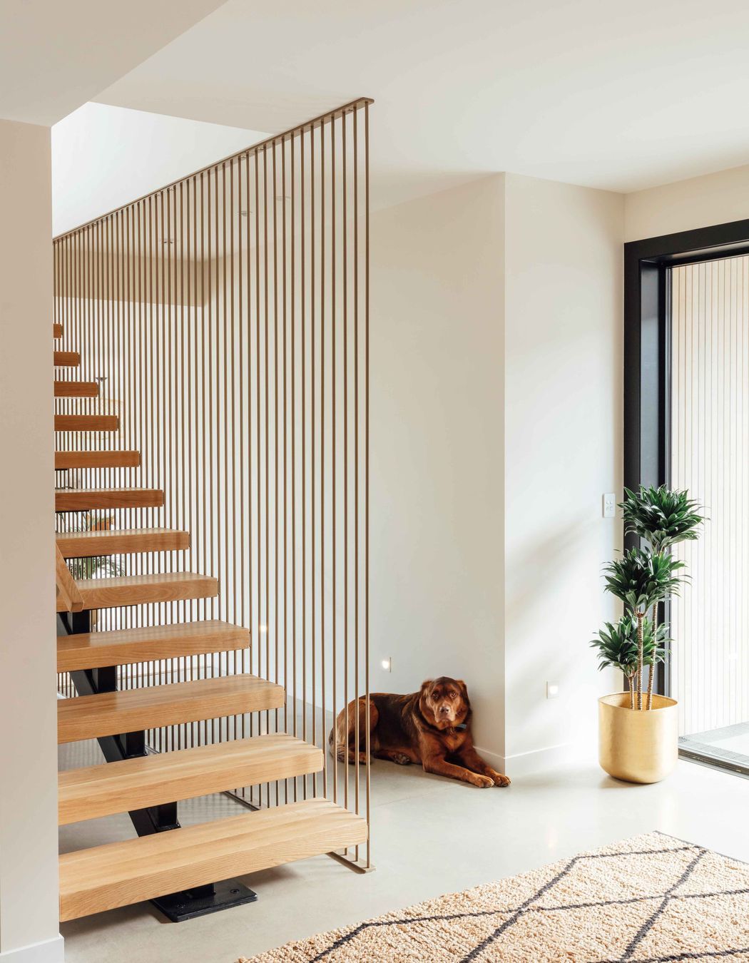
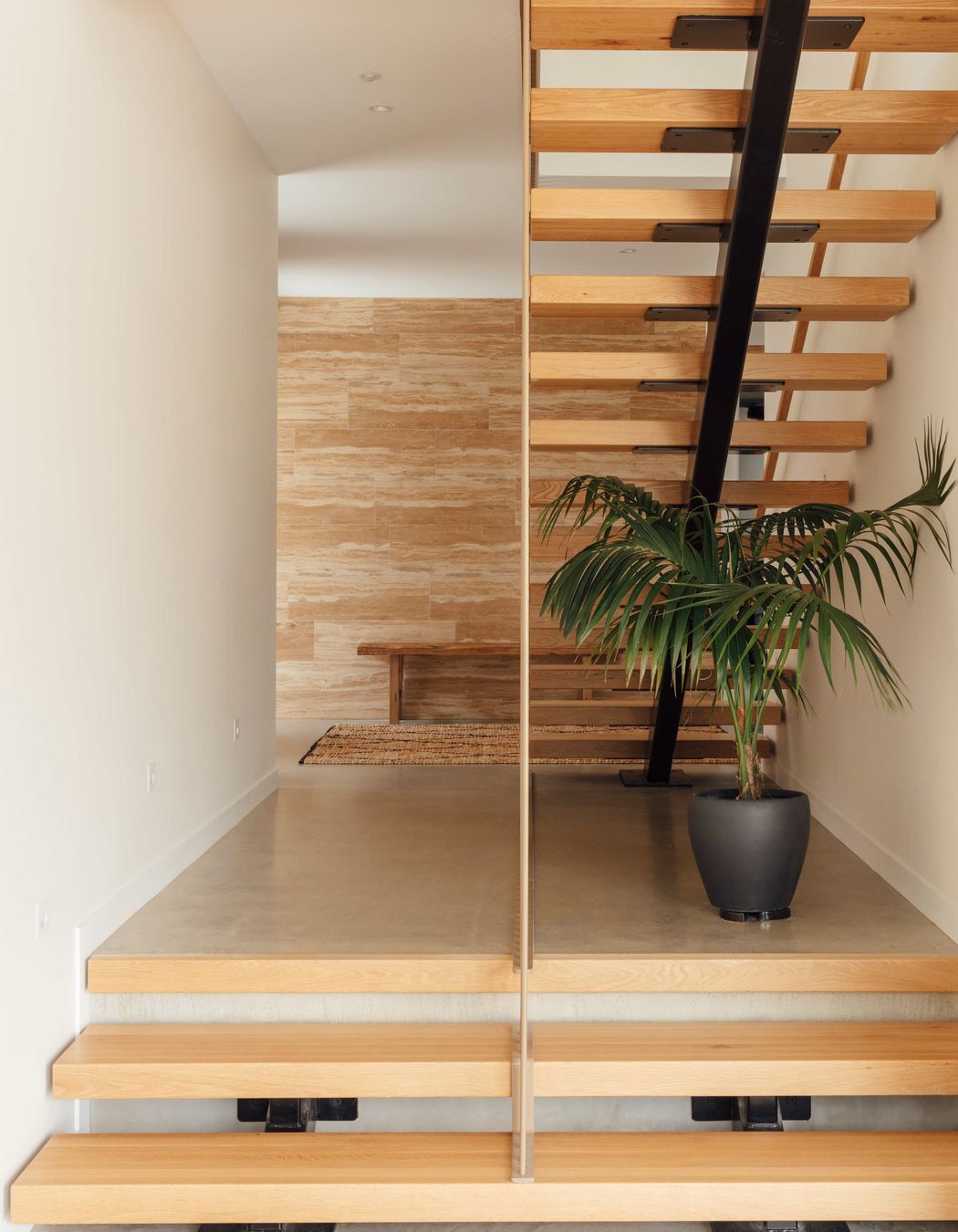
In size and appearance, it’s all very low key. However, once through the front door, there is an inkling of something special to come. An open-tread, suspended timber staircase floats in the entry space. From here, the design reveals itself slowly—until a corner is turned and the ‘wow’ moment that takes in the courtyard becomes apparent.

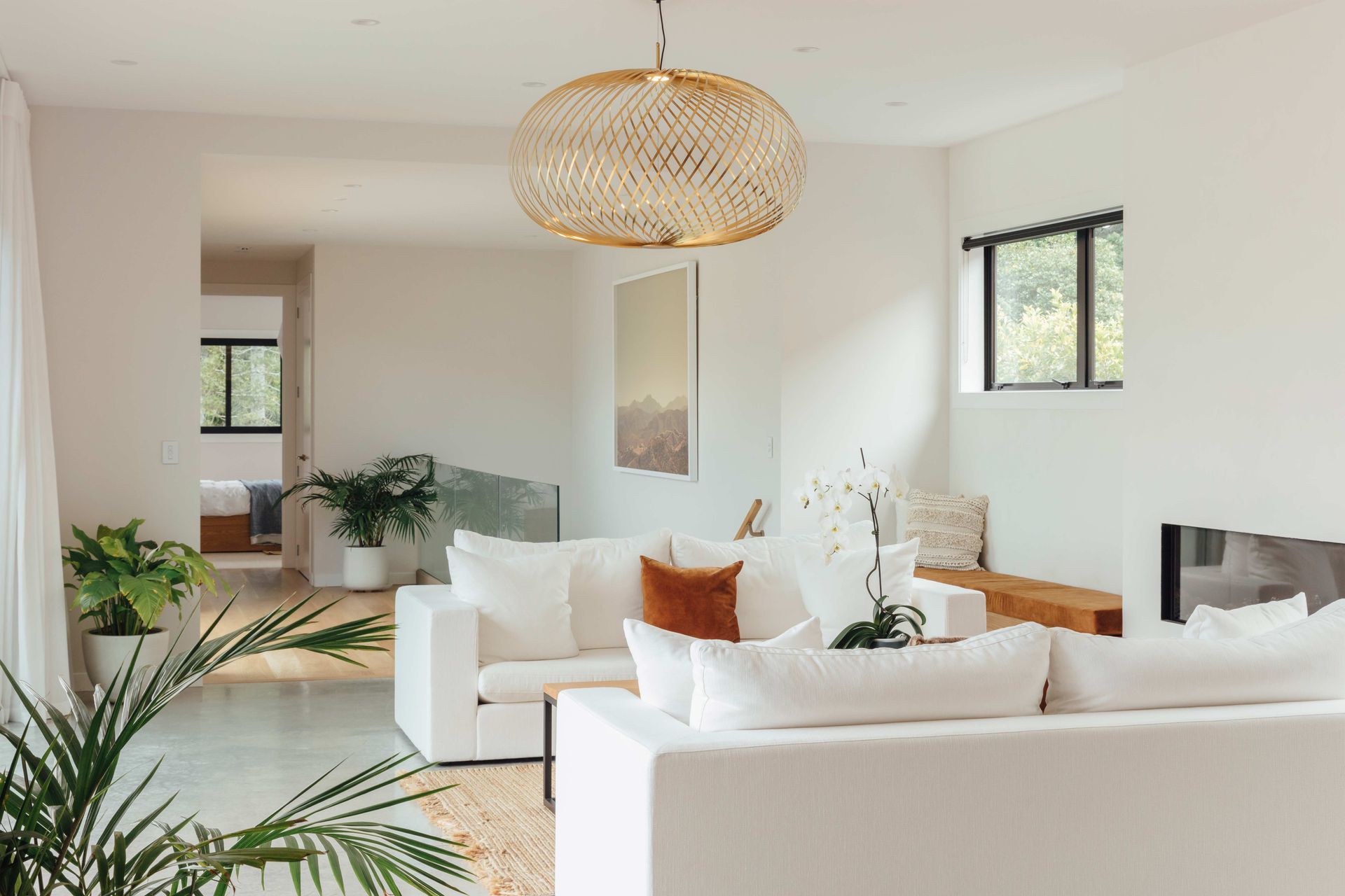
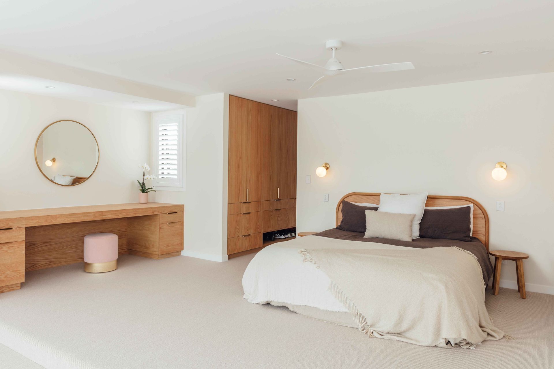
“While concrete floors, black-framed glazing and white walls in the main living areas are minimalist, almost brutal, they are not stark. We also used a lot of oak cabinetry and flooring for texture and warmth.

“On the fireplace wall, the paintwork has subtle texture that reflects the abundant light that streams through floor-to-ceiling glass sliders. A built-in timber ledge is both a hearth and bench-seats that flank the fire and bring symmetry to the space. Dark-gold squabs are a colourful, warming element against a pair of custom-designed white sofas.”

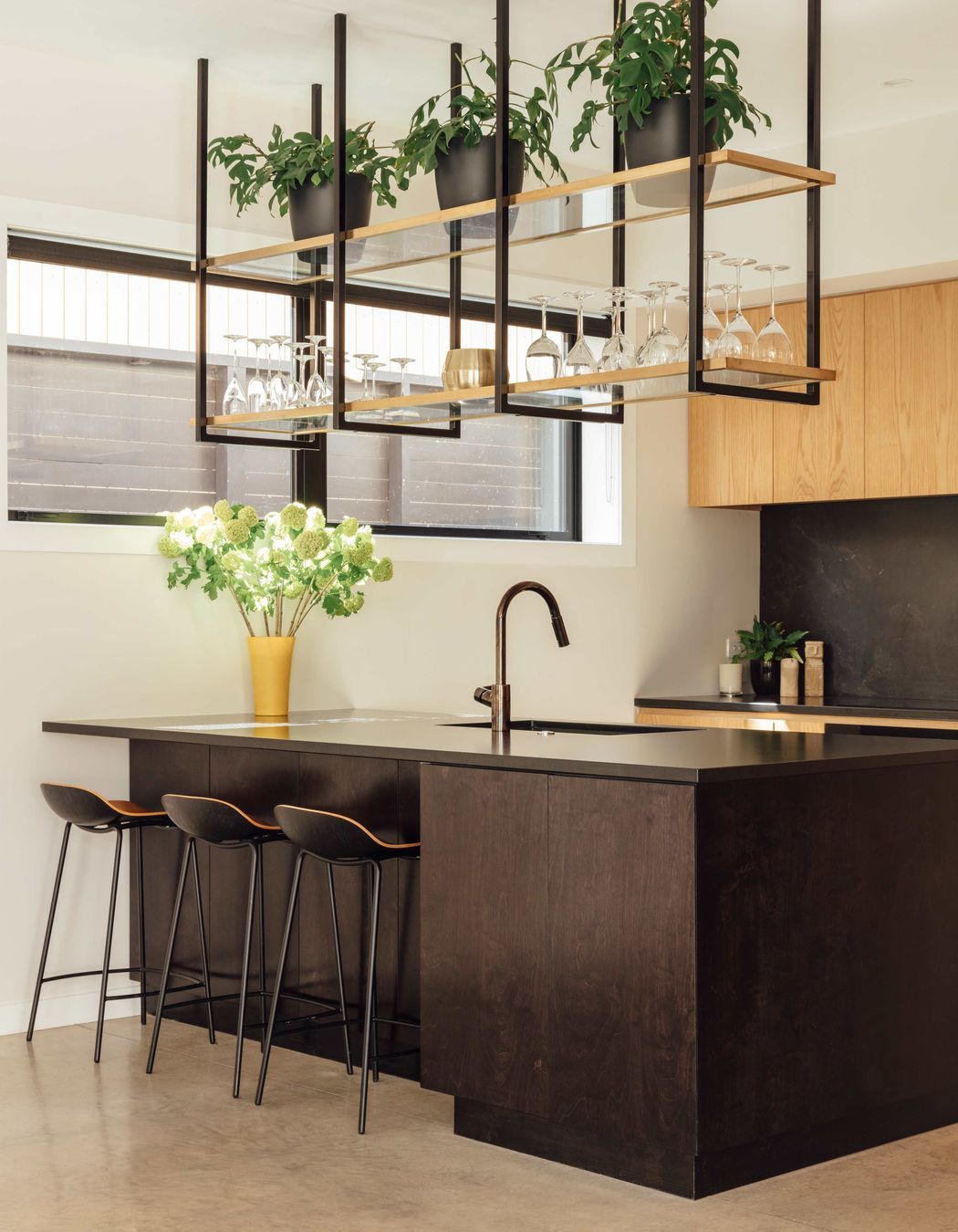
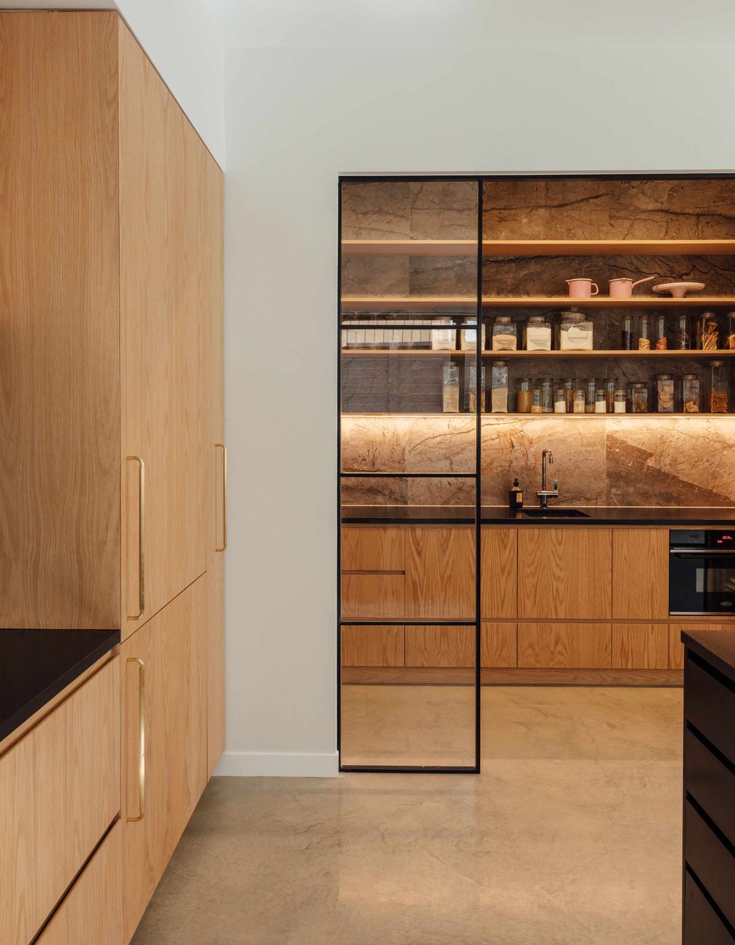
In the kitchen, appliances are integrated behind American oak cabinetry and a tiled splashback has brown veining, providing an urbane twist. Open shelving above the island features integrated LED lighting to provide additional illumination for food preparation. The butler’s pantry has the toaster, jug and blender on one side—to contain the morning mayhem—and a wine fridge and cocktail making station on the other, for more grown-up entertaining options.

“We have three girls, so creating spaces that enabled separation as well as communal areas was a must. There are three living areas, one on each level, along with four bedrooms and a raft of outdoor spaces. Connection to the outdoors is probably the best feature, with almost every room having views out onto the bush backdrop.”

Words by Justin Foote.

About the
Professional

David Reid Homes is an iconic New Zealand brand with a proud history of building beautifully crafted, innovative homes. Since 1993, we've had the one goal: to create innovative homes that reflect personalities and the way people live their lives. Since then, we have grown to become a nationwide network of franchised branches and our core values and aspirations are still the same.