Our clients first got in contact with us when venturing into doing a whole home renovation with Purely Residential. They had been planning on renovating for the past ten years and were finally ready to take the plunge. They wanted our help to create a home that was young and fresh which they could enjoy now, but still be current in the future and appeal to young families if they ever wanted to sell. Our clients had created a mood board which gave us a really strong indication from the get go what style they wanted to achieve; crisp whites, minimal and subtle splashes of blue.
BATHROOM
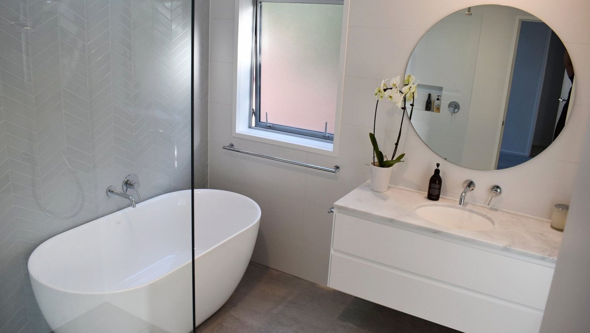
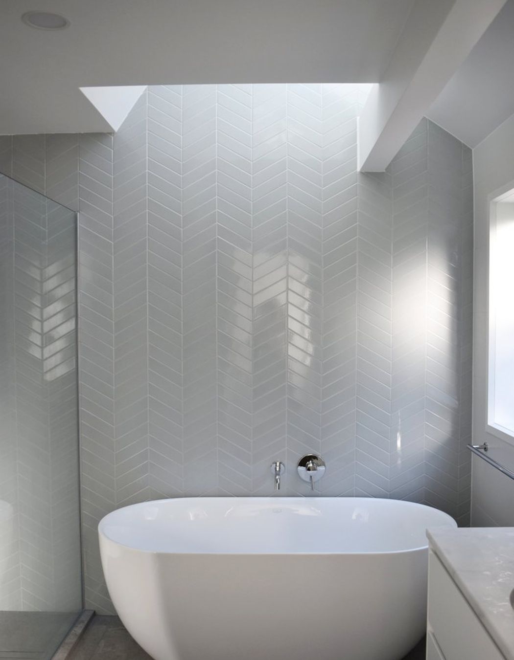
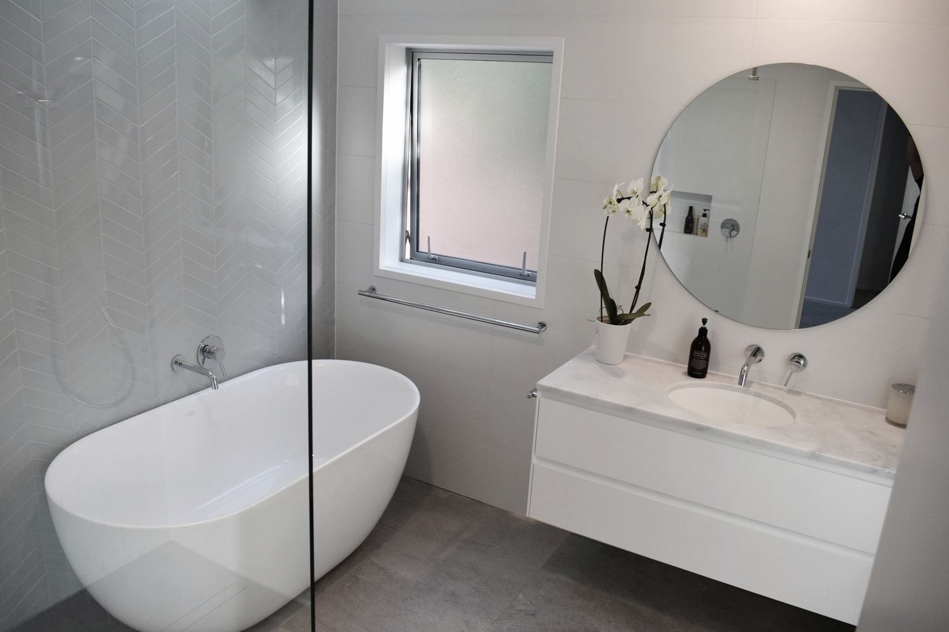
For the bathroom we wanted to create a restful space that could be enjoyed by the whole family and guests. Previously, this bathroom had a large spa-bath in it which took up a large portion of the space. By removing this we were able to include a large walk in shower and a free standing bath. We wanted to keep this room looking as spacious as possible. By selecting a wall hung vanity we achieved the appearance of a larger space, whist still having plenty of storage.
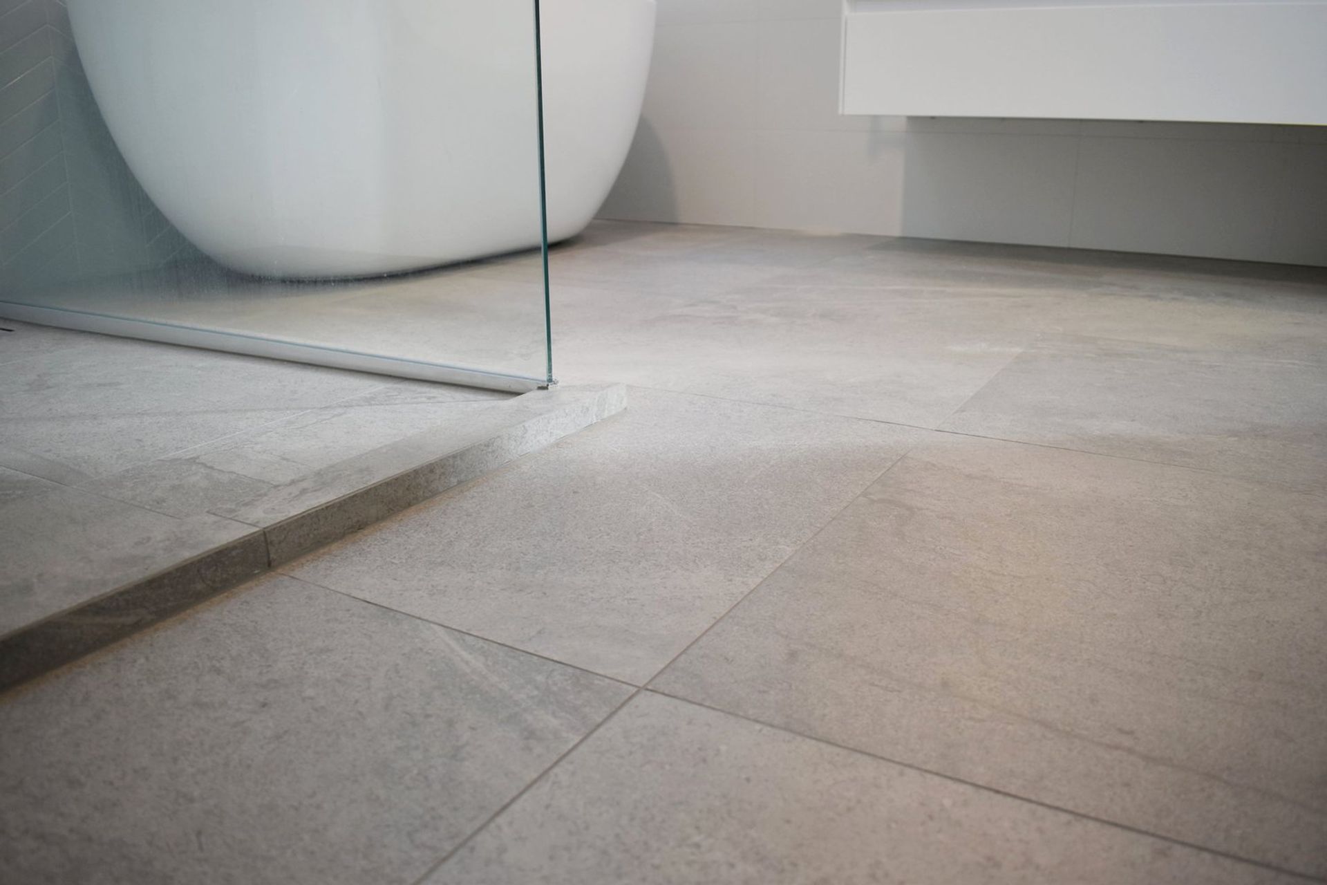
The feature in this bathroom is a beautiful sky blue chevron tiled wall. By extending the tiles all the way into the skylight cavity, it gives a fantastic sense of movement and height within the bathroom. As the chevron tiles are the main feature, we kept the white wall tiles simple and large format, that way they don't detract from the feature tile. The floor tiles are a beautiful limestone look porcelain, with a slight beige undertone which compliments the sky blue perfectly. Together they create a harmonious flow out into the hallway which has a complimentary carpet selection.
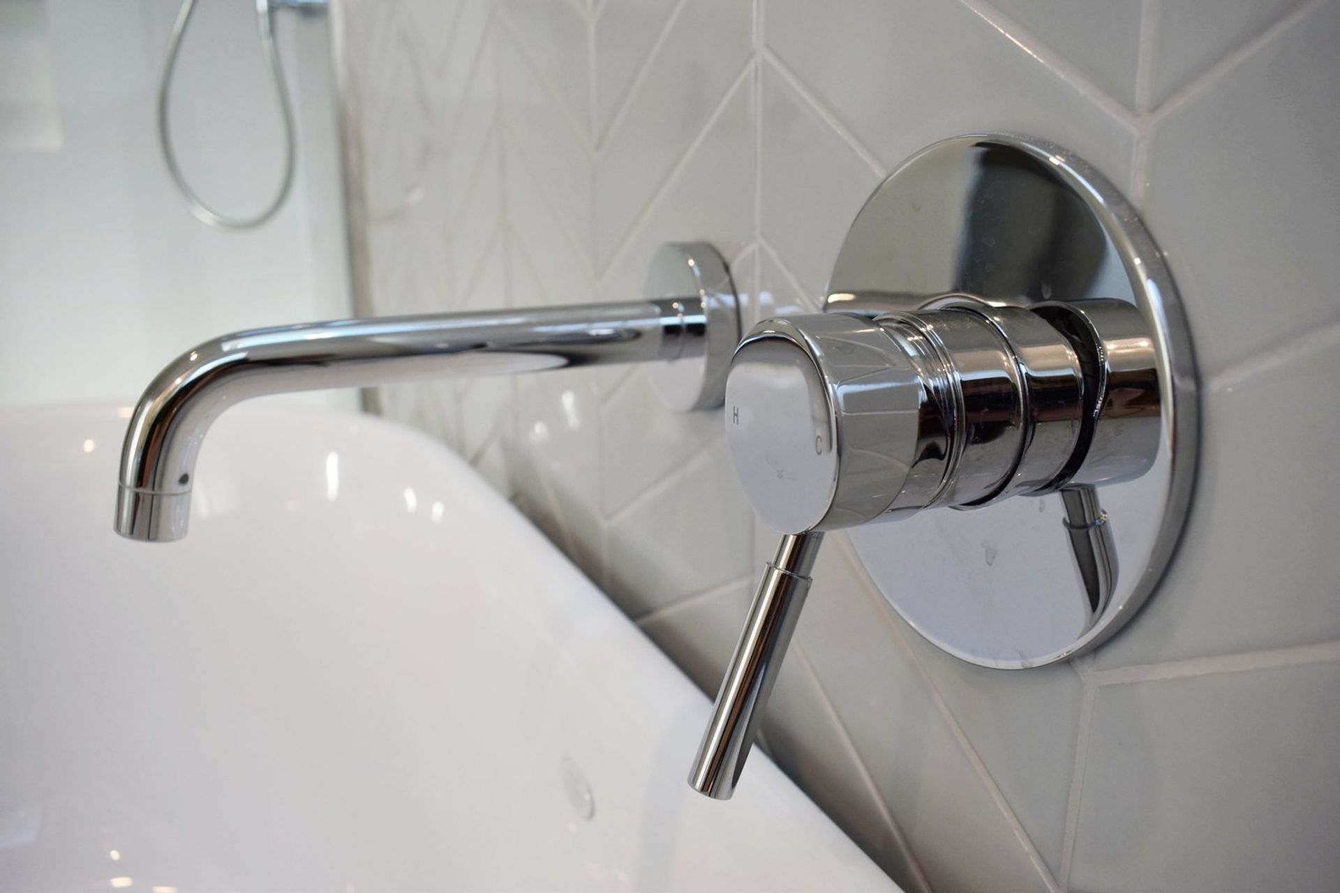
For the tap ware and fittings we selected a minimalistic, chrome range which reflected the curvature of the bath and mirror to give a cohesive look. By adding in a shower recess we are able to reduce clutter and keep the space feeling as minimalistic and weightless as possible. The duel headed shower with large 300mm rain head adds a luxurious feature to this family friendly bathroom.
KITCHEN
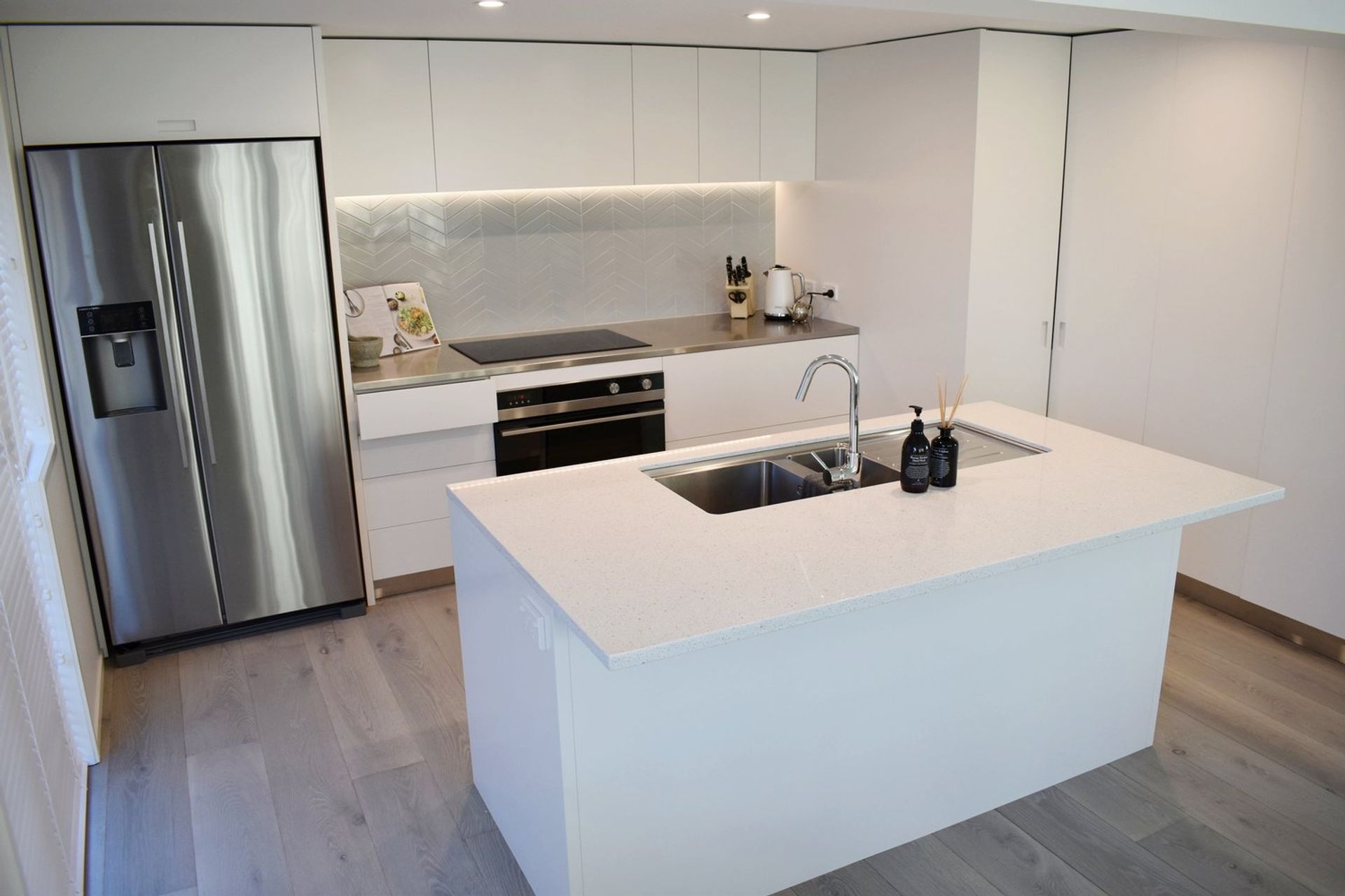
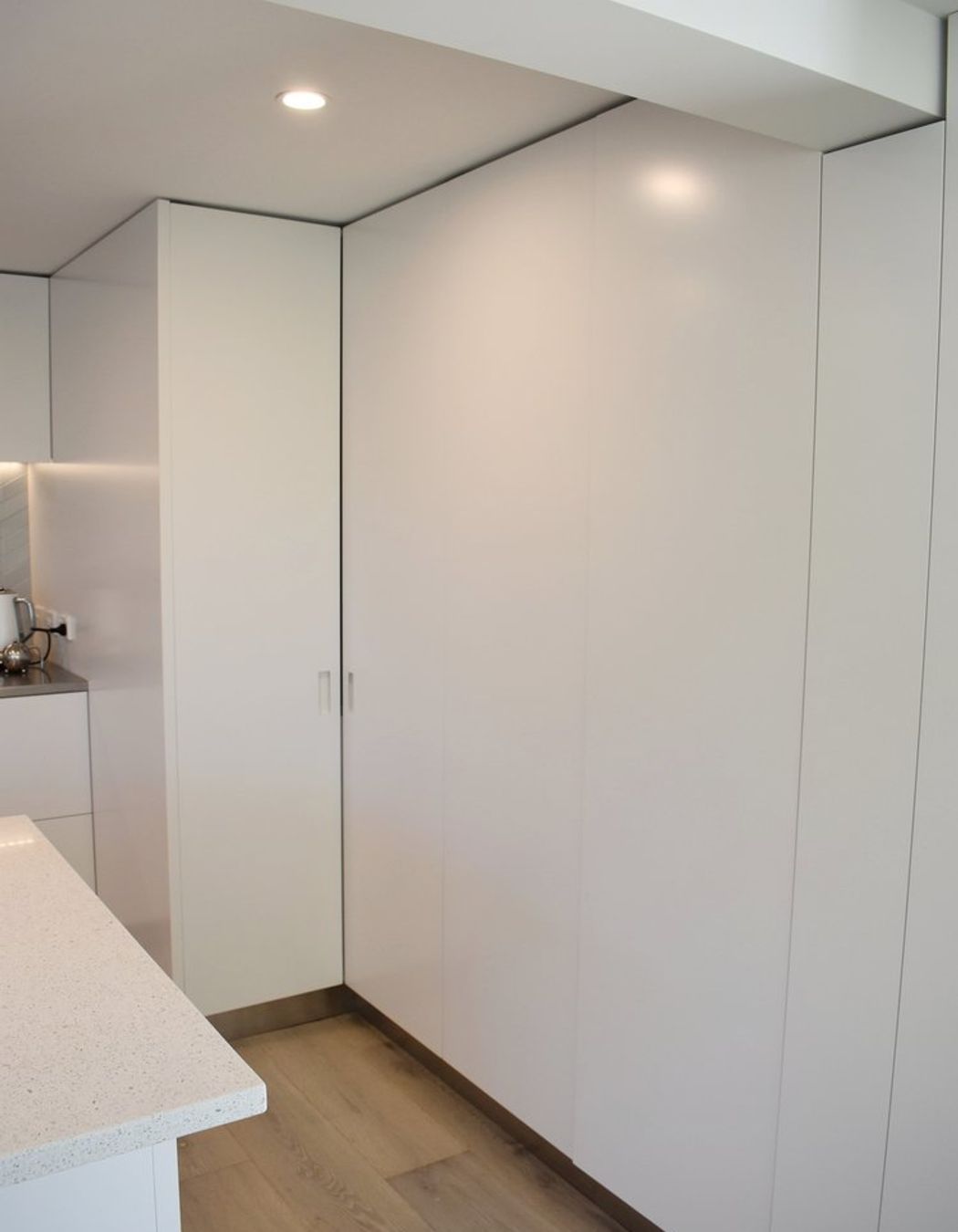
Our clients love to cook. They wanted a space that was going to be functional, minimal and had plenty of storage. This kitchen has quite a low ceiling height, so we took the cabinetry all the way up to elongate the space as much as possible and utilise every inch of space available. During the demolition phase, we discovered that the stairs from the floor below intercepted right where we had intended on placing the fridge, which resulted in a big re-shuffle of space to get all the elements included. We came up with a solution to conceal the stairs by creating a corner pantry which would leave the space above available to be used for storage.
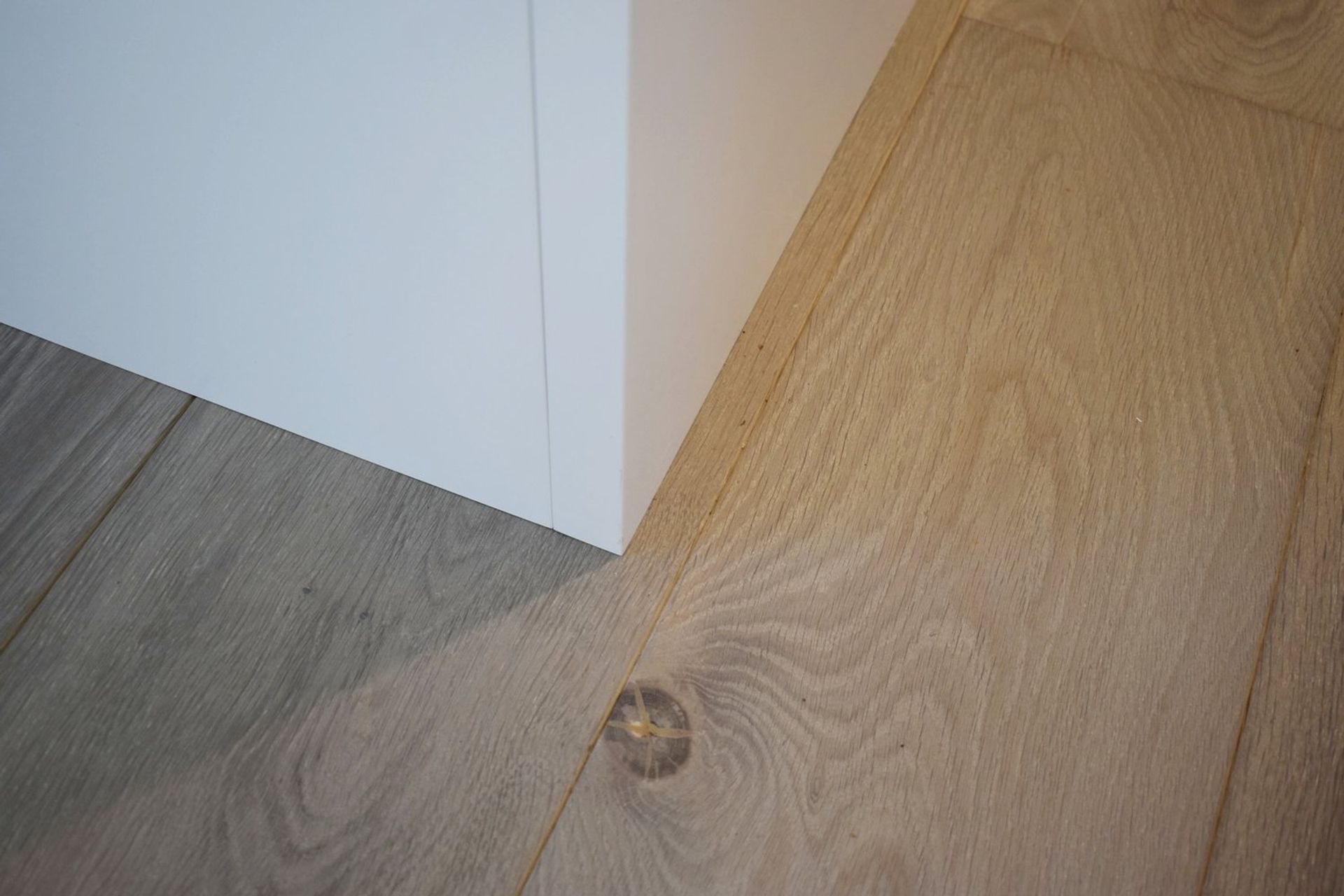
We continued the stunning, sky blue chevron tile into the kitchen as a splash back and included an LED strip light which highlights them beautifully and provides ambient lighting when entertaining. The flooring throughout the kitchen and dining area is a beautiful french oak which adds texture and warmth to the space.
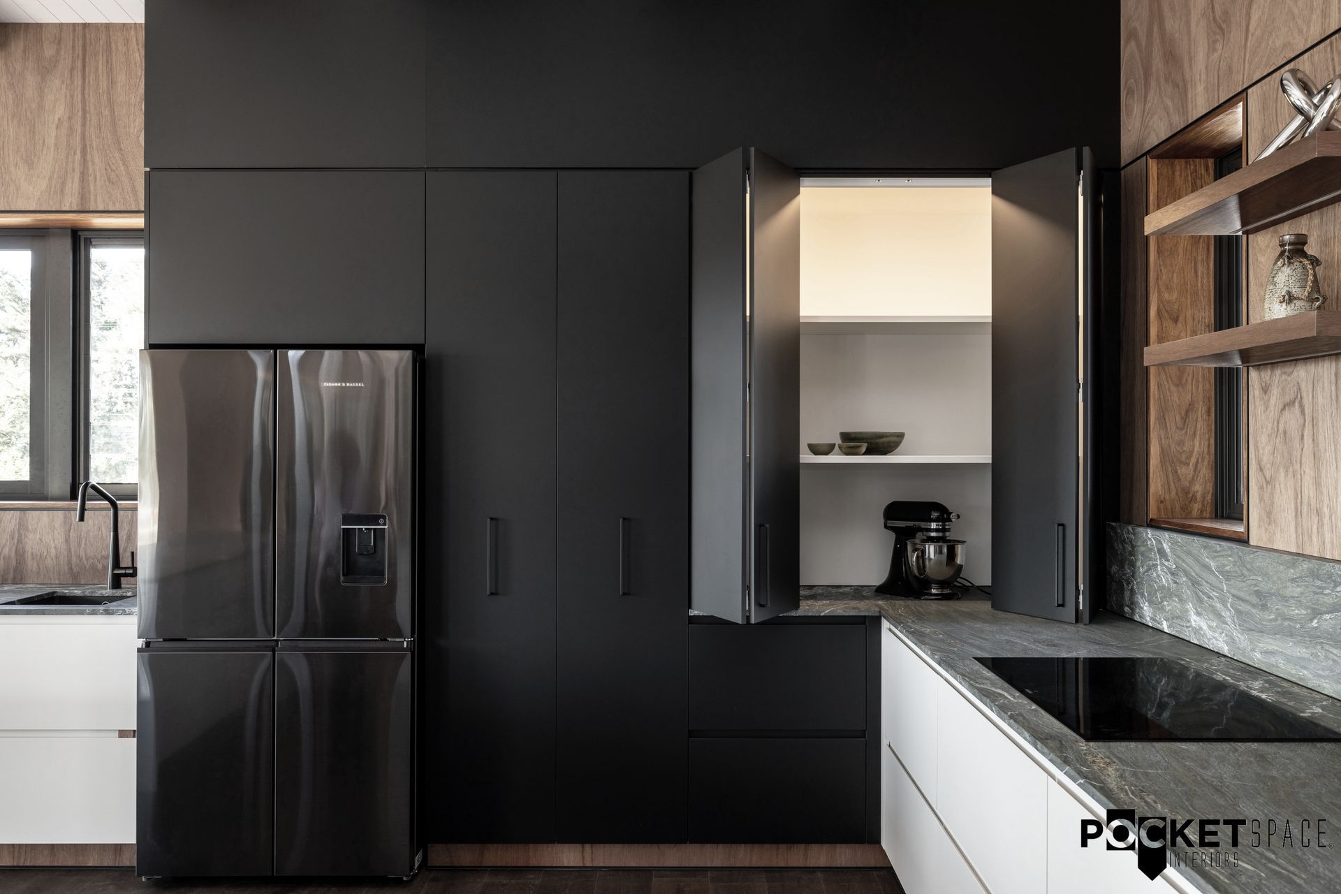
To give our clients storage as well as a minimal, functional space, we created a whole wall of pantry space that is designed to merge together and create a seamless effect that is easy on the eye; but when opened the doors retract backwards to keep the kitchen fully functional with fantastic circulation and storage. By including stainless bench tops within the pantry, these areas can be used as back up prep space when entertaining. They can also be fully utilised for kitchen gadgets such as blenders and toasters with out having to remove appliances from the pantry. Beneath the stainless steel bench tops we have included draws which are ideal for gaining access to hard to reach places at the back of the pantry. Beneath the beam that divides the kitchen and dining spaces, we added a very narrow cupboard with pull out storage which is perfect for tall bottles, spices and cans.
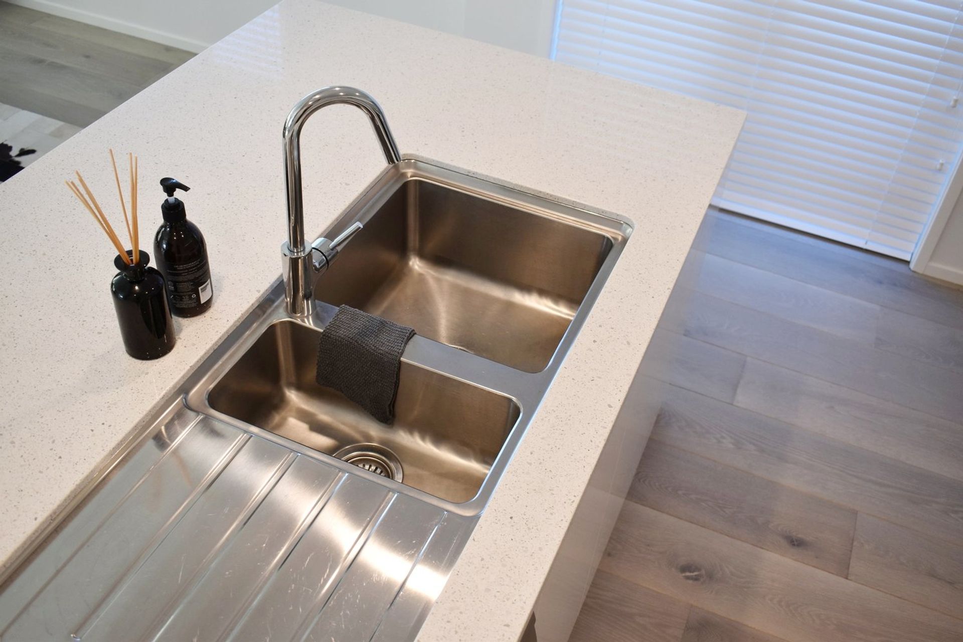
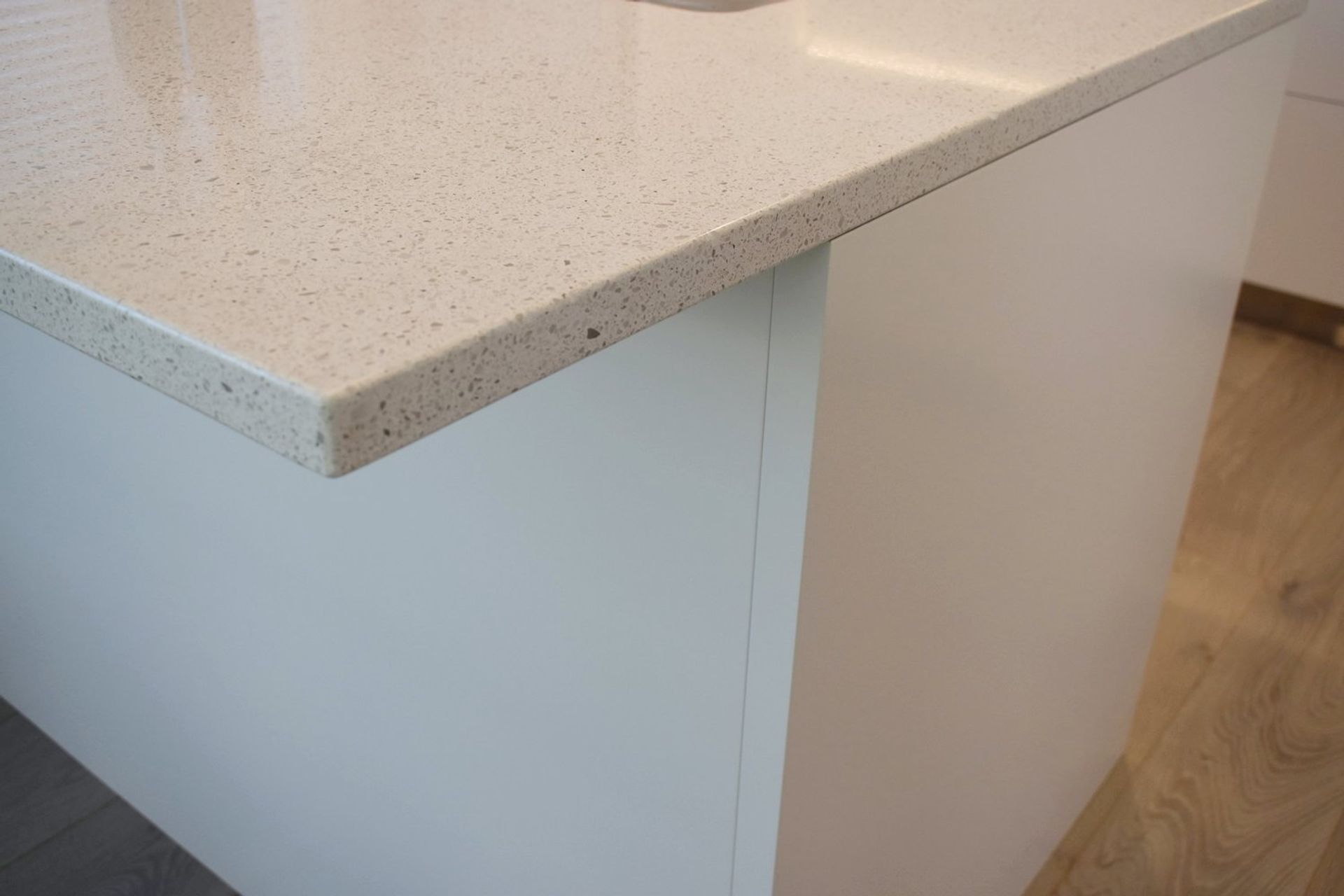
Our clients loved the idea of an island which made the kitchen accessible from both sides of the dining space. Previously the kitchen was a 'U' shape which meant to access the kitchen you had to walk to the far side of the dining room which wasn't the most user friendly solution. As a result, we designed the kitchen to include an island with access on both sides. We selected a beautiful Caesarstone top which reflects light and has a subtle speckle texture which makes it easy to keep clean. We also selected an oversized, under-mounted sink to fit all those large cooking trays and pots, which can often be difficult to clean.
The kitchen was made and installed by Fieldcraft, designed by Pocketspace Interiors.
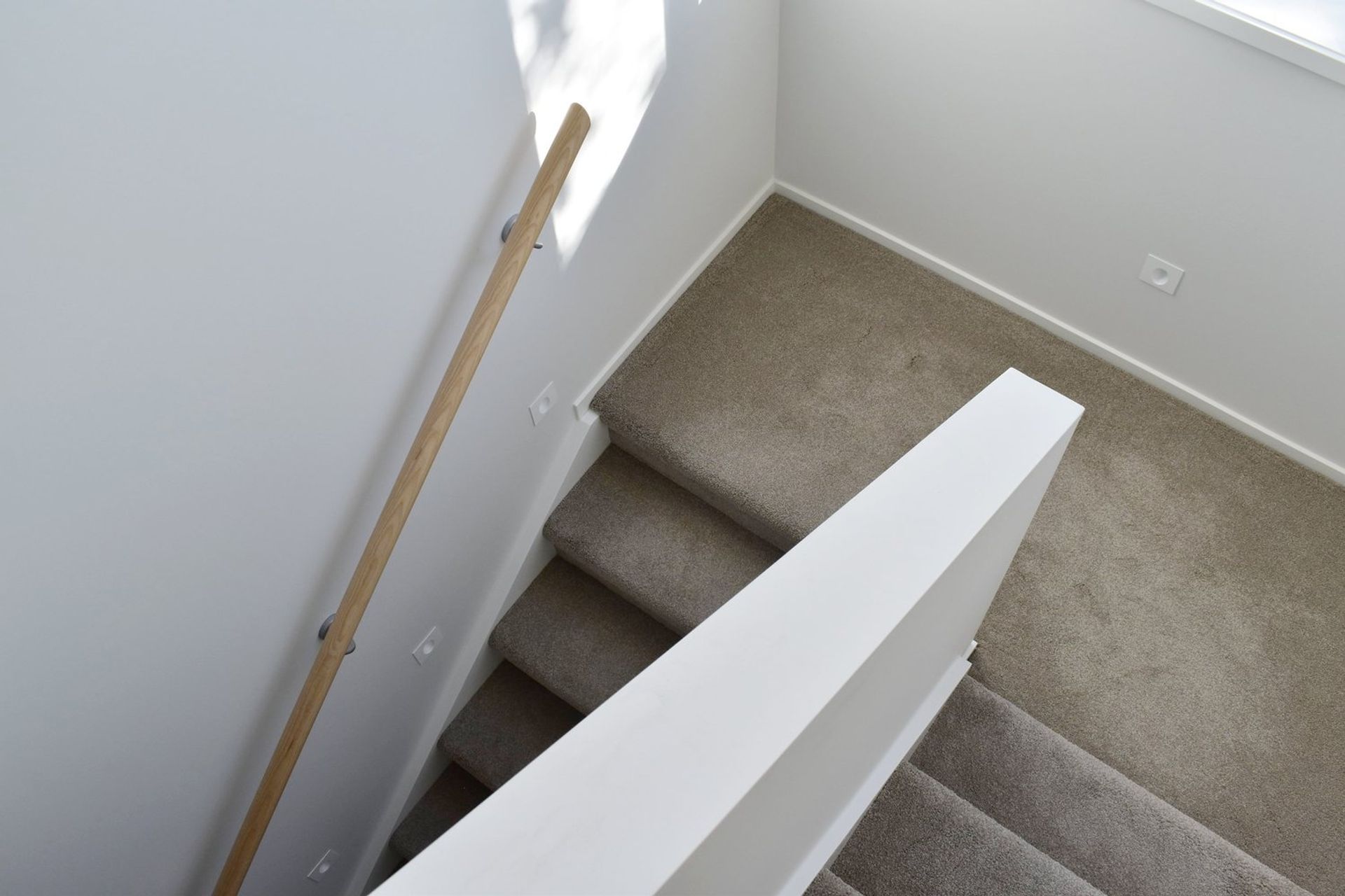
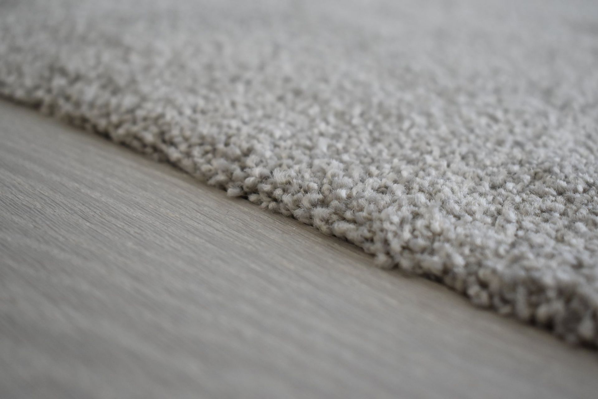
Throughout the entire home we selected a luxurious carpet which is extremely soft under foot. Its beige undertone compliments the french oak flooring perfectly and adds a sense of warmth to this crisp white space. For the walls we went with a bright white to help the space feel as large and as light as possible. Outside, we selected an outdoor tile for the entrance way, which incorporated the exterior sage green colour which looks fantastic upon arrival to the home and provides a grippy surface to prevent any slips in wet weather.

