Drawing on the past to design a legacy for the future
INTERVIEW WITH RICH NAISH OF RTA STUDIO
With dwindling rolls among many of New Zealand's private schools, how did a small provincial boarding school use architecture to attract more students? Here, we interview architect Rich Naish about RTA Studio’s new designs for one of New Zealand's oldest schools, Whanganui Collegiate, a private secondary school for girls and boys with an enviable alumni that includes: HRH Prince Edward, the F1 racing driver and Le Mans champion Chris Amon, and former All Black captain David Kirk.
RTA Studio is well-known for its innovative house designs and commercial developments, but it also has a substantial portfolio of award-winning schools, including Tarawera High School and Te Kura Kaupapa Māori o Ngāti Kahungunu o Te Wairoa. The firm’s latest projects at Whanganui Collegiate are part of a redeveloped masterplan that includes a striking new administrative building and the restoration of the library.
Justine Harvey: Founded in 1852, Collegiate is one of New Zealand's oldest school, did you reference the history of the school in your design concepts for the masterplan, administration/arrivals building and the library?
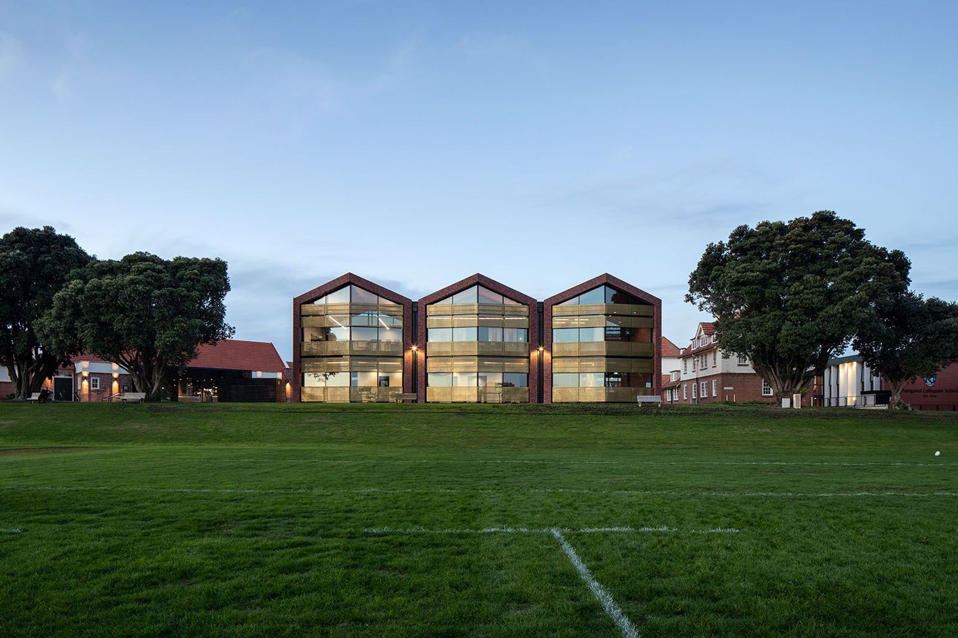
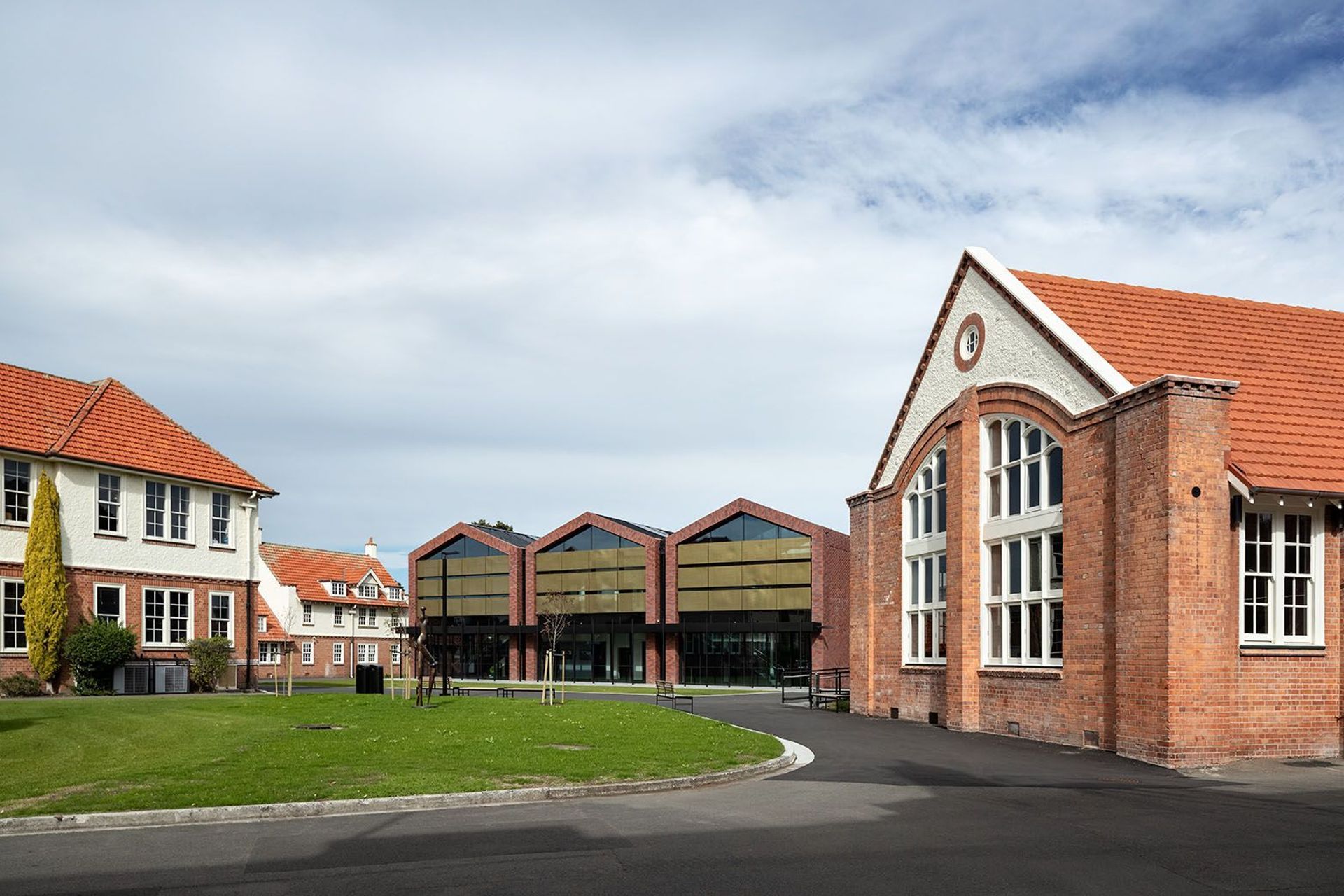
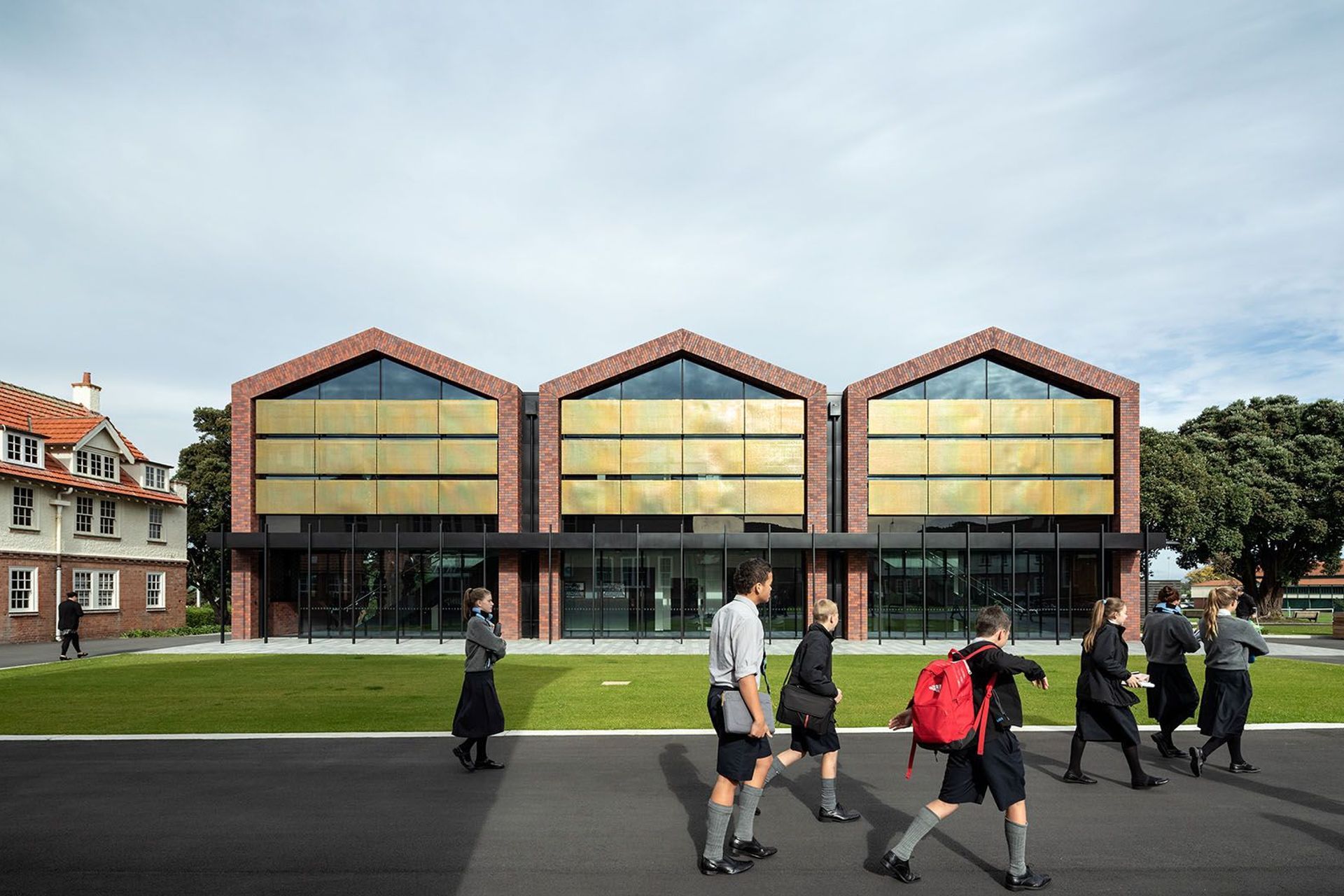
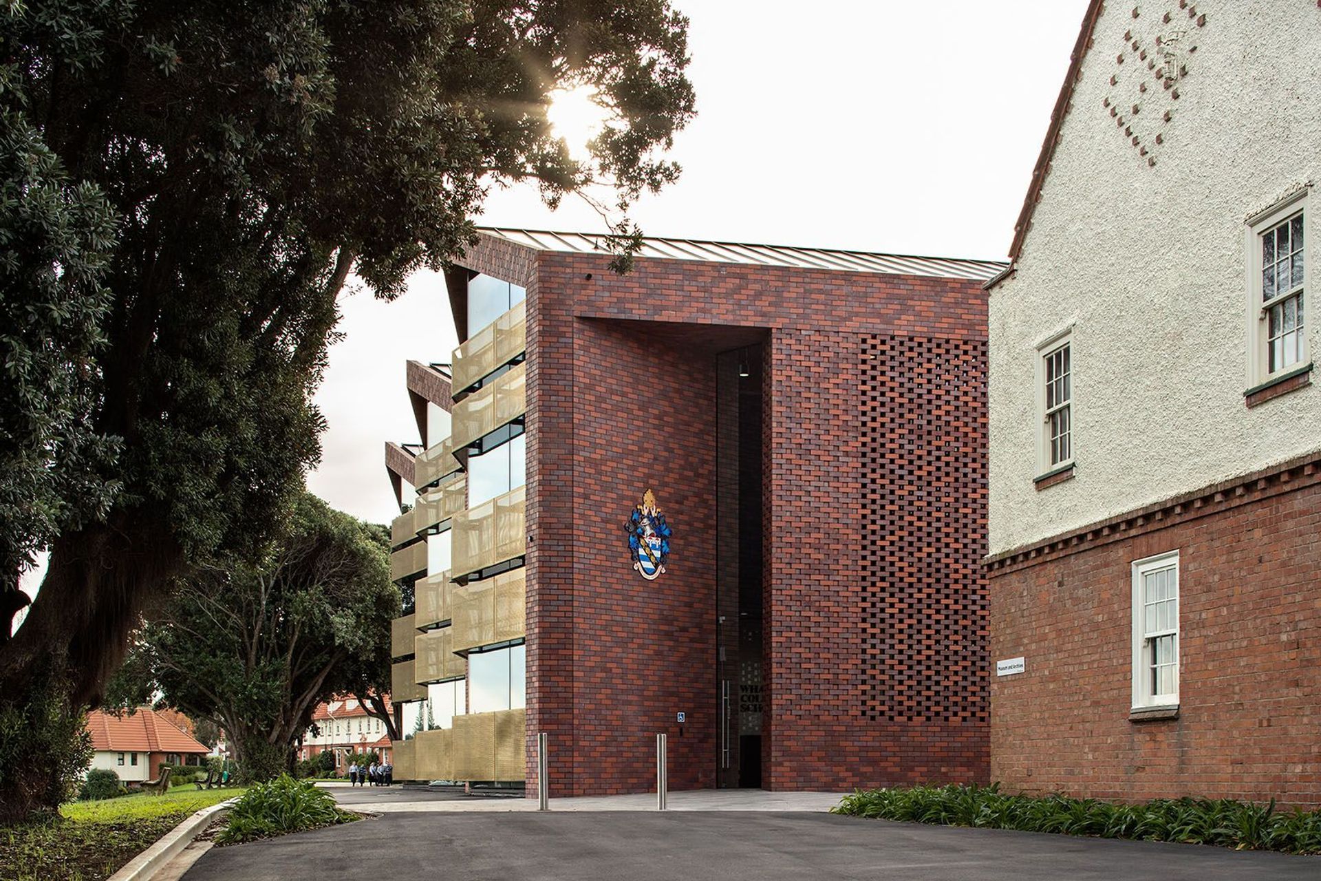
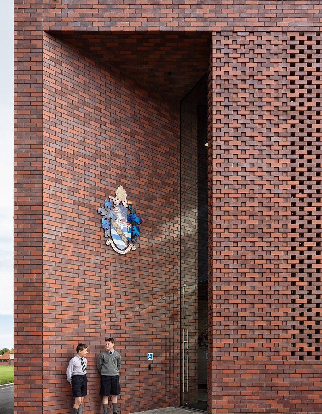
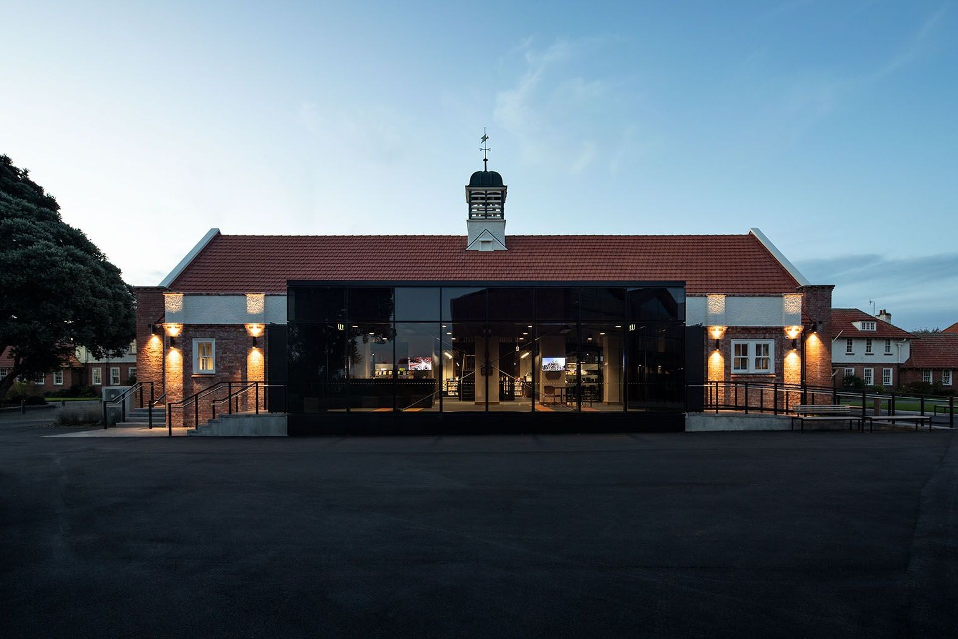
Rich Naish: Yes, we’re always really interested in the context and the history of a place, so there was a lot of careful study of the school’s architecture, including both the historic and the modernist buildings. On the campus, there’s a 1960s’ dining hall that’s been converted into a library.It has a wiggly roof that goes up and down, which we’ve referred to in our new admin/arrivals building – seen clearly in the three gables but you can read as being a connection to both the modernist and the heritage buildings. And, of course, the materiality of the new building is traditional brick but we’ve done it in a much more modern way.
It was really important for us to design a building that was going to balance nicely as modern, progressive building but that’s also deferential to the architecture that was already there. Not just important for us personally, but we sensed that was part of our design brief. There wasn’t an opportunity to design something avant-garde but, on the other hand, we didn’t want to do anything that was imitation heritage either, so we’ve tried to hit a balance.
Predominantly, the masterplan envisages about 50 years into the future, so there is more work in the masterplan that will figure out other parts in the school, but the first stage was about creating a new heart to the campus – achieved with the new student quad and the placement of the new building. It was really about giving the school an everyday entrance, in contrast to the ceremonial entrance on Liverpool, where you drive in between the chapel and Big School, which is used for church services, weddings and Anzac day ceremonies. Our everyday entrance creates a centre of gravity, a student hub and an administrative front door to the school.
Tell us about the design concept?
One of the key aspects of the concept was siting of the new building. We worked through the overall masterplanning concept, together with landscape architect Megan Wraight from Wraight + Associates, including the siting of the buildingon the edge of the bern that drops down to the number-one rugby field. This was a very important move because it allows a generosity of space between the new building and the Big School, which is the name of the old heritage building that contains most of the classrooms. This allowed the new student quad to be formed and, also, the refurbishment of the new library addresses that quad as well.
We also removed a number of rubbish old buildings to help make that space and doing that really gave a presence to the college from the streets, and we had to remove three of about ten pohutakawa trees in a row in order to push the building forward. This was a reasonably bold move, but, in terms of the concept, it was about confidently placing the building to show that the school was moving forward in a modern and progressive way but, also, to give a good clue as to where the arrival – the front door of the school – is now.
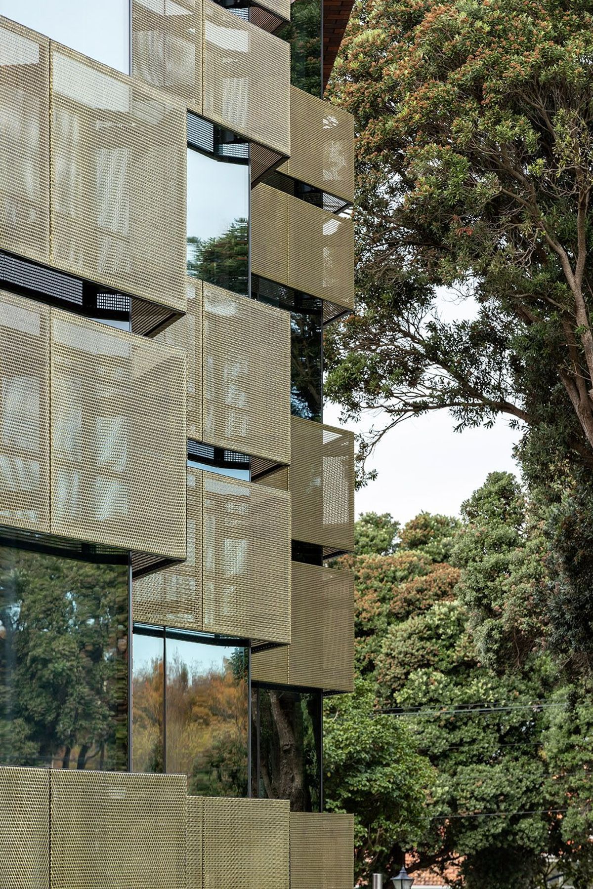
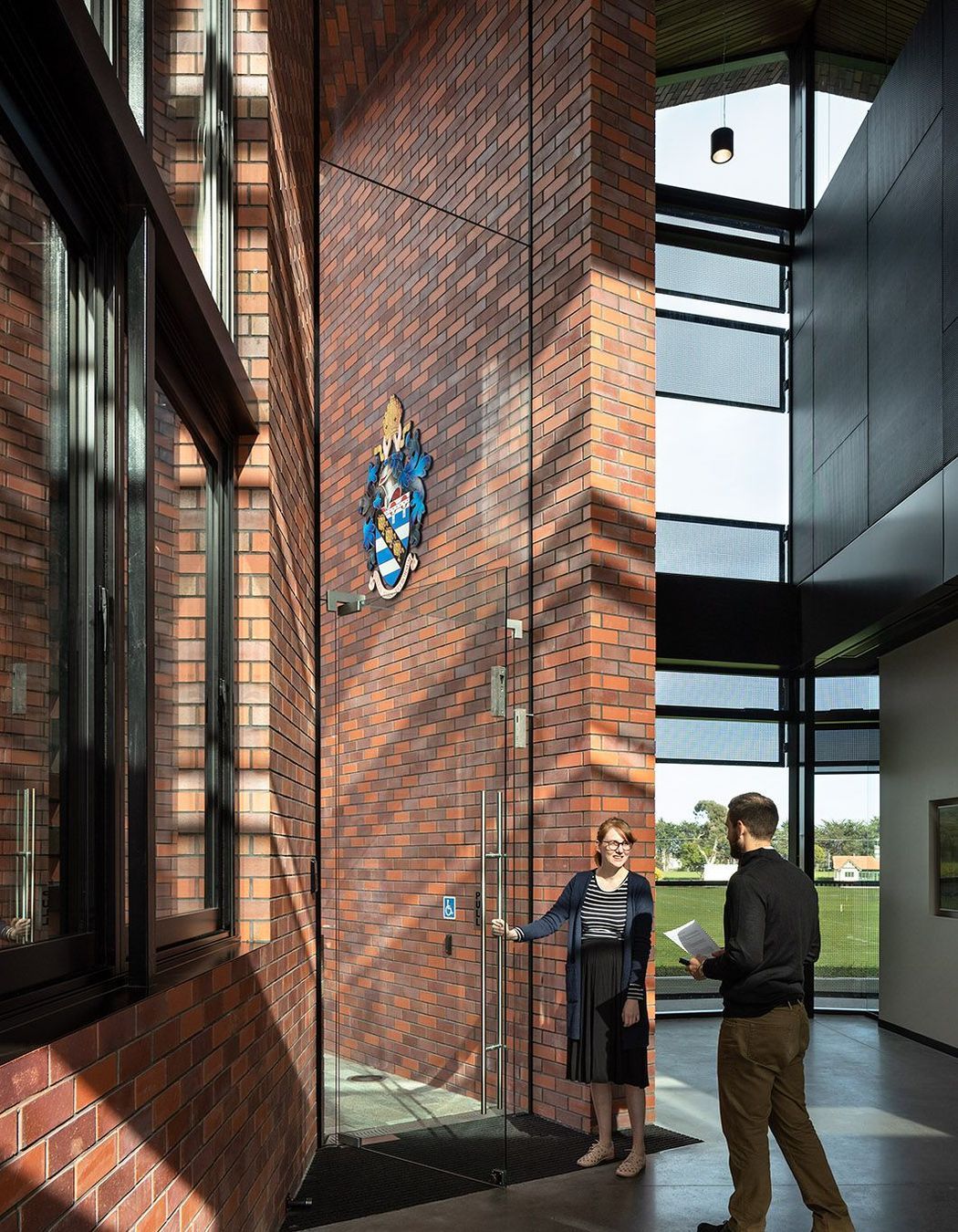
The rest of the concept is tied into the historical form I mentioned before but, also, it includes lots of high-performance glass and sustainable sun-shading screens on both sides to moderate the heat and privacy as well. It’s a modern workplace environment for admin staff and in the staff room, and gives a lot of visibility across the school grounds and into the gathering spaces of the students.
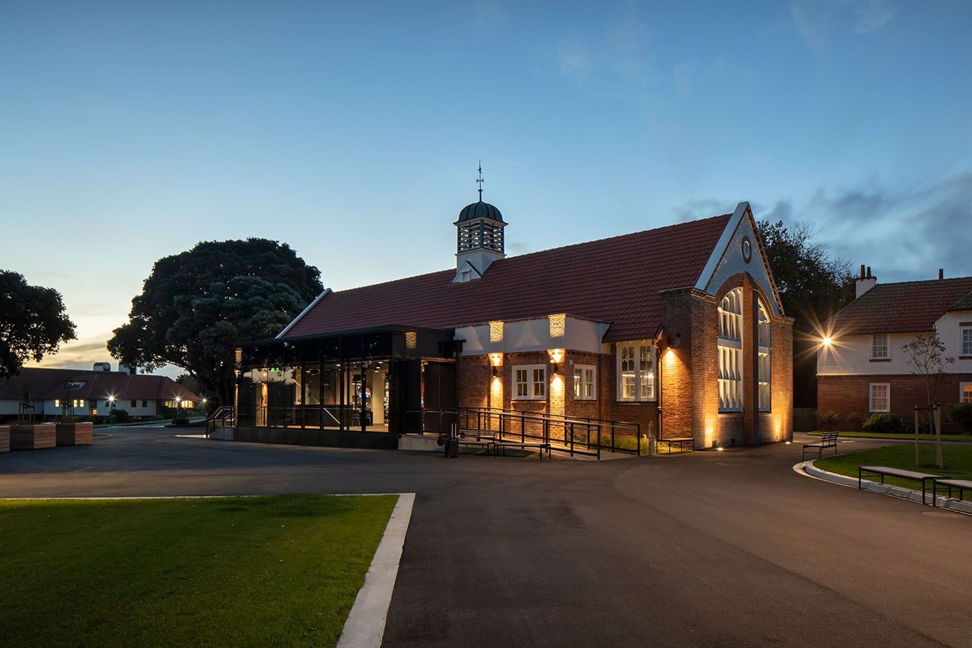
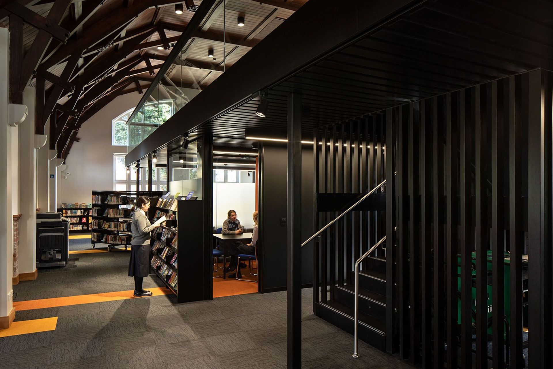
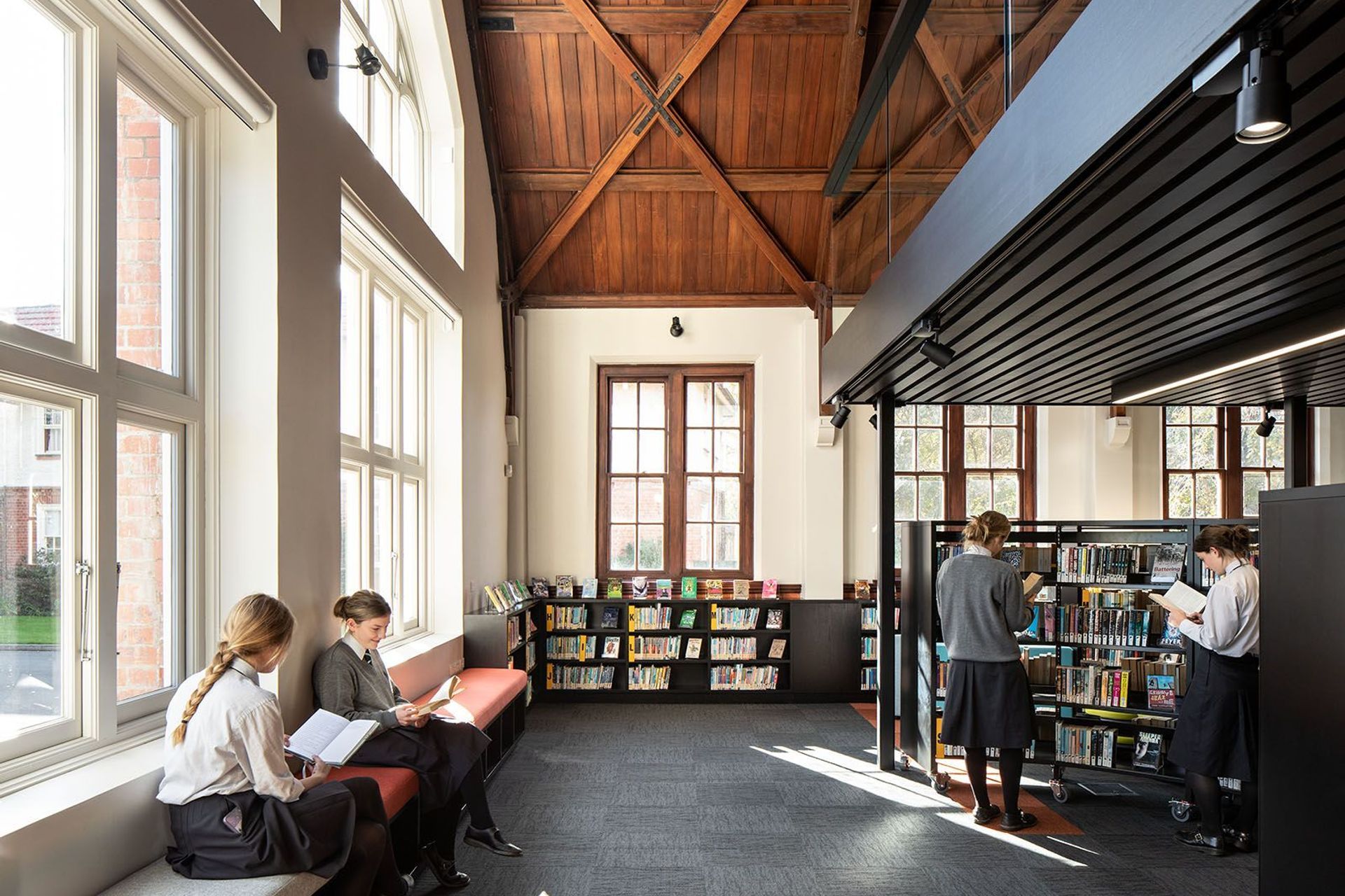
The library is now much more of a 21st century library – a modern learning environment. The beautiful dining hall in brick masonry has a lovely timber ceiling and a bell tower on top, but it was horribly converted in the 1980s to a library, and was given a new mezzanine level that really didn’t respect the building at all. So we didn’t change the use, but we ripped out all of the poorly executed additions and, then, we placed a new floating mezzanine that doesn’t touch the outside walls but floats within the centre of the floorplan, allowing the volume to still be read very clearly in the architecture.
The refurbishment of the heritage building into a modern working library was super satisfying and part of a wonderful opportunity. We get really excited about putting new buildings into older environments. With all the work we’ve done over the years in the neighbourhoods of Grey Lynn and Ponsonby and so on – it’s just an extension of that in an educational world.
There are a lot of dwindling rolls among many private schools around New Zealand and I wondered if contemporary architecture has helped Collegiate to attract more students as well as providing more amenities?
Yes and linked to that, the school became integrated with the state system a few years ago, which provides some additional funding but, also, new facilities needed to be provided; the administration facilities were one aspect of that and the library was another. As a result of the integration procedure, the school started a design competition to select an architect – ourselves – then, we developed the masterplan. From that, came the high-priority buildings, which are these two and some remediation work at the boys’ boarding houses, which are over 100 years old. The girls’ boarding houses were purpose-built when girls started attending the school about twenty years ago now.
So, with those three elements moving forward, the school is starting to see positive roll growth and, given that this coming year is the first year after Christmas since the buildings will have been finished, by all accounts, I’m hearing that the enquiries and roll growth is looking really positive.
Whanganui has a rich architectural history, from 19th century warehouses to brutalist icons – did this factor into your design thinking at all?
Whenever you work in an environment of high-quality architecture, you’re always buoyed along by the ambition to place buildings in that environment that are equally good. So, absolutely! The War Memorial Hall, the Sergeant Gallery and some of those buildings in the centre of town around Civic Square are great architecture and you have a sense when you visit Whanganui that some great architects have worked in that town. But, over-riding that, we were working on one of the most significant schools in the country – the whole campus of Collegiate is a Category A-listed heritage site and every building on there is too, so we were really conscious that we had to offer something that was going to punch above its weight in that environment.
How did you choose some of the key materials?
Both façades, front and back, are essentially glass, so we worked with a modern material in juxtaposition to the traditional brick. The glazing allows wonderful views in and out of the building, along with the quality of light. Then, we’ve overlaid that with brass screens, chosen partly because brass is atraditional material that was used in the quality parts of the older buildings – the door knobs, plates, hinges and so on – so it seemed like an appropriate material to use. It also tarnishes and softens with age, but it’s very much there as a solar-performing screen that’s cutting down glare and preventing solar gain into the building.
The glass and the screen are quite a sophisticated screen, whereas the shell of the building is a traditional masonry brick. Inside, we’ve used a lot of timber and that’s a reference to traditional heritage buildings on the site. So, again, we were playing on that juxtaposition between old and new.
How did you approach the sustainability of these projects?
These days, it’s in our DNA that every project we touch has a sustainability programme and all clients recognise that too, and I think that’s changing by the month at the moment with the current ground swell globally with the climate emergency. So, it’s not something we even ask to do, it’s just embedded in our approach.
RTA Studio has designed a substantial legacy of education projects now – what attracts you to this typology? We started the practice with strong educational projects, so it was a natural progression to move into designing secondary and primary schools. It was about ten years ago that we designed the arrivals building at St Kentigens College. Education is our solid core as a practice because it’s public building and giving back, so we get a lot of satisfaction from seeing achievement levels increase after these projects are finished, particularly in communities like Tarawera and Wairoa. Education is just so satisfying as an architect...
