About
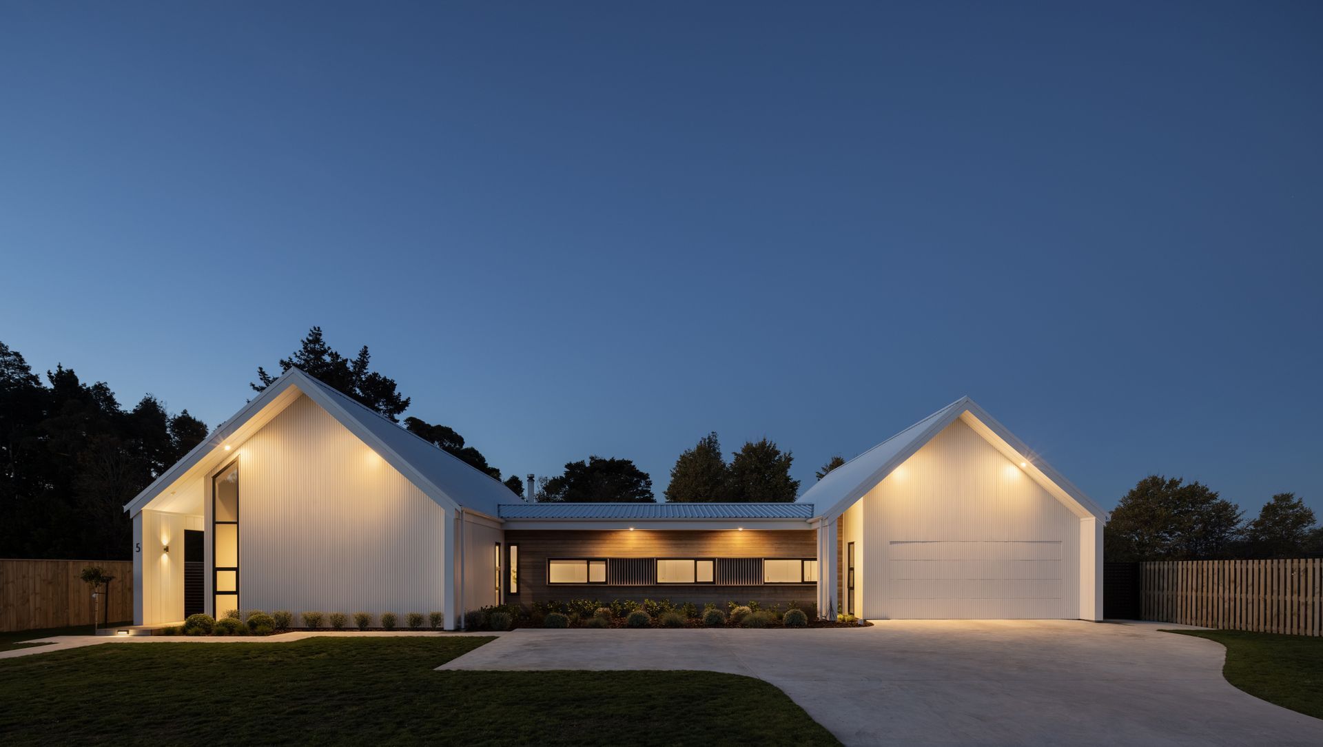
Four Gables House.
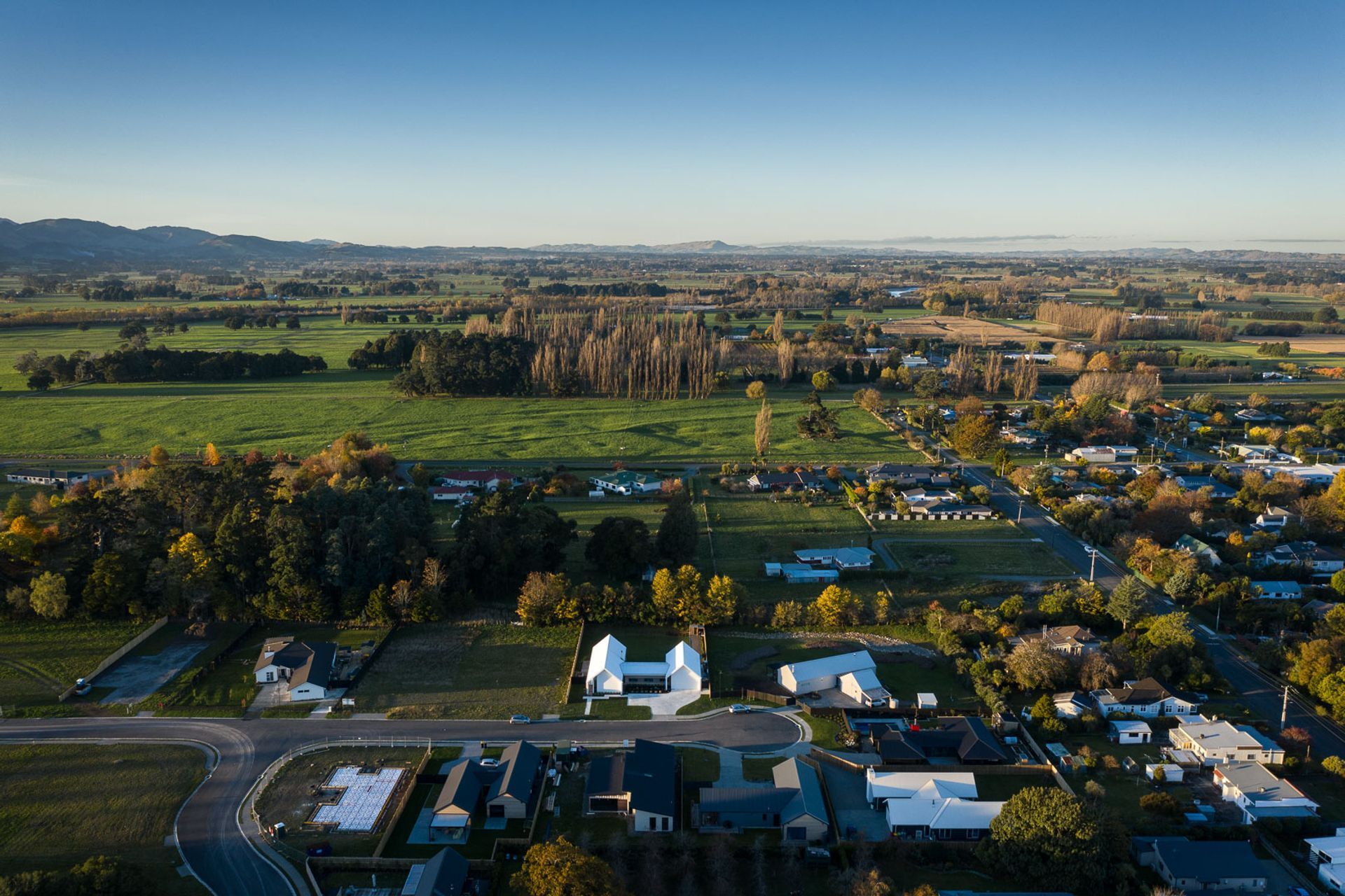
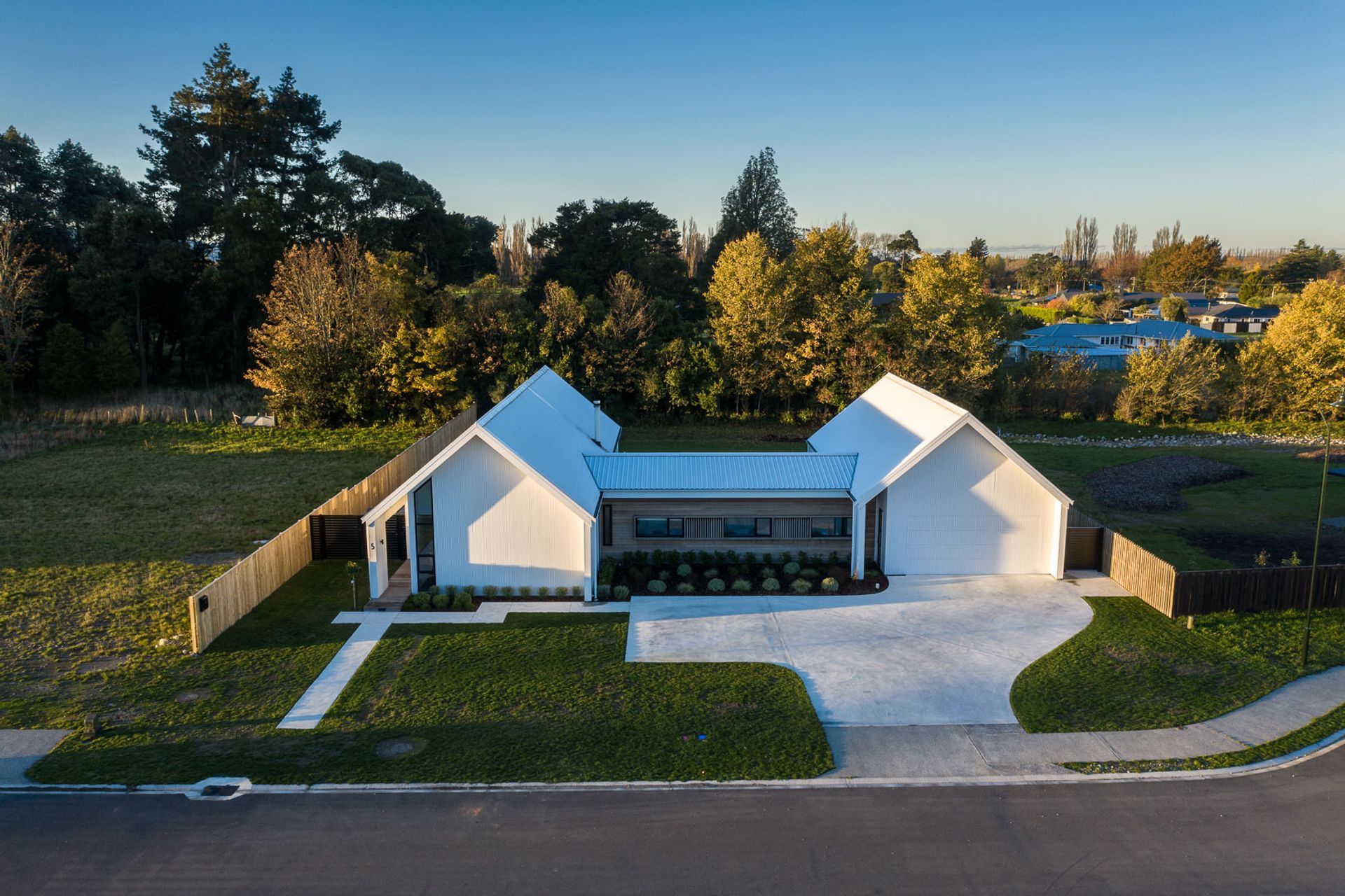
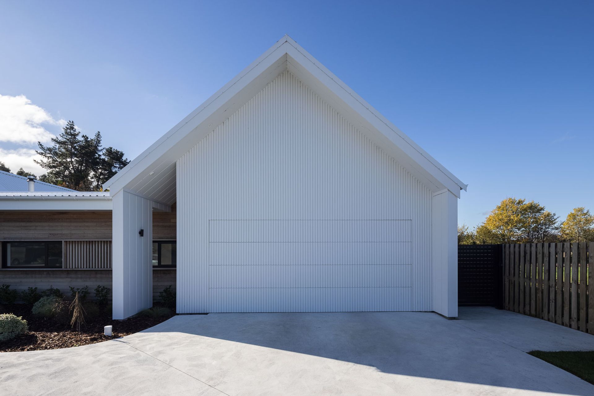
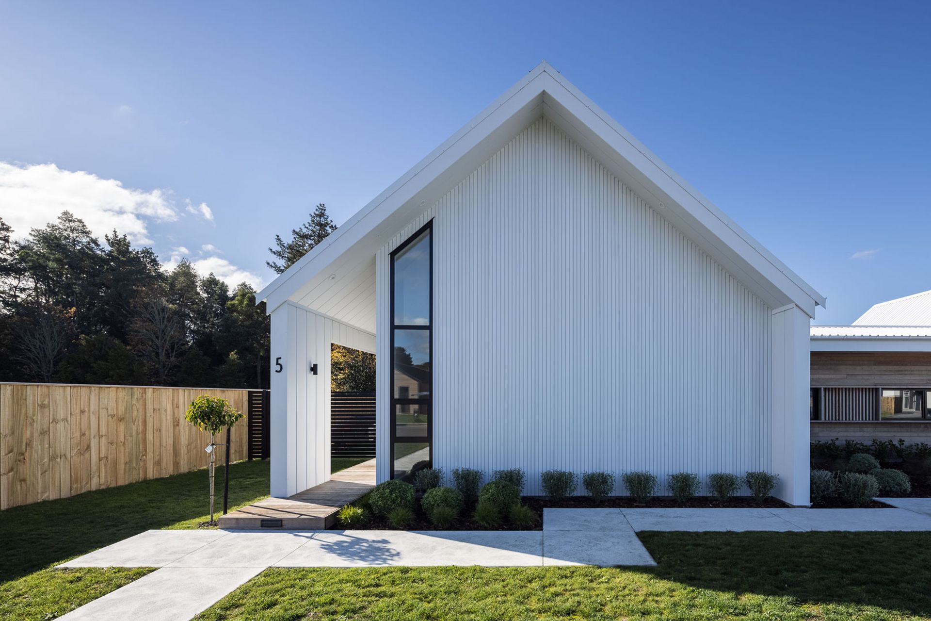
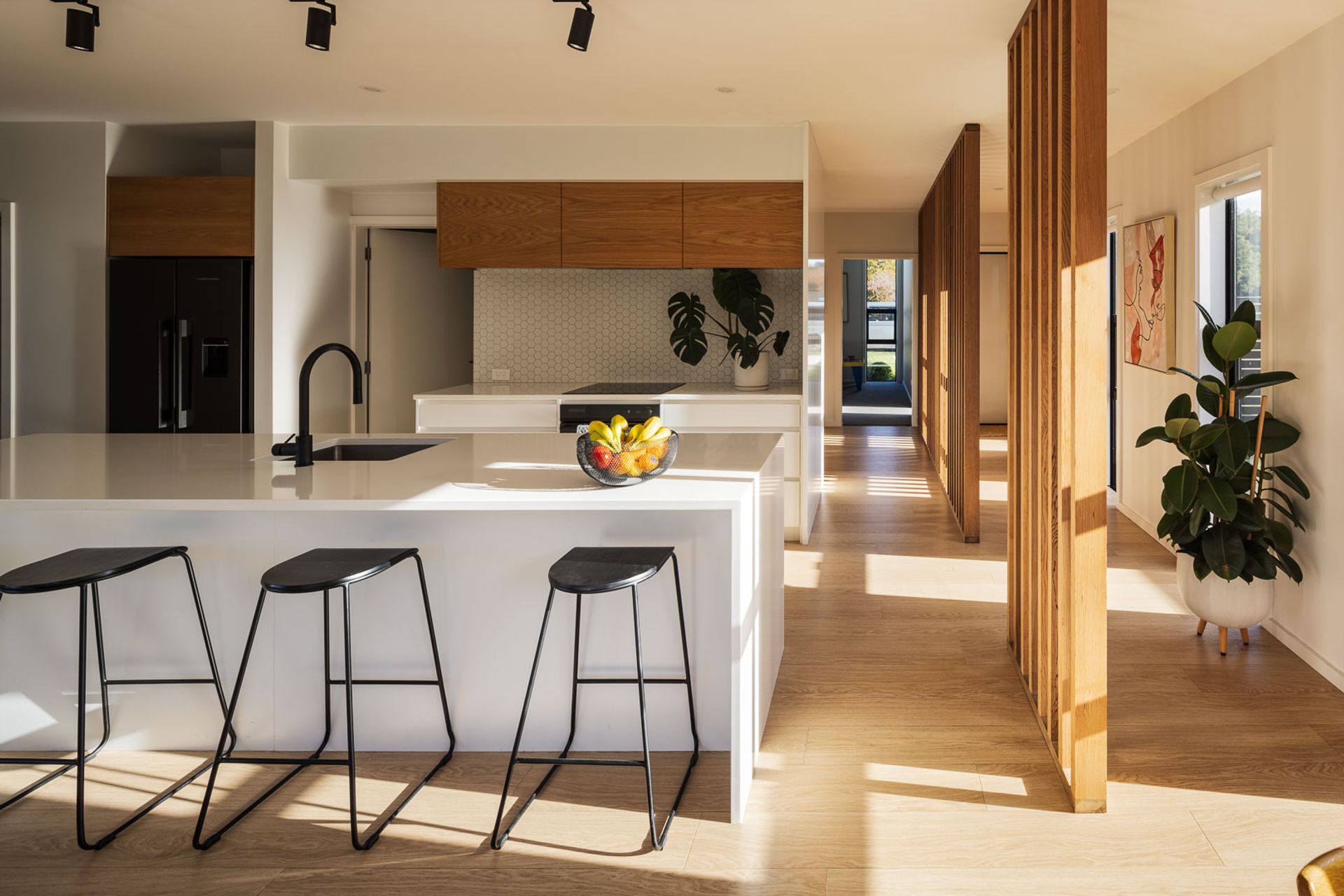
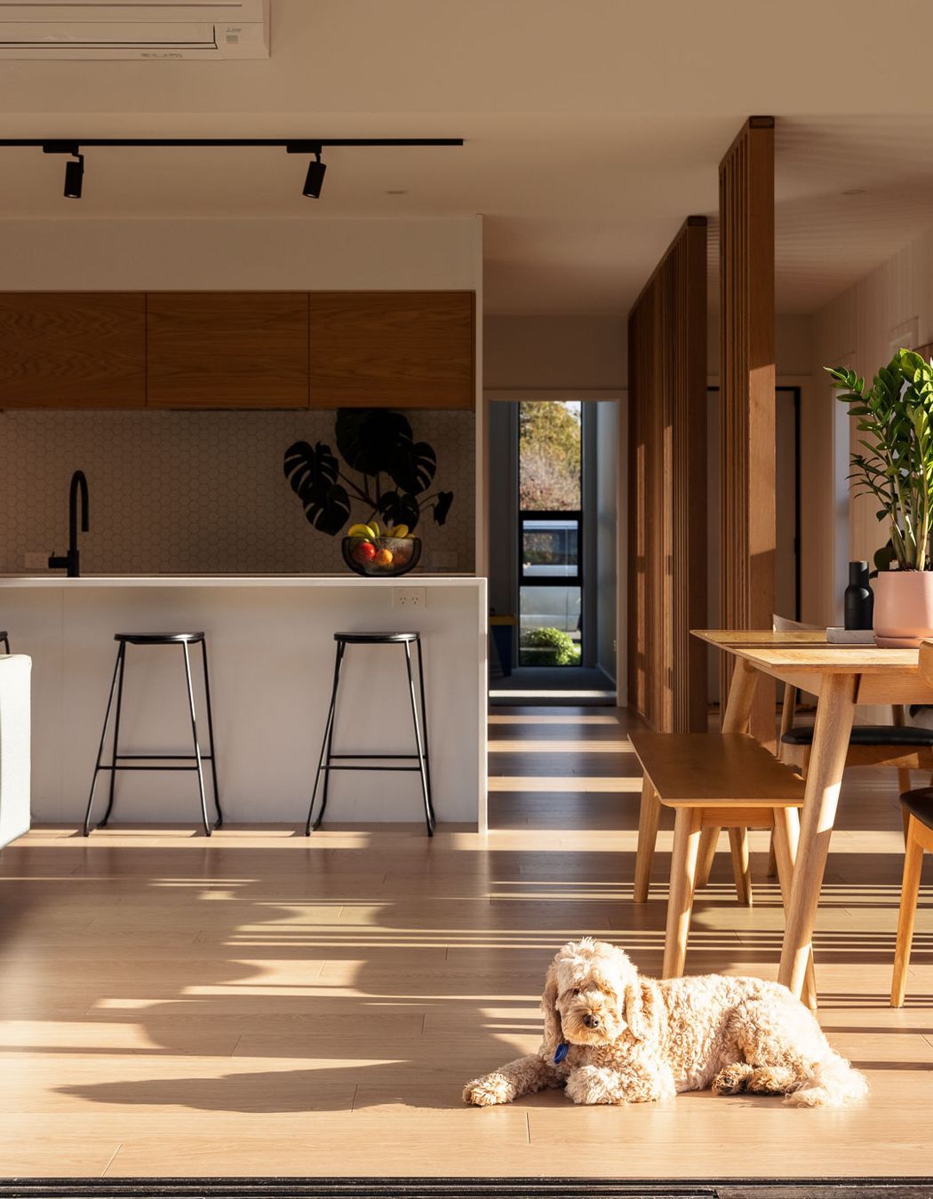
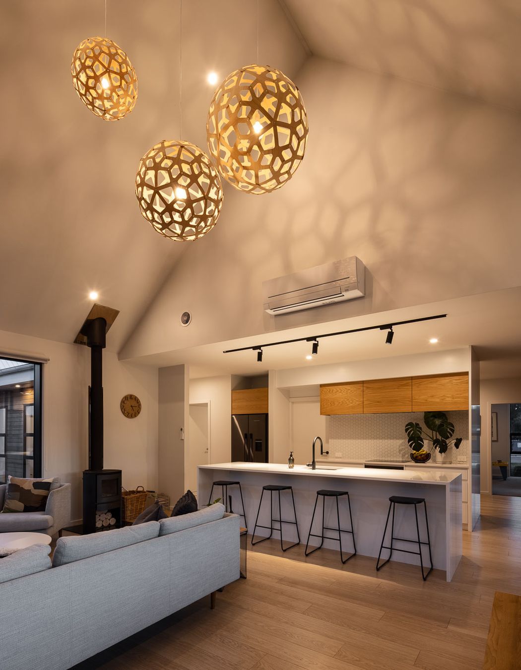
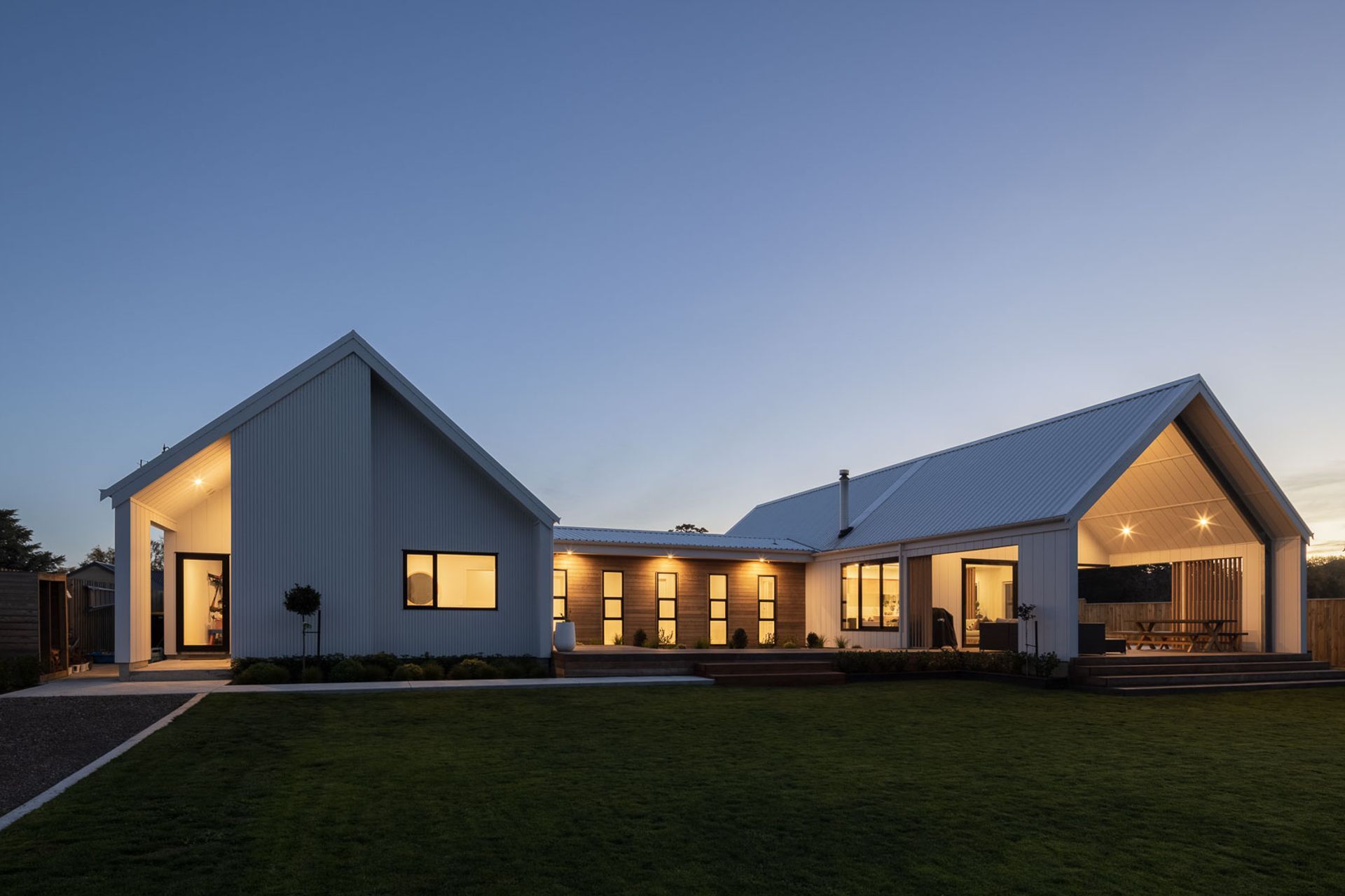
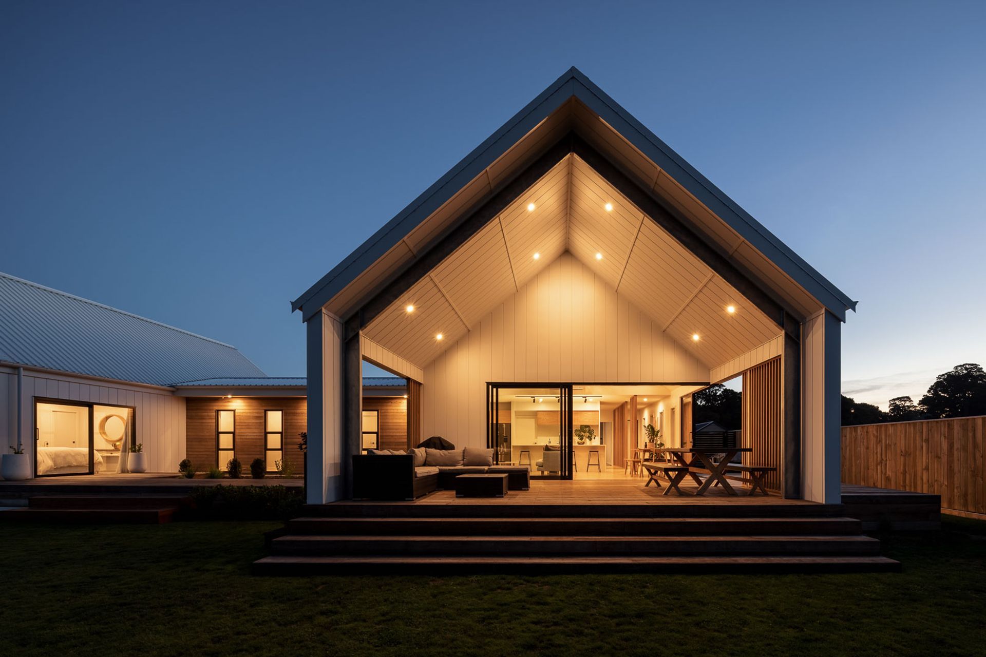
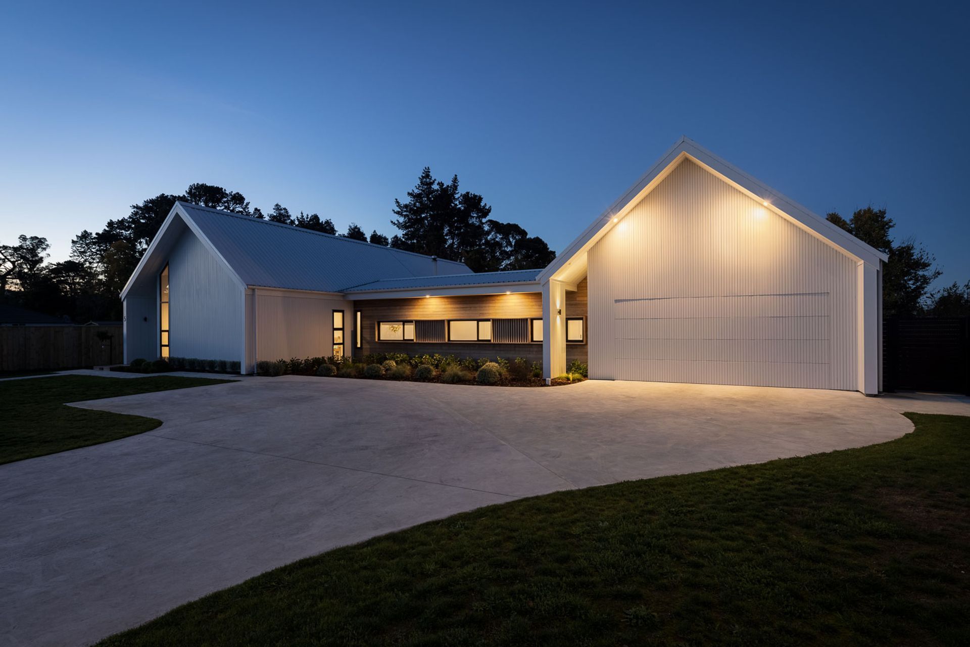
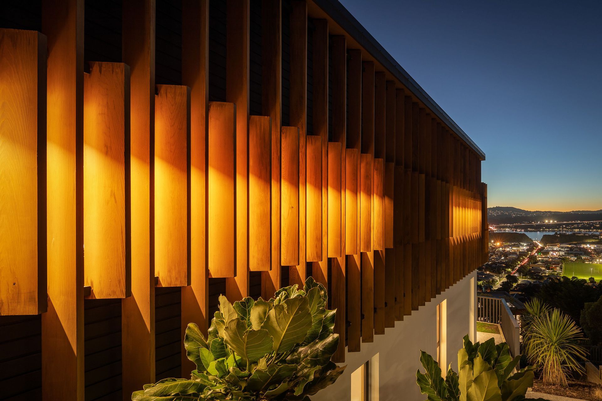
ArchiPro Project Summary - Four Gables House: A thoughtfully designed four-bedroom family home featuring open-plan living, seamless indoor-outdoor connections, and a striking white exterior, set within a new residential development in Greytown.
- Title:
- Four Gables House
- Architectural Designer:
- Holmes Architecture
- Category:
- Residential/
- New Builds
Project Gallery
Views and Engagement
Products used
Professionals used

Holmes Architecture. With a family heritage in construction and as a qualified builder himself, Mike Holmes established Holmes Architecture while completing the Masters of Architecture programme at Victoria University.Working on complex residential and commercial projects fostered an affinity with built form, and Holmes Architecture was initiated through connecting this intimate knowledge of the construction process with an intuition and passion for architecture and design.
Mike’s approach to the design process is fluid and intuitive, although his non-linear approach is always coupled with a strong sense of identity, purpose and process - “Establishing identity is fundamental to the creative process and establishing who you, and your clients are, will ensure a clear project vision.”
Identity may be revealed in a multitude of ways: architectural style, environmental considerations, materiality, detailing, form, relationship to landscape - in either case a strong sense of form and composition is often a theme of the practice. Client and context is the first conversation initiated in each project, where the many competing forces of the design brief are reconciled through design thinking, visualisation and documentation.
Mike believes that architecture is communication in both practice and product - “The spark that delivers an initial design insight is a relatively brief moment in the process. The practice of architecture is then the communication of this brief and intense moment. What elevates buildings to architecture is when a designer has something worthwhile to say and does so in an insightful and honest way.”
Mikes ultimate aim is that unexpected and delightful design solutions are achieved through balancing function, construction and efficiency with a deep empathy for site, context and client.
Year Joined
2018
Established presence on ArchiPro.
Projects Listed
16
A portfolio of work to explore.
Holmes Architecture.
Profile
Projects
Contact
Project Portfolio
Other People also viewed
Why ArchiPro?
No more endless searching -
Everything you need, all in one place.Real projects, real experts -
Work with vetted architects, designers, and suppliers.Designed for New Zealand -
Projects, products, and professionals that meet local standards.From inspiration to reality -
Find your style and connect with the experts behind it.Start your Project
Start you project with a free account to unlock features designed to help you simplify your building project.
Learn MoreBecome a Pro
Showcase your business on ArchiPro and join industry leading brands showcasing their products and expertise.
Learn More