About
Over the Fence.
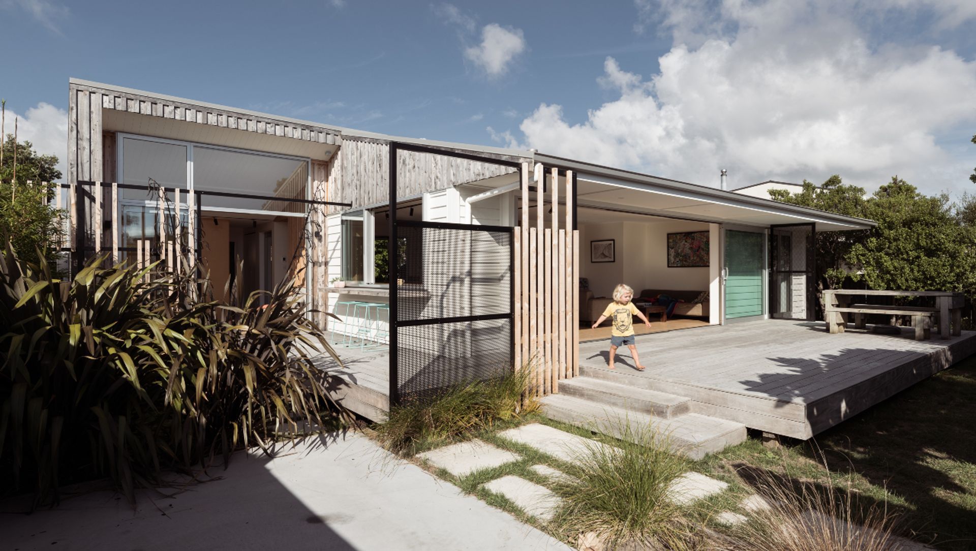
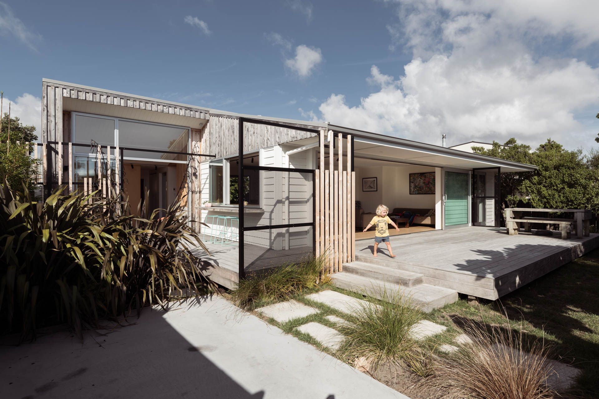
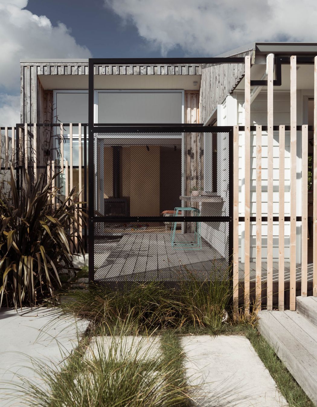
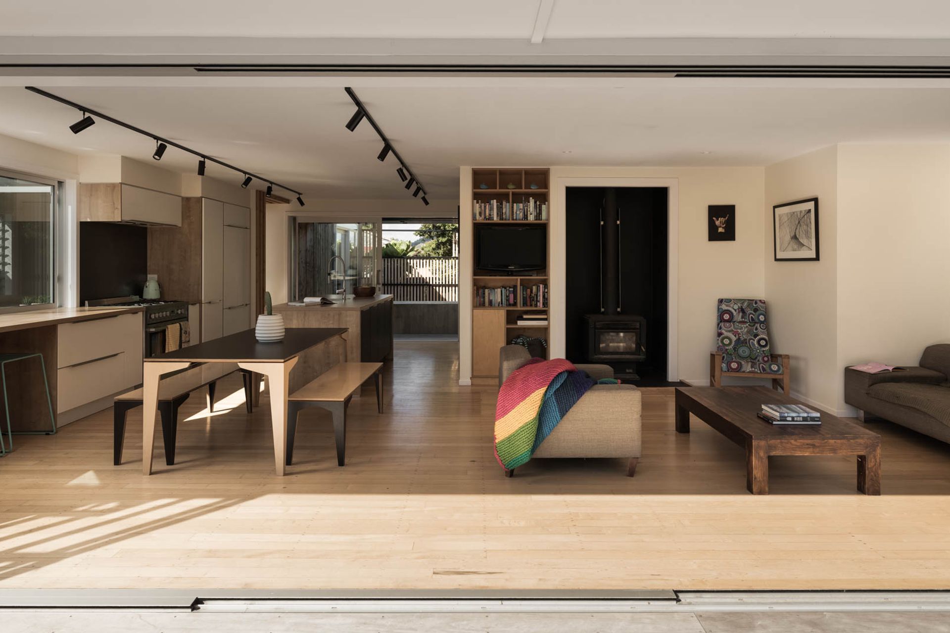
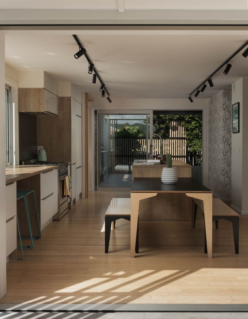
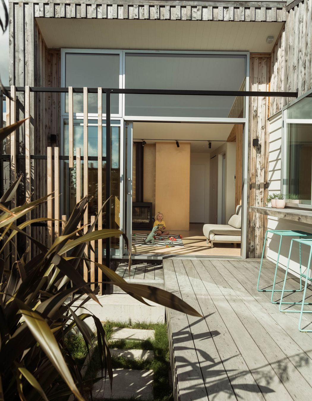
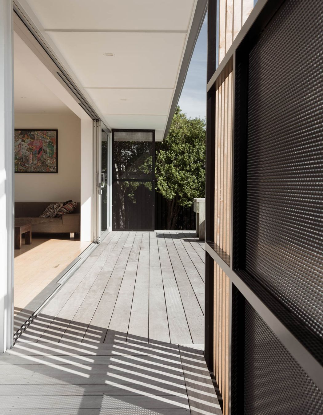
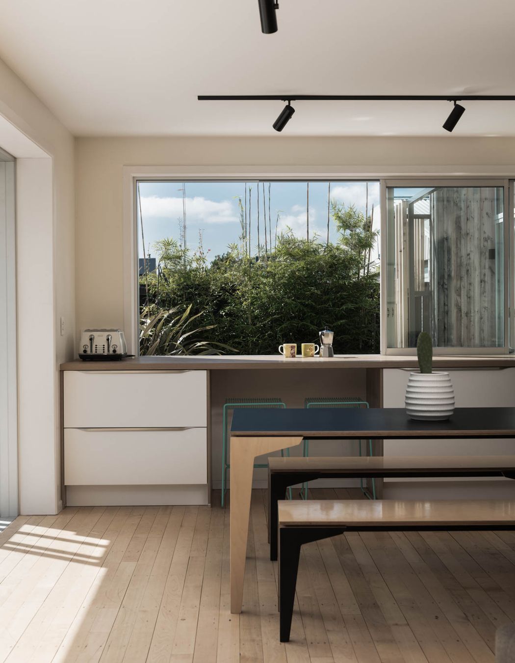
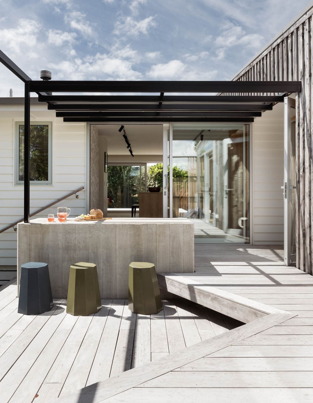
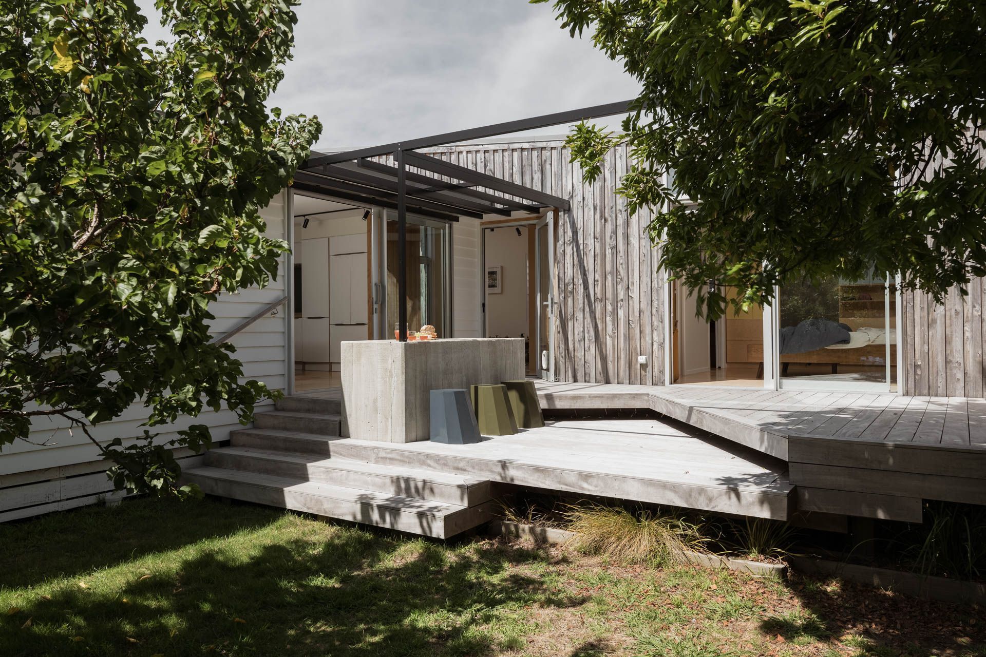
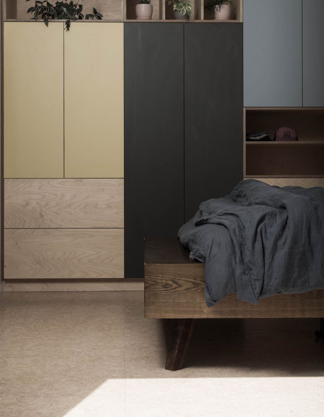
ArchiPro Project Summary - A contemporary beach shack transformation that enhances family living with seamless indoor-outdoor connections, a master retreat, and thoughtful design elements that celebrate the existing character while providing modern comforts.
- Title:
- Over the Fence
- Architectural Designer:
- ata
- Category:
- Residential/
- Renovations and Extensions
- Region:
- Papamoa Beach, Bay of Plenty, NZ
- Building style:
- Contemporary
- Photographers:
- Media Masters
Project Gallery
Views and Engagement
Professionals used

ata. ata is an award-winning, full-service architectural studio committed to the creation of intelligent, sustainable, and progressive design solutions.
Our projects are deeply grounded in understanding our clients. We work in an open and collaborative way to ensure the end result is relevant, meaningful, and reflects their unique identities.
Our work encompasses proportion, use of light, material integrity and sustainable methodology to create functional yet engaging architecture.
Having previously worked in both large and boutique architectural practices, as well as two years as a Project Manager in the construction business, Adam Taylor brings a wealth of knowledge and understanding to his projects.
Year Joined
2014
Established presence on ArchiPro.
Projects Listed
24
A portfolio of work to explore.
ata.
Profile
Projects
Contact
Other People also viewed
Why ArchiPro?
No more endless searching -
Everything you need, all in one place.Real projects, real experts -
Work with vetted architects, designers, and suppliers.Designed for New Zealand -
Projects, products, and professionals that meet local standards.From inspiration to reality -
Find your style and connect with the experts behind it.Start your Project
Start you project with a free account to unlock features designed to help you simplify your building project.
Learn MoreBecome a Pro
Showcase your business on ArchiPro and join industry leading brands showcasing their products and expertise.
Learn More