Wellness in architecture is often discussed in terms of features such as pools, gyms and exercise spaces. Its most powerful expressions, however, are felt rather than seen. They exist in the way light enters a room, how the body moves intuitively through a home, and the quiet sense of ease that comes from spaces working effortlessly together. For this new residence in Melbourne’s eastern suburbs, wellness was not an aesthetic overlay but the lens through which the architecture was conceived from the very beginning.
Designed by Taylor Knights, the home was shaped by a highly considered brief from its owners, both doctors and one also a health entrepreneur, who wanted a place that could support their young family, host workshops and gatherings, and provide genuine spaces for retreat and wellbeing.
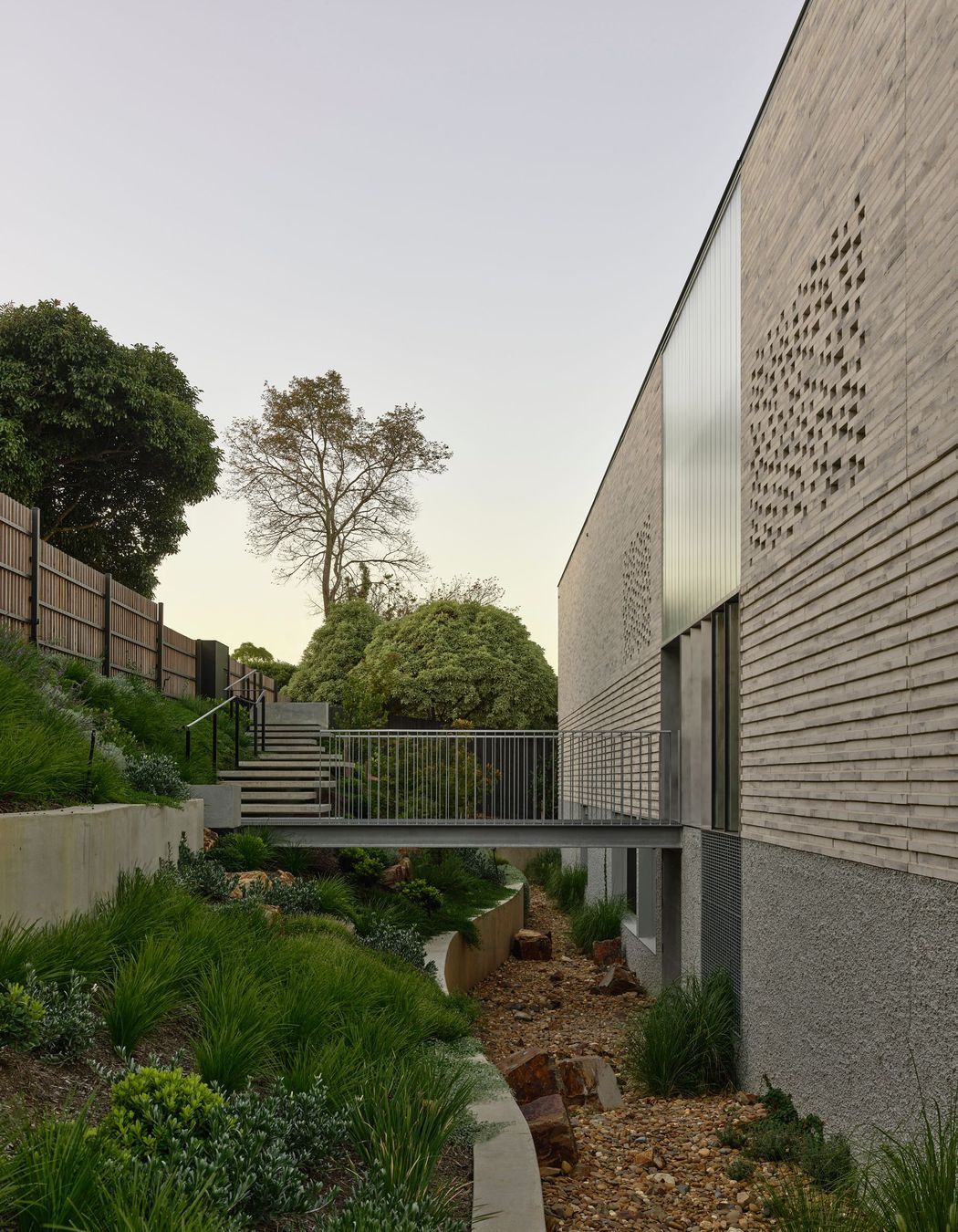
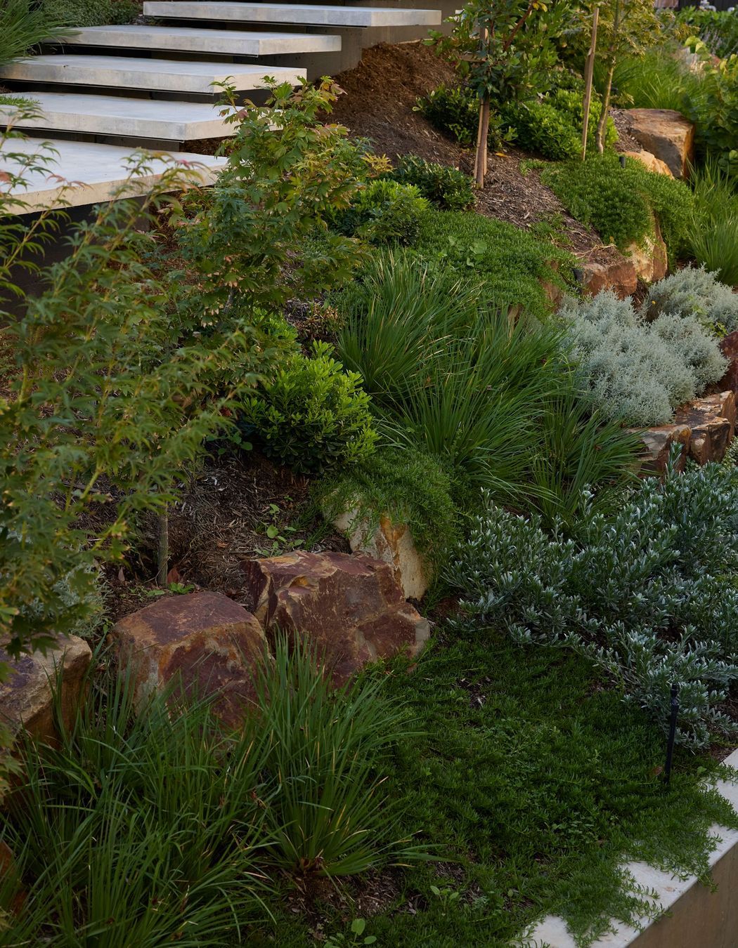
The site sits in Wheeler’s Hill, one of Melbourne’s highest points, overlooking the expansive Jells Park.
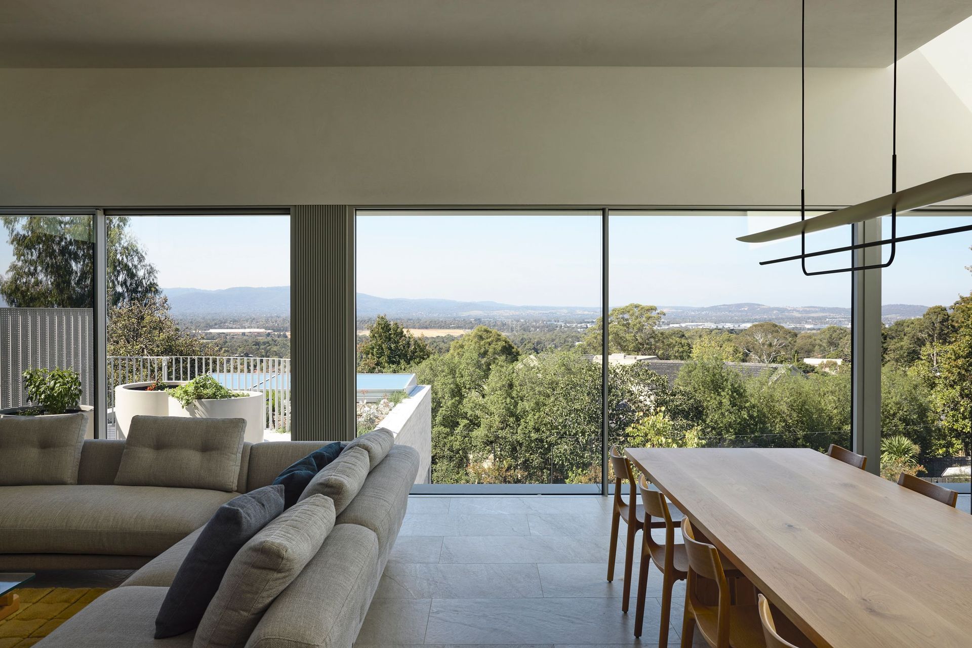
“The property is perched fairly high up on the hill, and the main aspect is facing east,” says architect Peter Knights. “It gets beautiful eastern morning light, with courtyards that help capture sun throughout the day, and the sloping topography allows the house to cascade naturally down the landscape.”
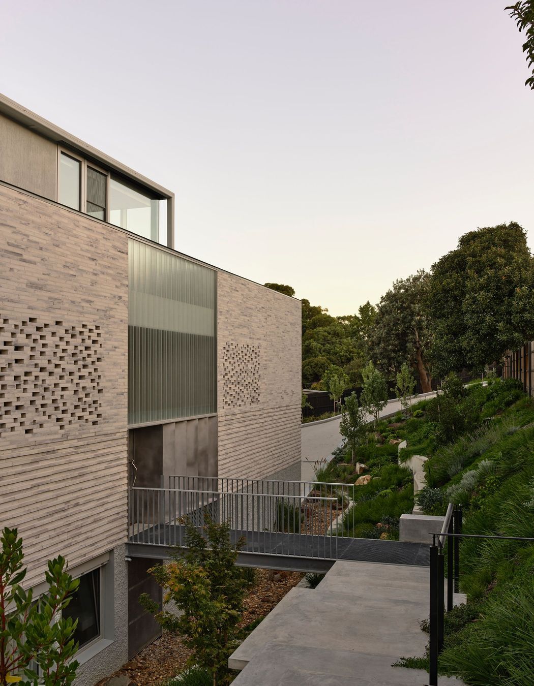
That relationship to the land is fundamental to the home’s organisation. With road access at the top of the site, the architect used the natural fall of the terrain to separate public and private domains, both vertically and laterally. This separation allows the house to operate seamlessly across different modes of occupation without one function overwhelming another.
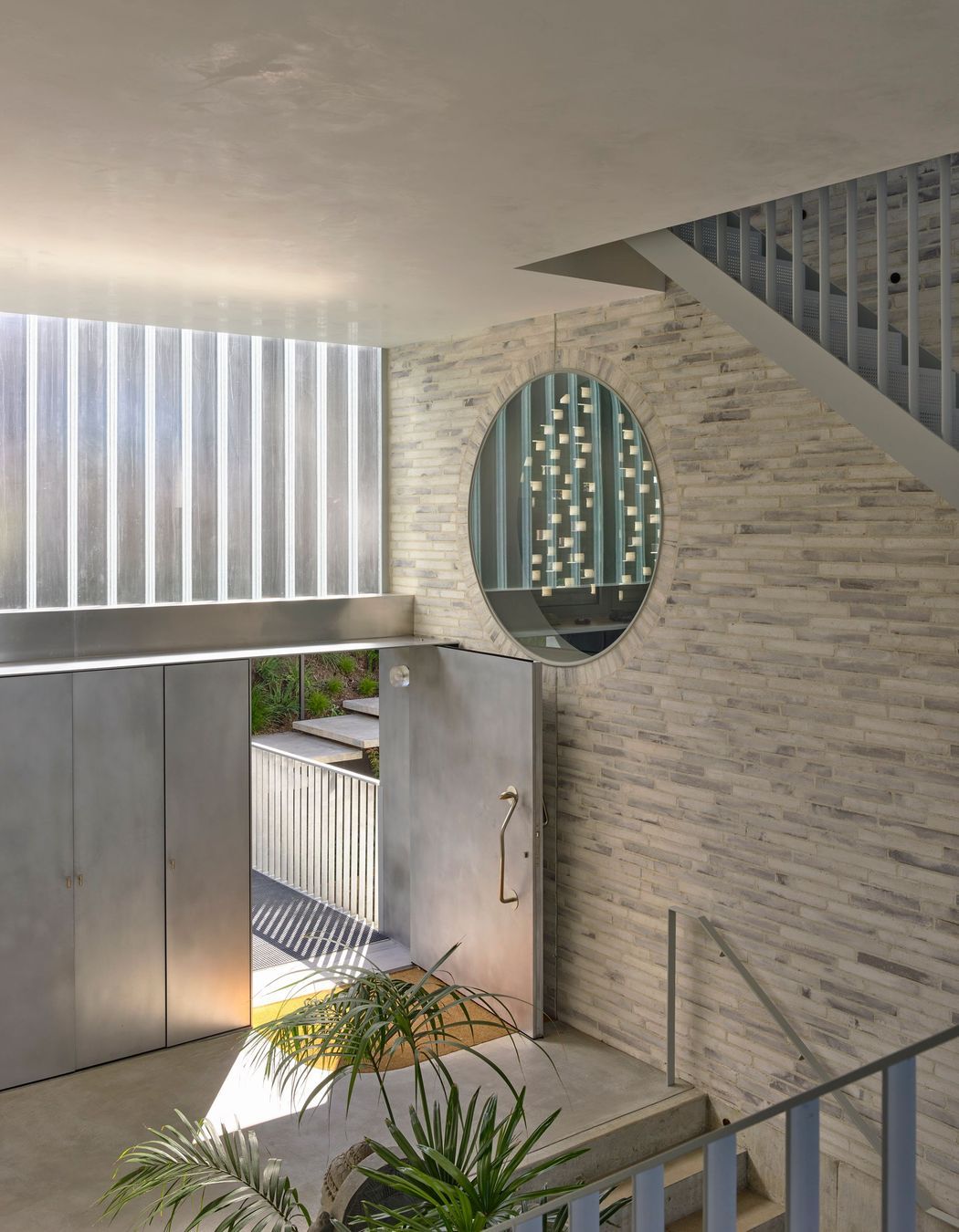
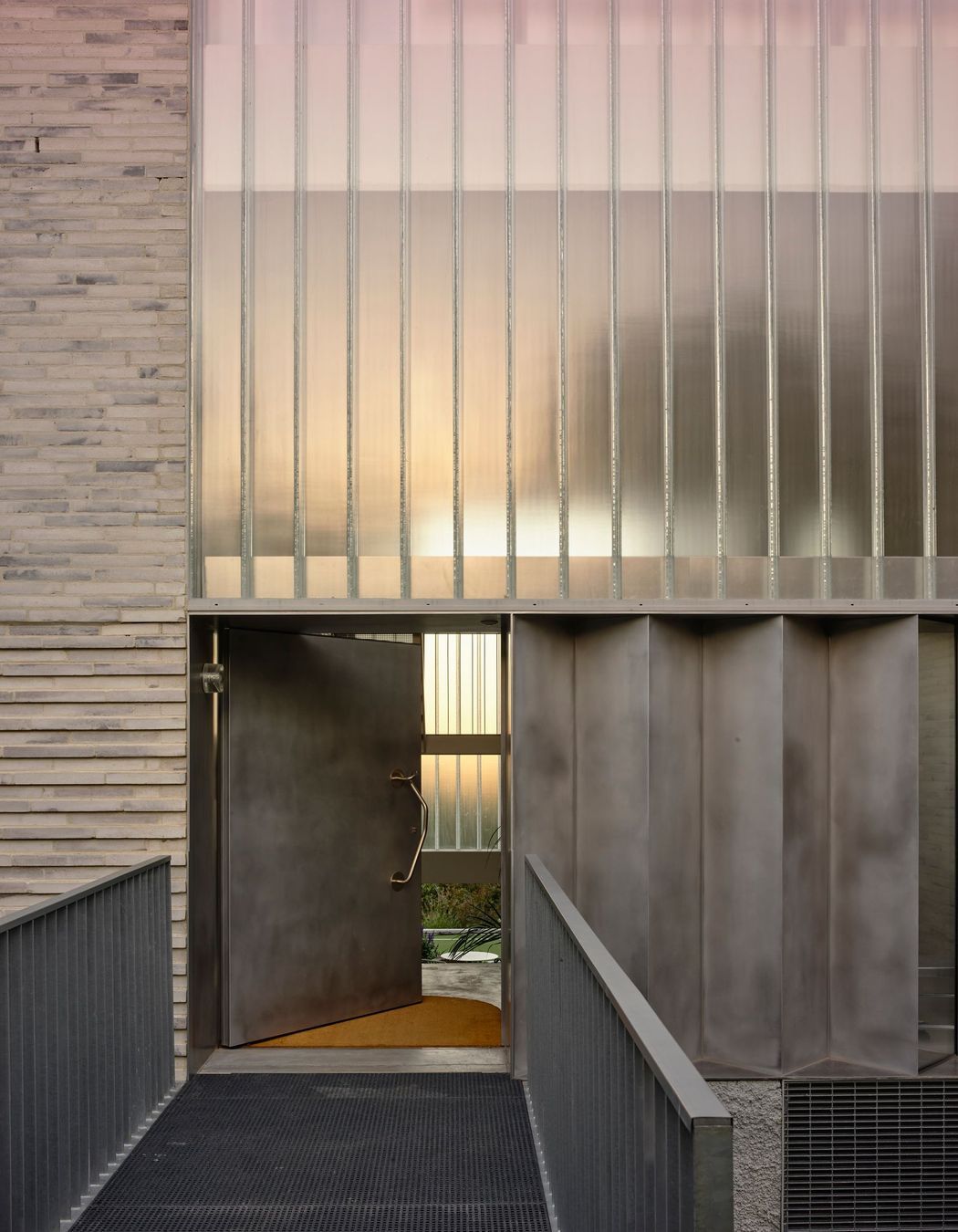
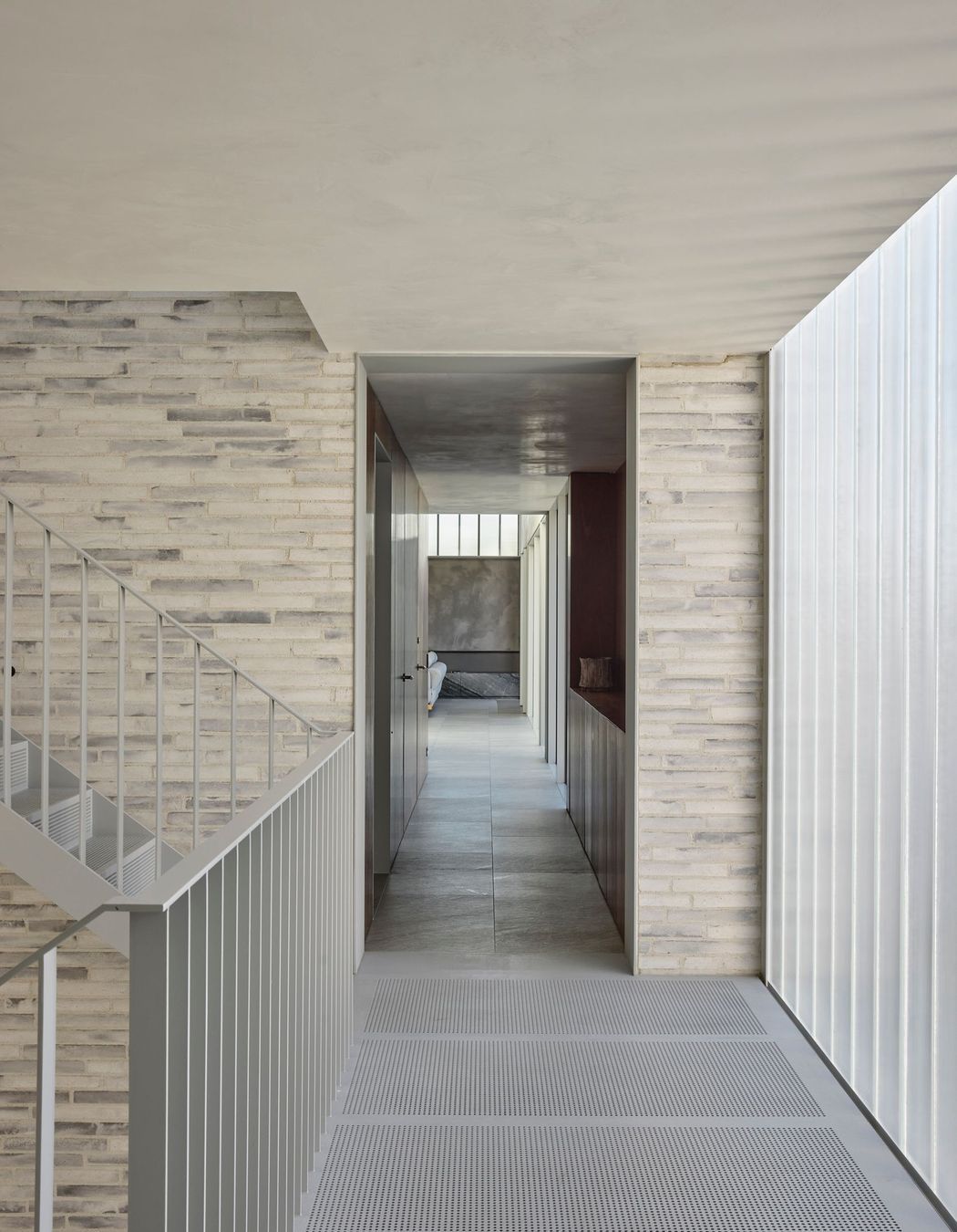
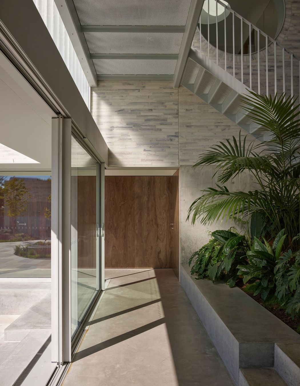
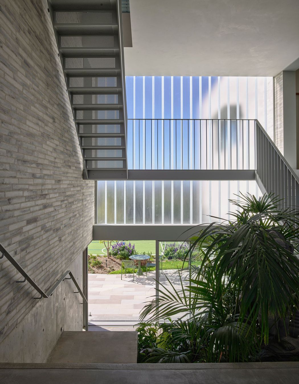
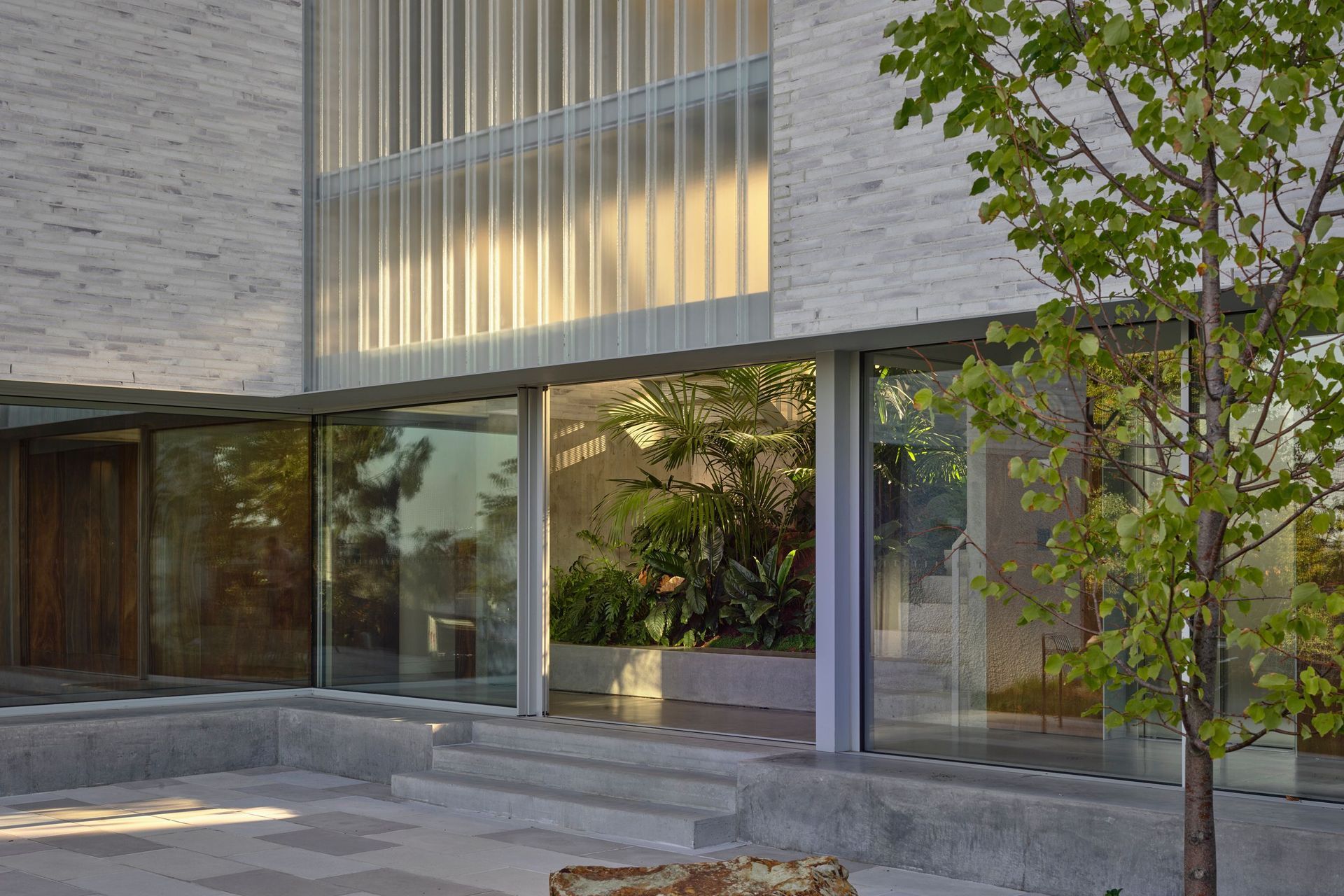
Arrival occurs at a mid-mezzanine level via a series of descending steps and a bridge, culminating in a dramatic double-height atrium. This space, referred to by the architect as the lantern, is the conceptual and spatial heart of the home.
“That point is really the section that separates, on the vertical plane, the public and the private,” Knights explains. “You step up into the private or down to the public, and it creates a very clear flow through the house.”
The atrium also resolved a key planning challenge. Local controls limited the house to two storeys, prompting the architects to use volume and sectional complexity rather than height to accommodate the brief. A home office sits above the atrium and opens onto a roof deck, creating the feeling of a three-storey home within a compliant envelope. “The form absolutely followed the function,” says Knights. “That’s really how we derived it.”
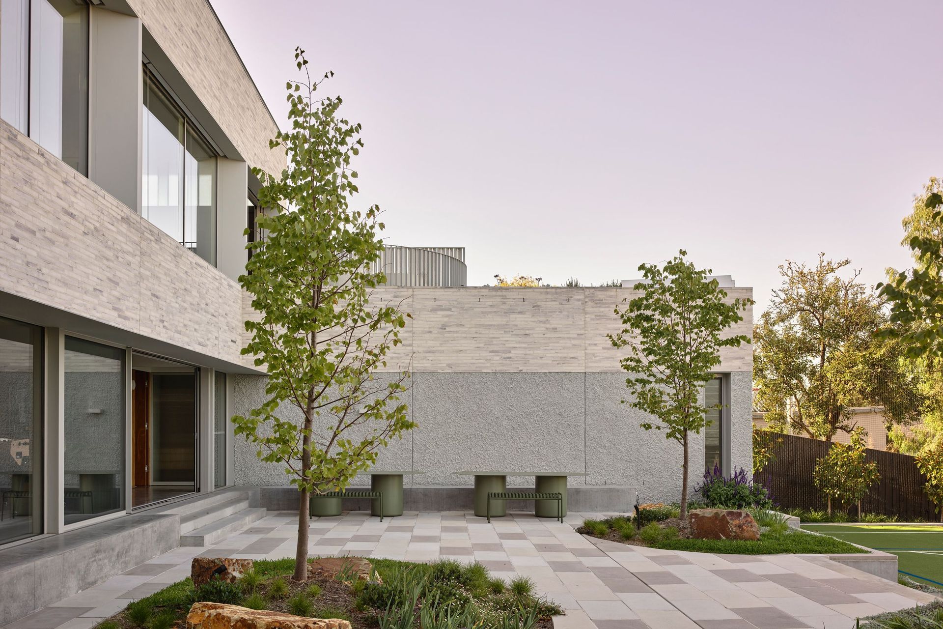
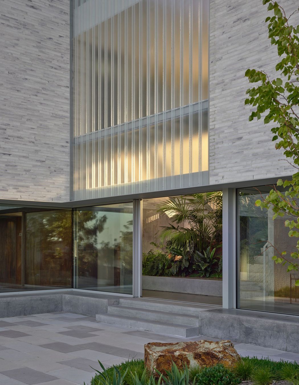
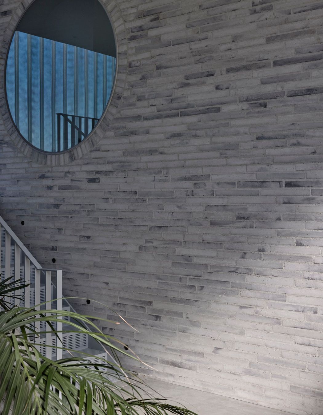
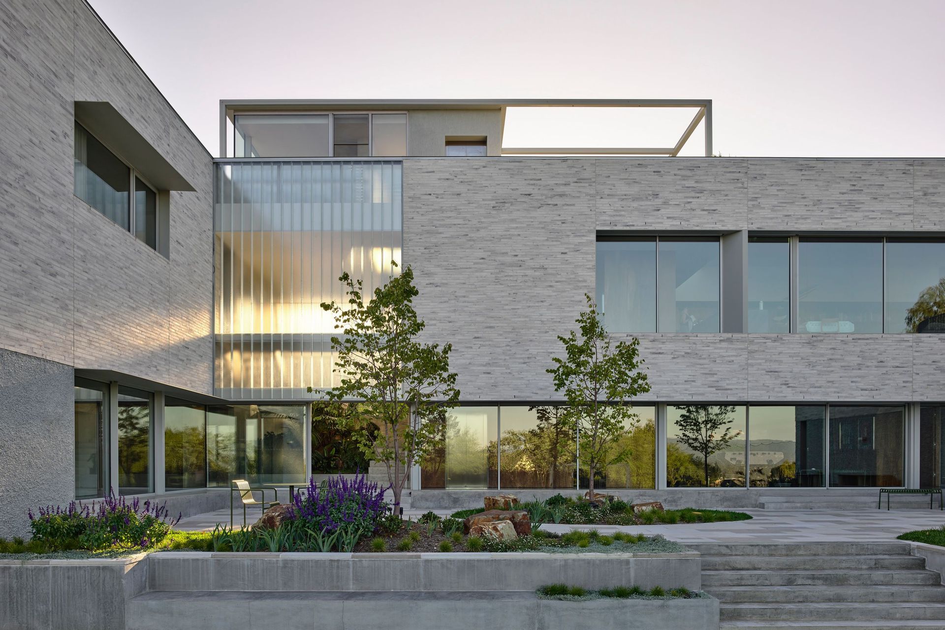
Externally, the building is wrapped in a restrained yet highly crafted material palette. A custom off-white concrete brick forms the primary envelope, laid in strong horizontal bands that ground the home within its landscape.
“We wanted a white product without it feeling stark,” Knights notes. “So we worked with the supplier to create a custom mix and a pattern that mediates against the landscape.”
Channel glass is used within the atrium, softly filtering light and allowing glimpses into internal spaces, animating the facade as the sun shifts throughout the day.
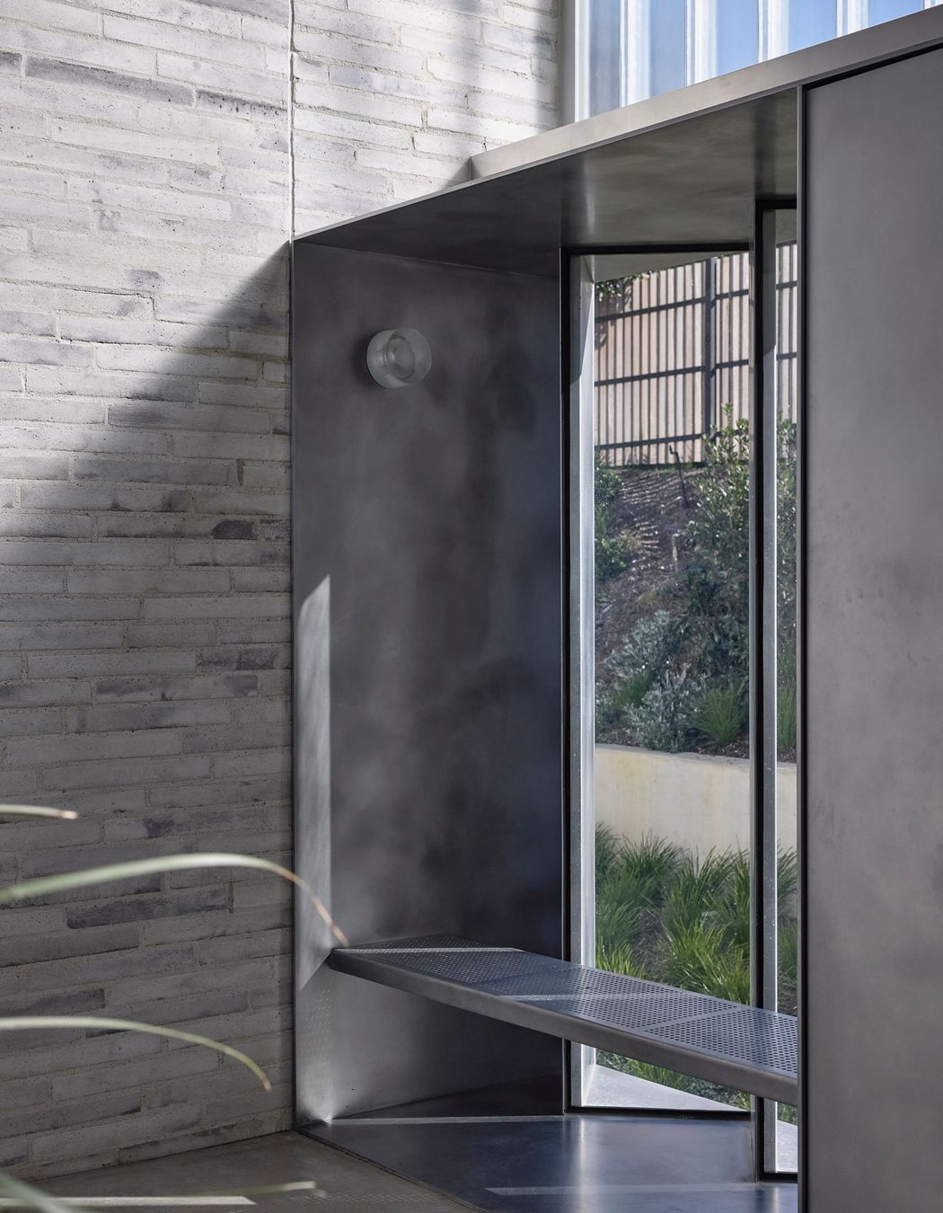
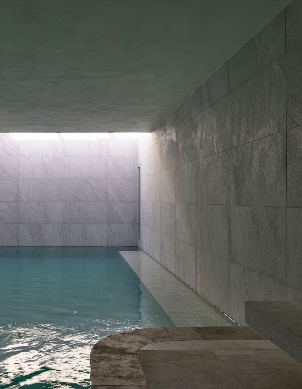
Moving down from the atrium reveals the home’s public and wellness-focused zones. On one side, generous communal spaces connect to an internal courtyard, gym, indoor swimming pool and sauna, before spilling further down the site to outdoor recreation areas and productive gardens. These spaces are designed to flow intuitively, encouraging movement between indoors and out during workshops and social gatherings.
On the opposite side of the lower level sits a fully self-contained apartment for grandparents, complete with kitchen, ensuite and its own secluded courtyard. While connected to the main house, it maintains a sense of independence.
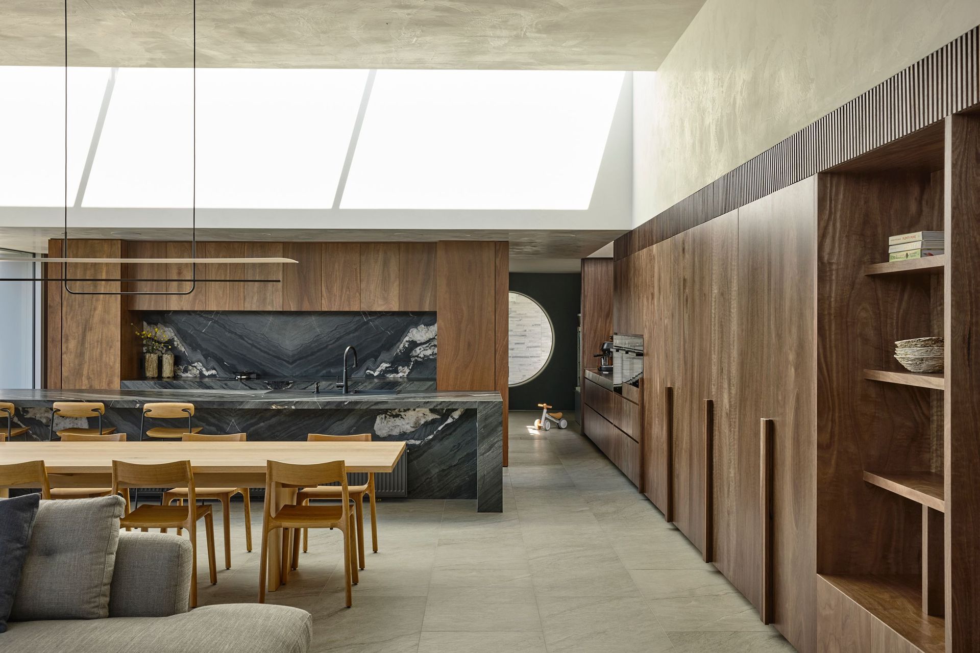
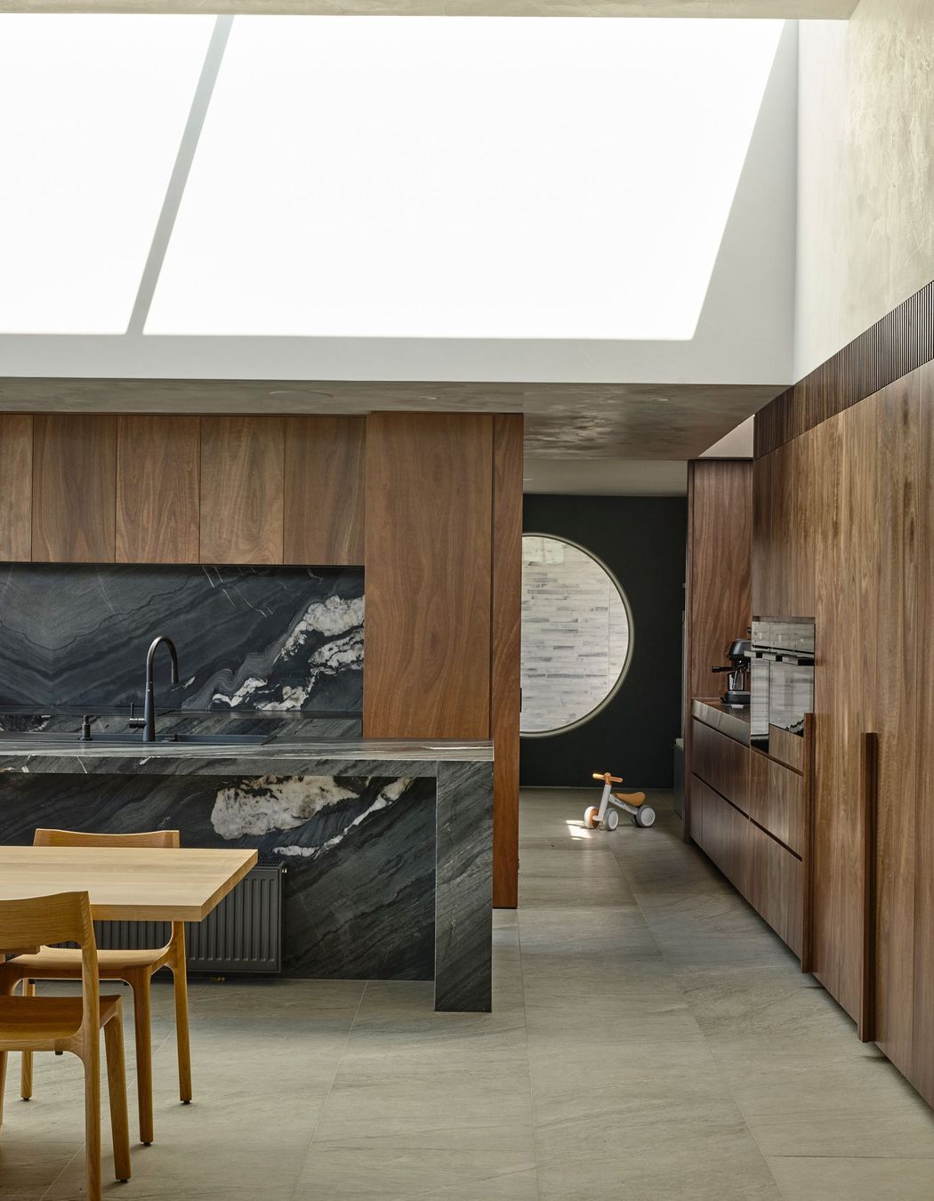
Ascending from the atrium leads into the private family zones. An open plan kitchen, living and dining area opens onto a roof deck planted with herbs, supporting daily rituals around cooking and gathering. Across the atrium, the family wing houses the main bedroom, children’s rooms and a prayer room. Above this, a home office and outdoor entertaining area complete the vertical sequence.
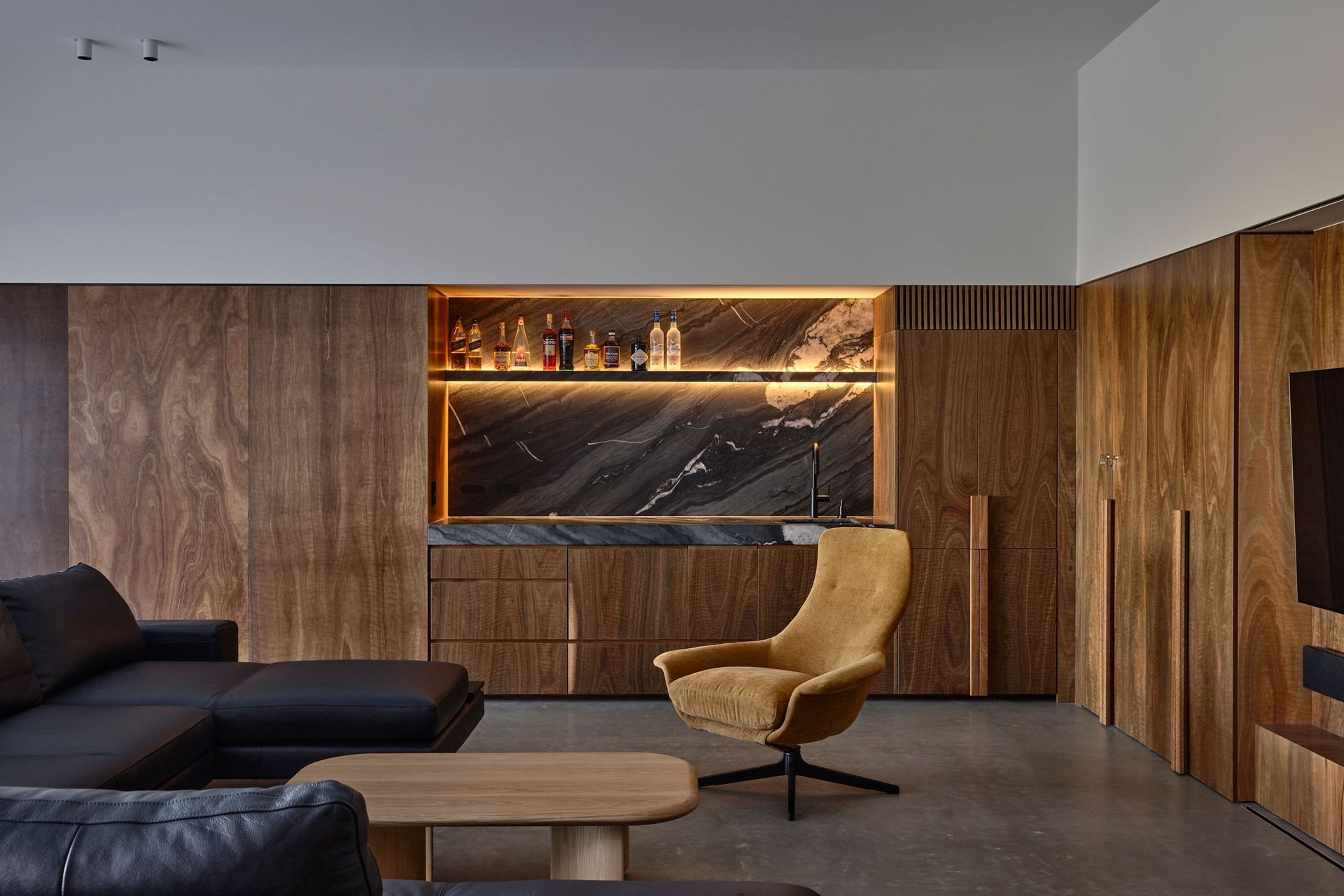
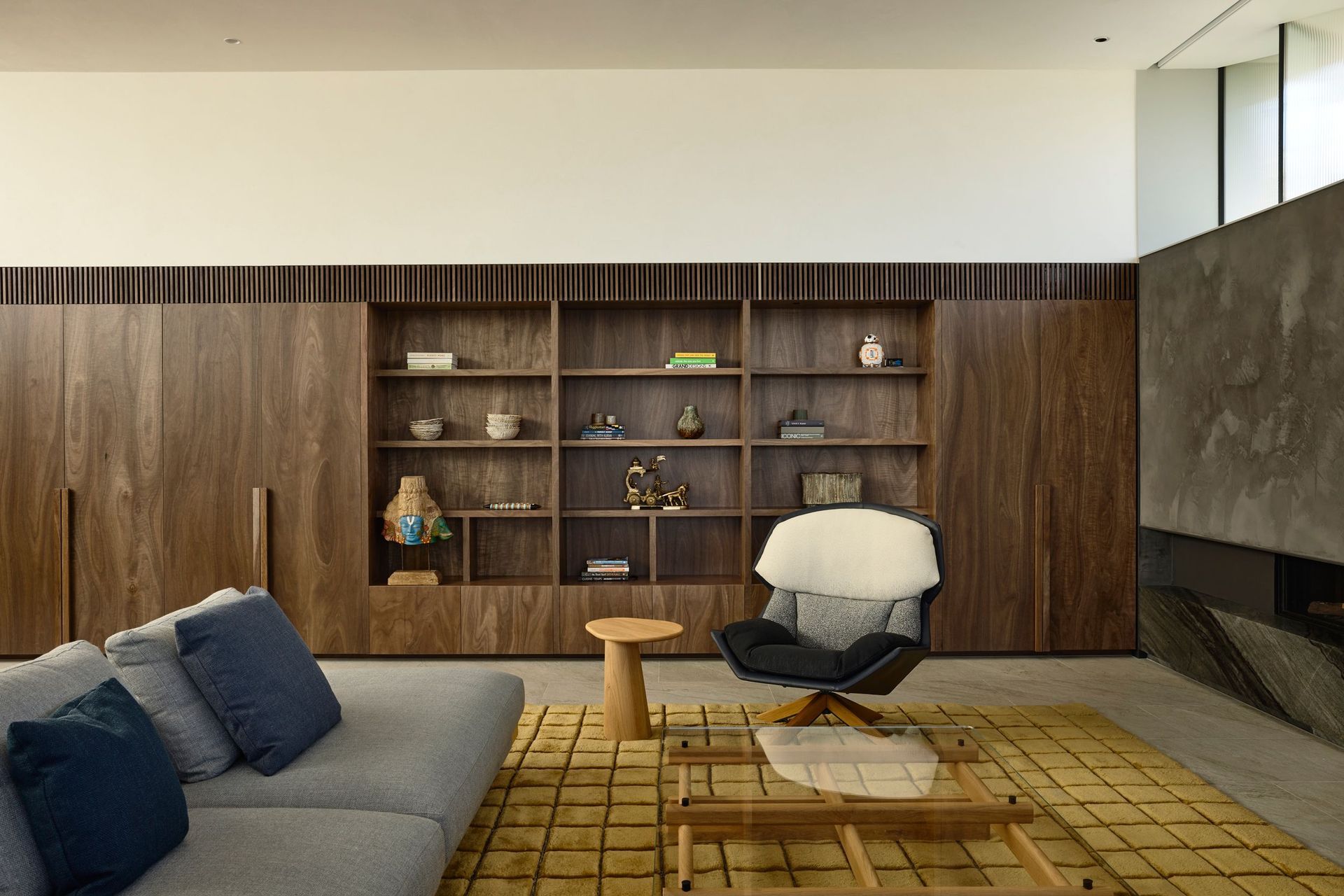
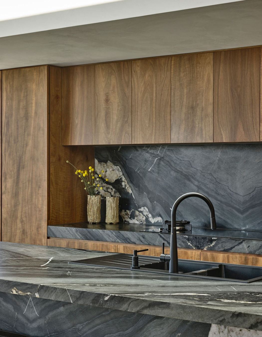
Internally, the material language is calm, tactile and consistent. Spotted gum timber panelling wraps the lower portion of the walls, concealing joinery and reinforcing a continuous horizontal dado line throughout the home. Above, polished plaster walls reflect light softly, their subtle imperfections adding depth and warmth.
“We often get a better result by creating something that’s perfect by its imperfections,” Knights reflects.
Flooring is unified with a durable, natural look porcelain chosen for longevity and ease of maintenance.
While the home includes an impressive array of wellness amenities, the architects are clear that wellbeing is ultimately about how a building supports daily life.
“It’s about first principles,” says Knights. “Good orientation, cross ventilation, insulation, and making sure people feel happy in their home. When people arrive and can let the stress of the world go, that’s when you’ve created wellness in architecture.”
Words: Jo Seton