Fitzherbert Arts & Crafts.
ArchiPro Project Summary - A stunning Colonial-style restoration of the Fitzherbert Arts & Crafts home, completed in 2022, blending timeless elegance with modern enhancements, featuring dark floors and white walls, while capturing the beauty of the outdoors.
- Title:
- Fitzherbert Arts & Crafts
- Interior Designer:
- Abbey Lang Home
- Category:
- Residential/
- Renovations and Extensions
- Completed:
- 2022
- Building style:
- Colonial
- Bathroom Design and Layout by Abbey Lang Home Ltd
- Interior Design and Details by Abbey Lang Home Ltd
- Architecturally designed collaboratively by Simon Clarkson and Sam Gavin (ABC design)
- Built by ABC Design
- Cabinetry by Cherrywood Kitchens.
- Photos primarily by Samuel Hartnett.
RENOVATION OVERVIEW
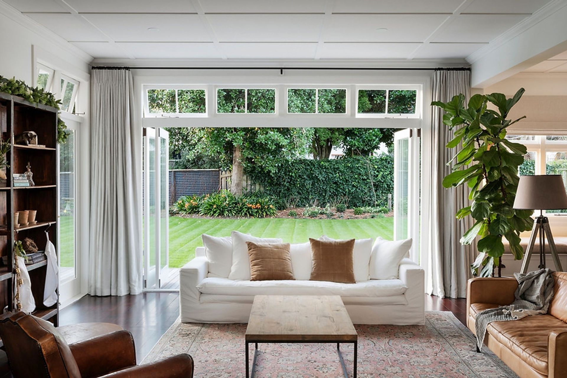
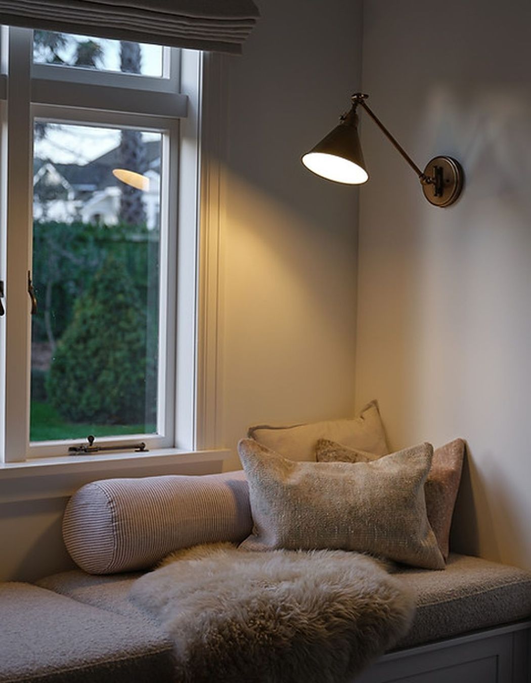
This beautiful arts and crafts home was the son's house of one of the grand old Dames on the River in Gisborne. The home was purchased by my clients who have a love and passion for restoring it and enhancing it to the best modern form of it's traditional self. The clients had asked Simon Clarkson for his design direction for the architecture and extension of the home, which was realised by Sam Gavin. I was referred by another client so hopped onto the project later in the piece. Aesthetically the client wanted dark floors and white walls for a formal grand feel. They wanted selections applicable to the home's period and design details which were timeless and elegant. The homeowner is a landscape gardener so captivating the outdoors was a key aspect also.
KITCHEN
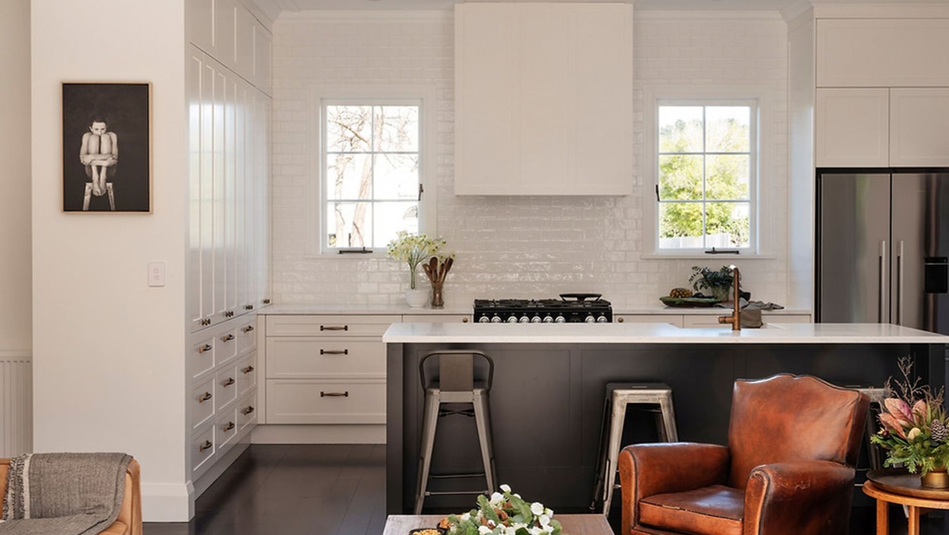
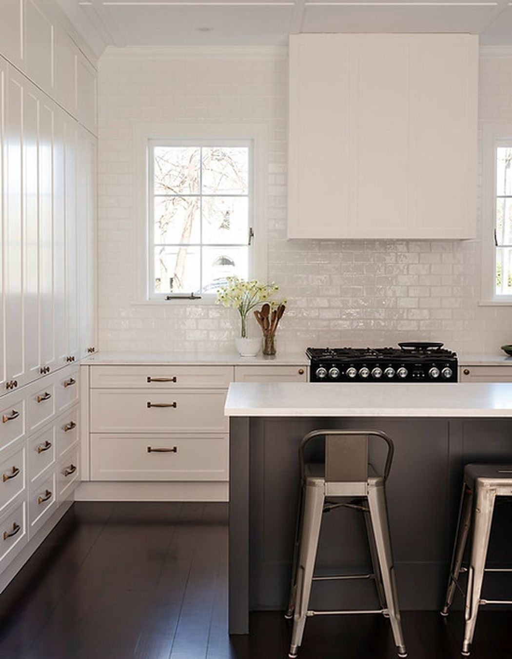
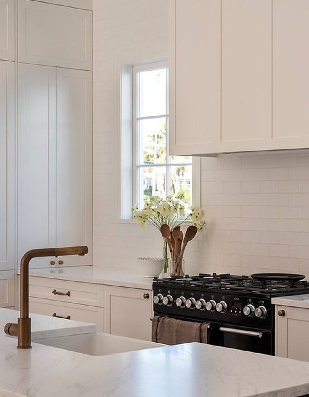
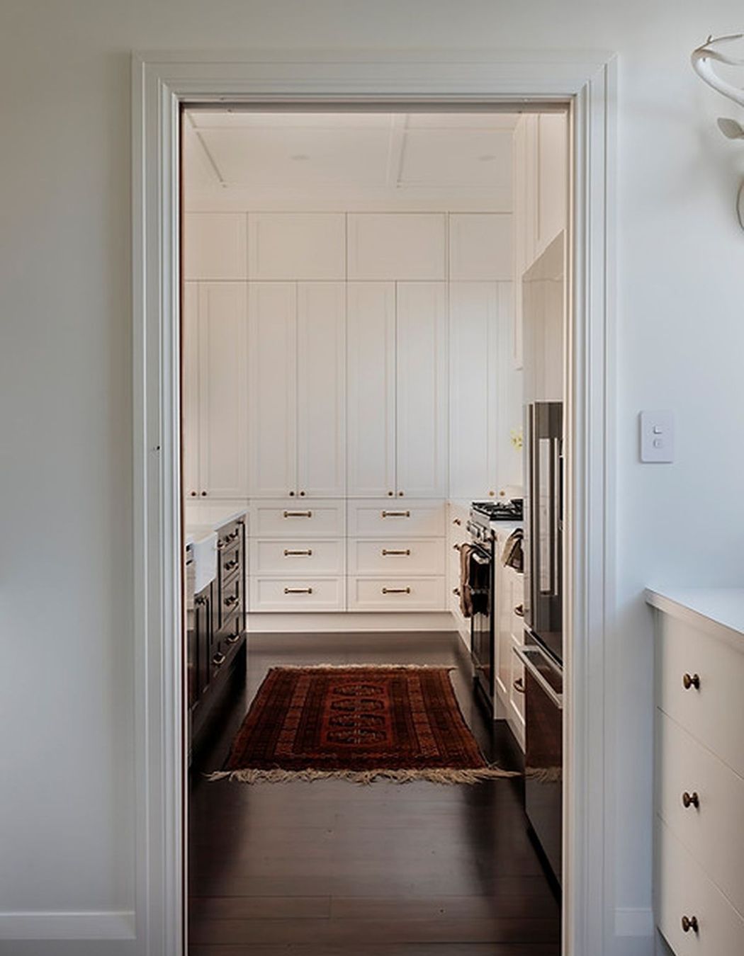
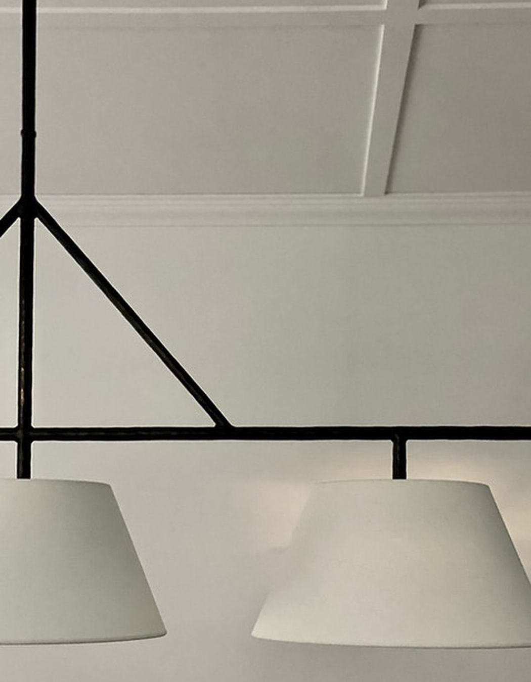
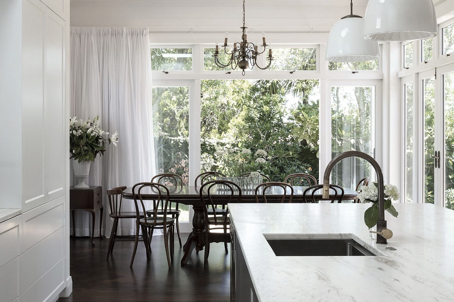
The kitchen layout had already been designed by Cherrywood joinery but the client asked that I give input on the style and details of the space alongside some cabinetry tweaks along the way. The client had already chosen a Travolo composite bench-top which was extremely practical and complemented the dark island beautifully. Range-hood details and splash-back tiles, alongside the ceiling batten detailing which ran throughout the open plan space, were all areas which I consulted on as well as paint colours, built in cabinetry, lighting and selected soft furnishings.
BATHROOM
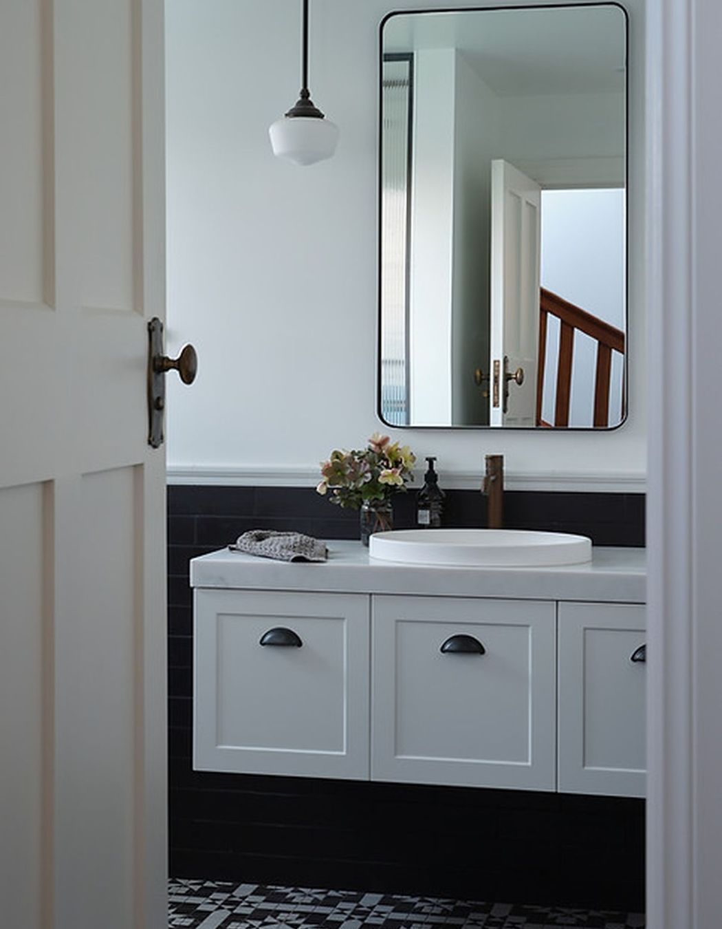
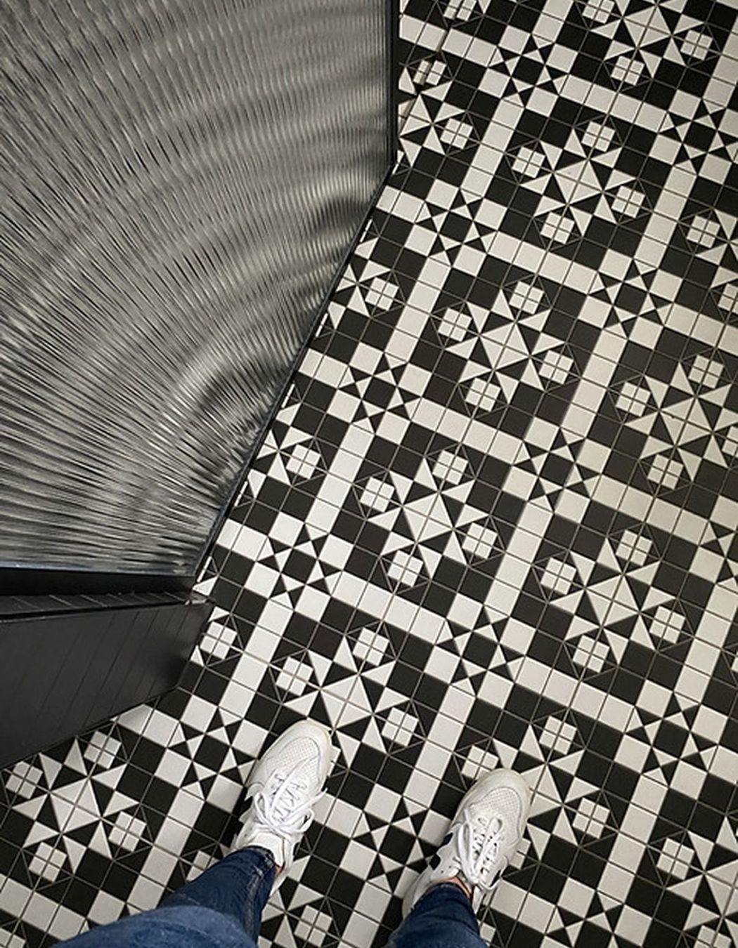
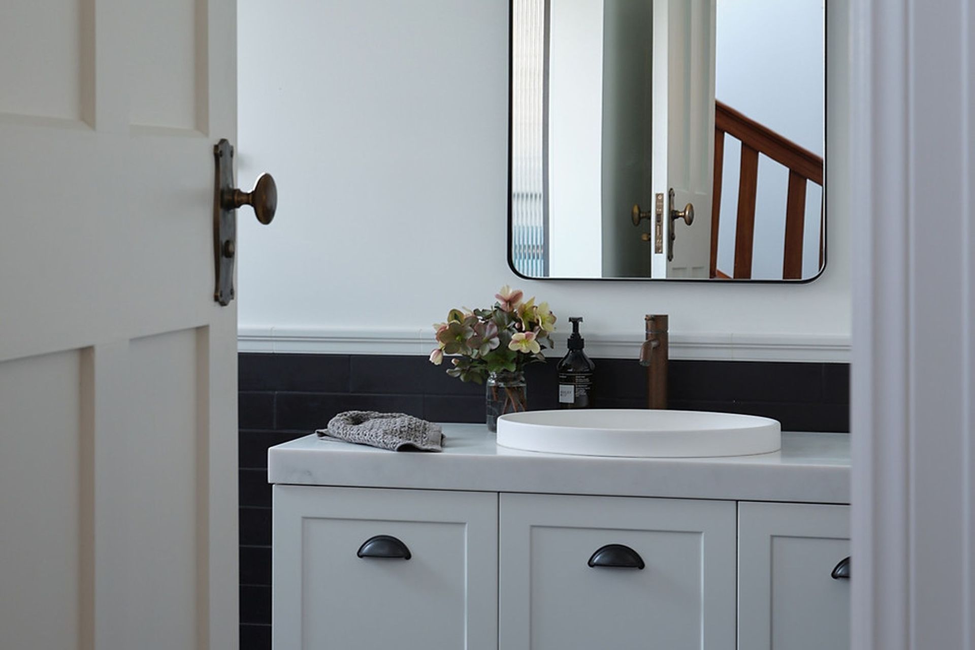
I was asked to design the bathroom, which took some re-configuring from the initial plans. As you come down the stairs you see into the bathroom as well as when you enter the house, so I wanted the line of sight to be as beautiful and tidy as possible. The bathroom was to double as a powder room (and a bathroom for the downstairs bedroom). A main consideration was hiding the usual shower clutter– so reeded glass was specified for this purpose. The vanity was positioned as you enter the bathroom, with traditional style pendant lights imported from the US and a custom made mirror. The floor tiles were inspired by traditional Winckelmans tiles which are usually laid by hand to form this layout. These were a more cost effective version but have the same impact. The lower walls are tiled in a matte black tile (for practical reasons) which is laid offset and is finished with a white dado tile where it meets the painted walls. The shower repeats the same tiles but with white gloss subway tiles above for waterproofing purposes.
PORTICO
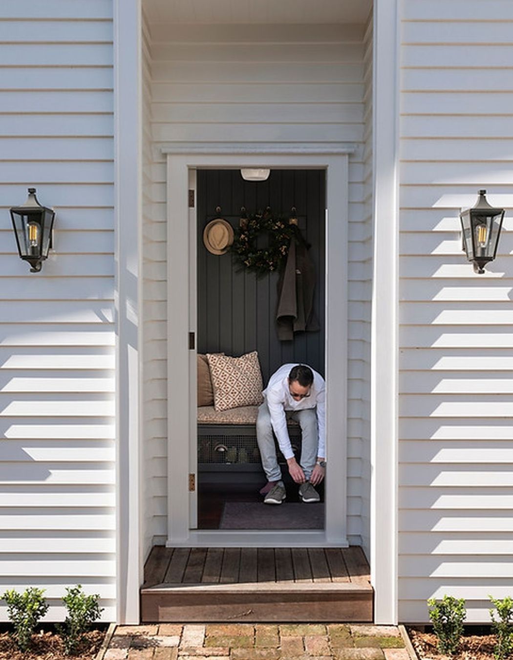
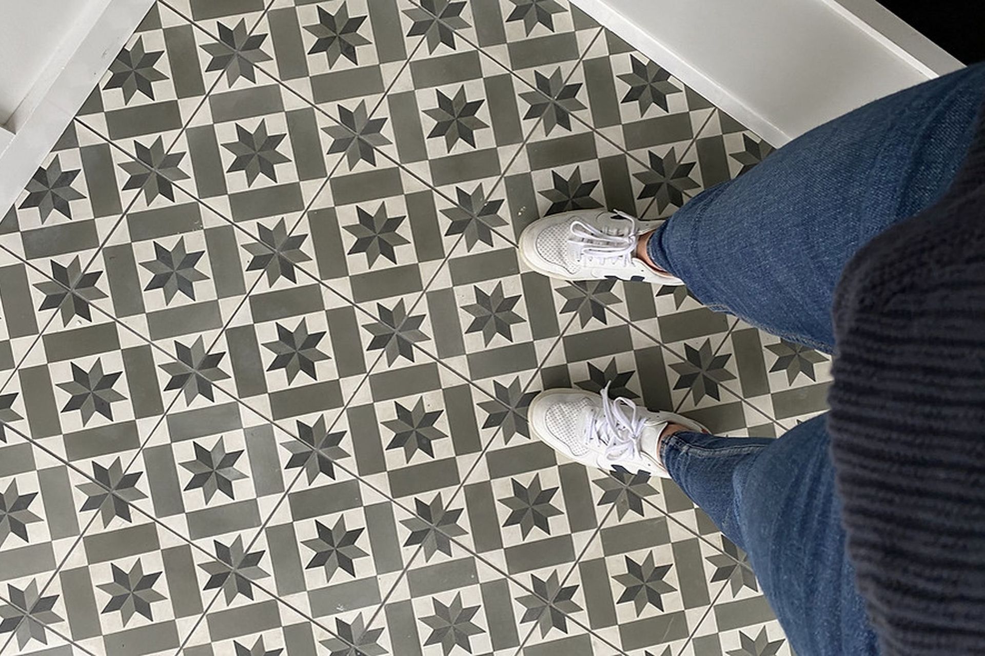
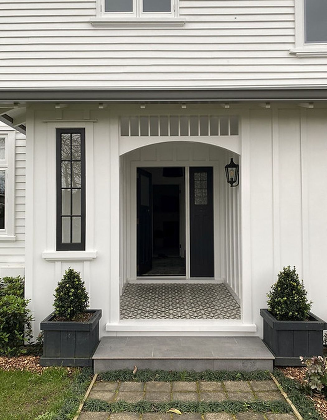
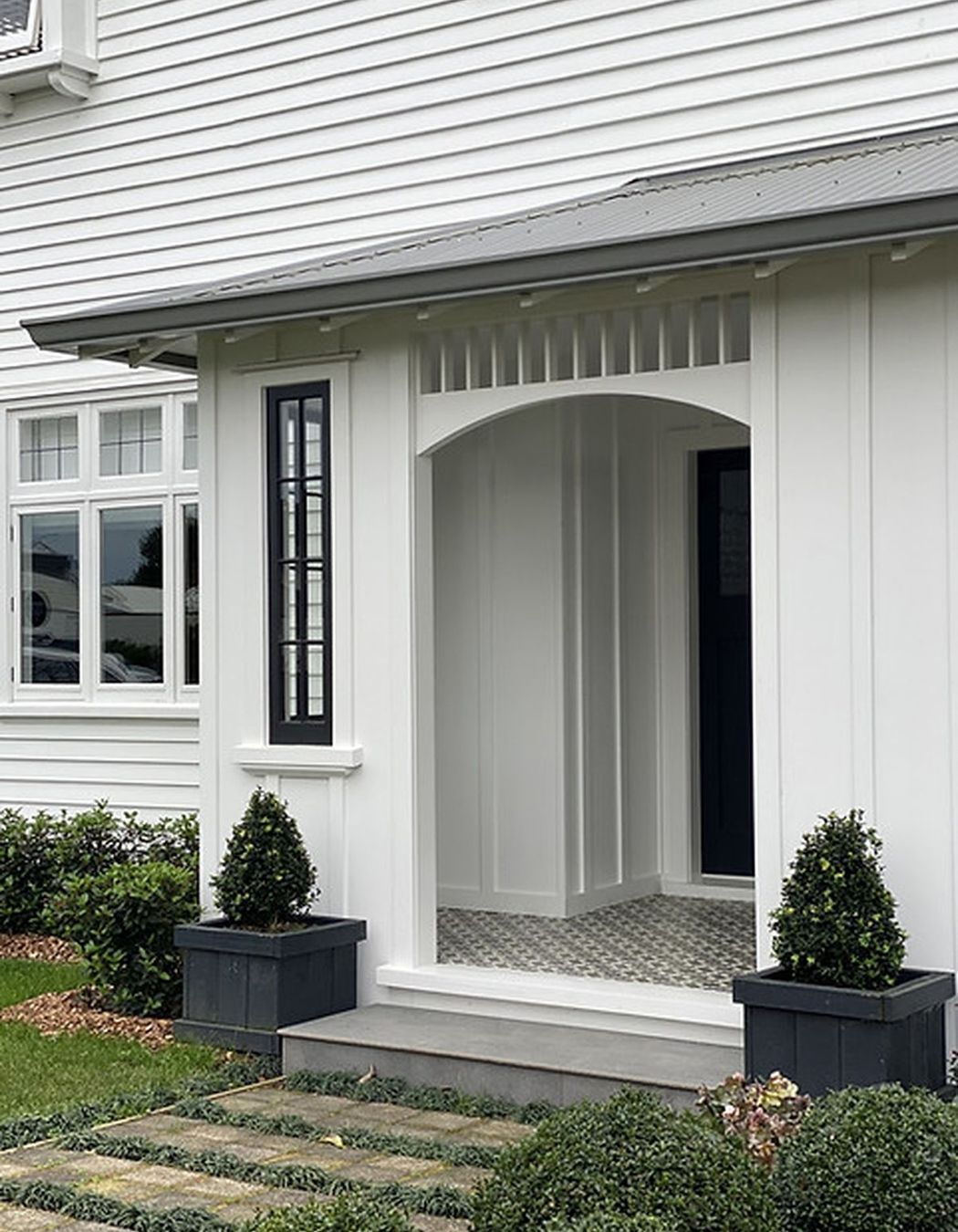
The portico was a new addition at the entrance of the home. It added a gorgeous street presence and worked well with the entrance landscaping vision of the homeowners. The finer details of this portico were to be designed, so I worked alongside the builder and owner to realise this space including the cement tiles, lighting and batten detailing on the walls.

Year Joined
Projects Listed
Abbey Lang Home.
Other People also viewed
Why ArchiPro?
No more endless searching -
Everything you need, all in one place.Real projects, real experts -
Work with vetted architects, designers, and suppliers.Designed for New Zealand -
Projects, products, and professionals that meet local standards.From inspiration to reality -
Find your style and connect with the experts behind it.Start your Project
Start you project with a free account to unlock features designed to help you simplify your building project.
Learn MoreBecome a Pro
Showcase your business on ArchiPro and join industry leading brands showcasing their products and expertise.
Learn More