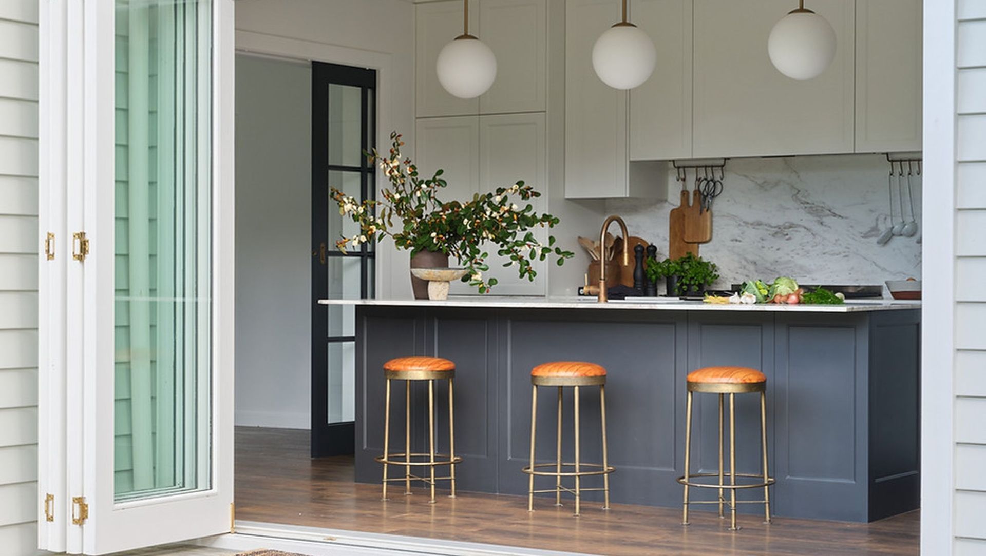
Titirangi Home.
ArchiPro Project Summary - Thoughtfully redesigned Titirangi home enhancing flow and functionality for family living and entertaining.
- Title:
- Titirangi Home
- Interior Designer:
- Abbey Lang Home
- Category:
- Residential/
- Renovations and Extensions
- Completed:
- 2022
- Spatial Planning and Interior Design by Abbey Lang Home
- Drafted and Consented by Obella Design
- Built by Lifebuilt Construction
- Cabinetry Manufactured by Bella Kitchens
- Completion Date Mid 2021
- Photography by Samuel Hartnett
RENOVATION OVERVIEW
The owners of this Titirangi home approached Abbey Lang Home to discuss a new kitchen. The home had been moved onto the site and renovated in the past but it didn’t function well for the family and there were some quirks to work around. The kitchen was at one end of a semi open plan space and had windows which looked out to the driveway of the home. The dining table was in the centre of
the kitchen and lounge and it had the front entrance door coming into it. The front entrance was the only way to access the largest part of the deck and outdoor table and there was no indoor outdoor flow. The dining room had 2 doors on the same internal wall within 4 metres of each other which accessed the hallway leading to the bedrooms. The lounge layout was good although the French doors offered a limited opening to the deck and backyard. Stud heights between spaces varied, as well as the finishing lines (from an extensive plaster cornice at one end to square stopping at the other) so these were also taken into consideration.
FLOOR-PLAN
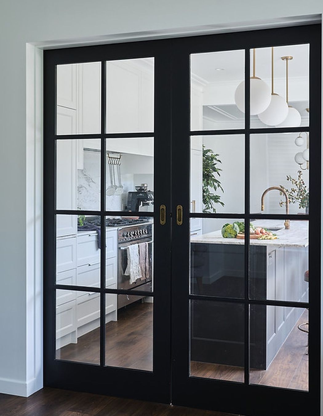
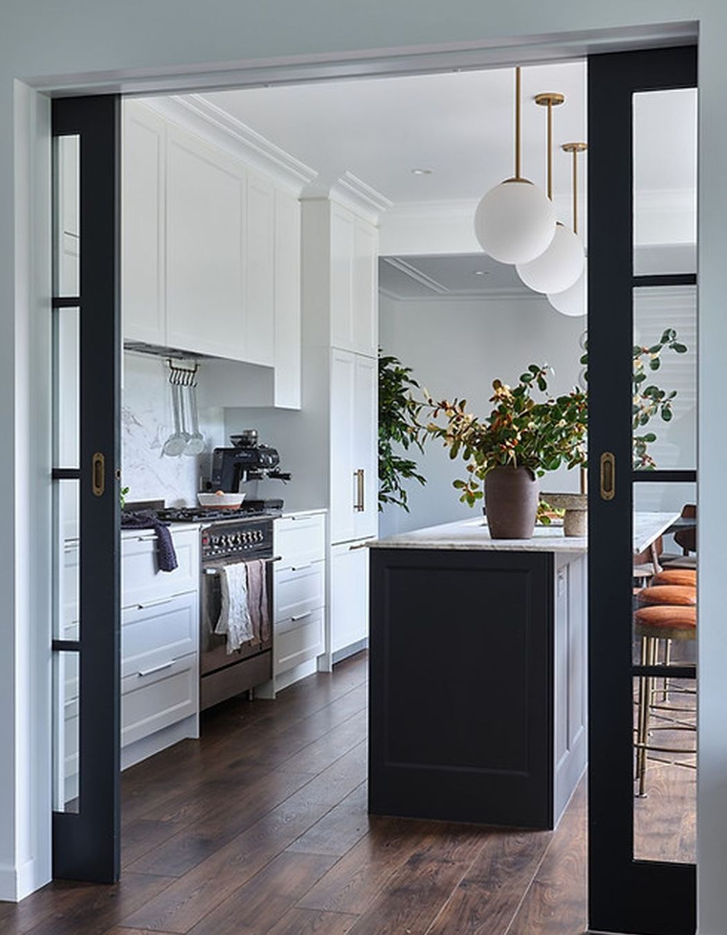
We reconfigured this floor-plan to have the kitchen in the centre of the lounge and dining room and introduced a large set of bi-fold doors for indoor and outdoor flow. The rear kitchen elevation was built on the internal wall backing the hallway. The single access doors were removed, and new double door cavity sliders were housed at the end of the new dining room. The front entrance was relocated closer to the driveway and double decorative French doors were installed to create a sense of entrance. The entrance doors access the dining room now which provides a flow to the hallway and bedrooms through the large glass cavity sliders. The lounge layout stayed the same but new larger bi-fold doors were added which opened up the lounge to create better indoor outdoor flow.
KITCHEN
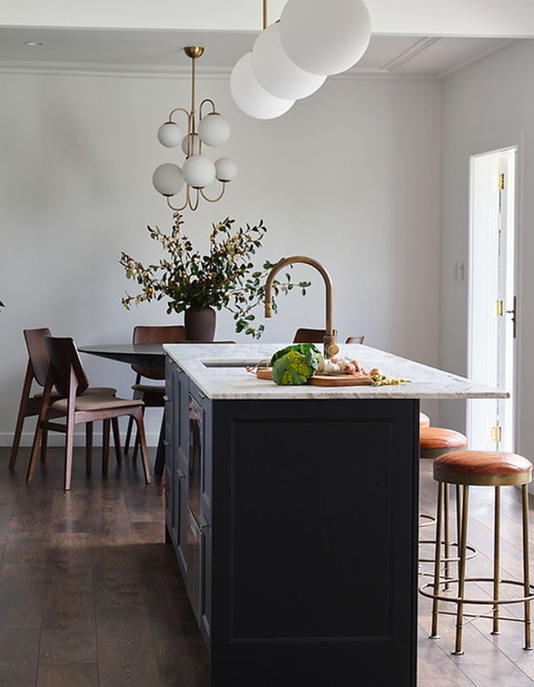
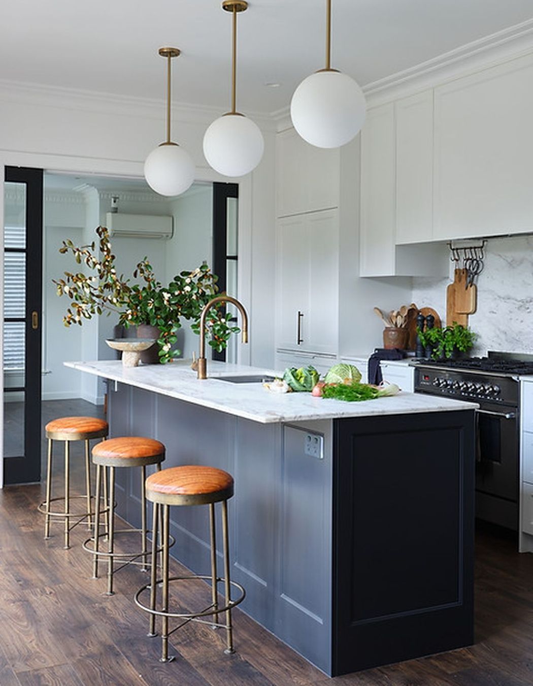
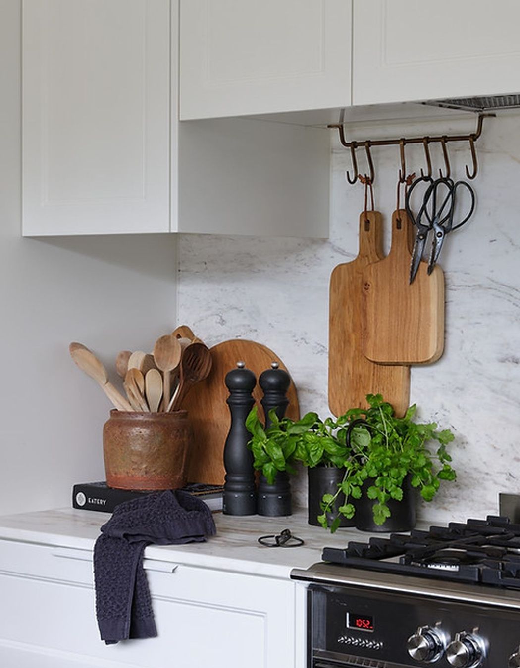
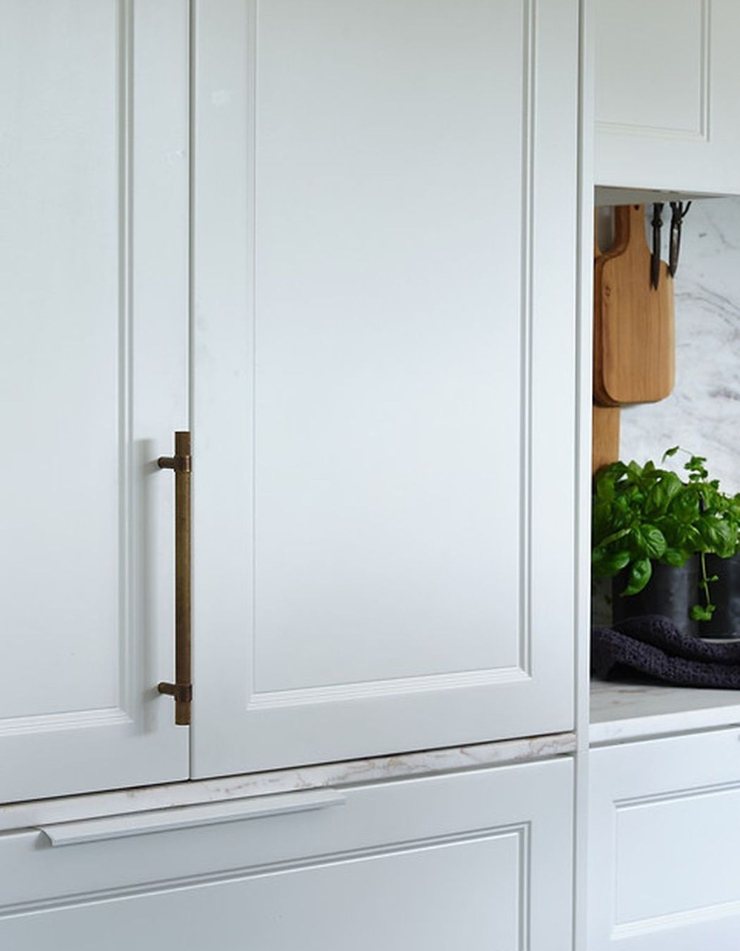
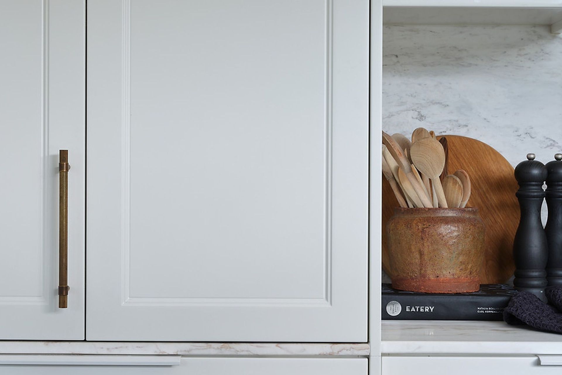
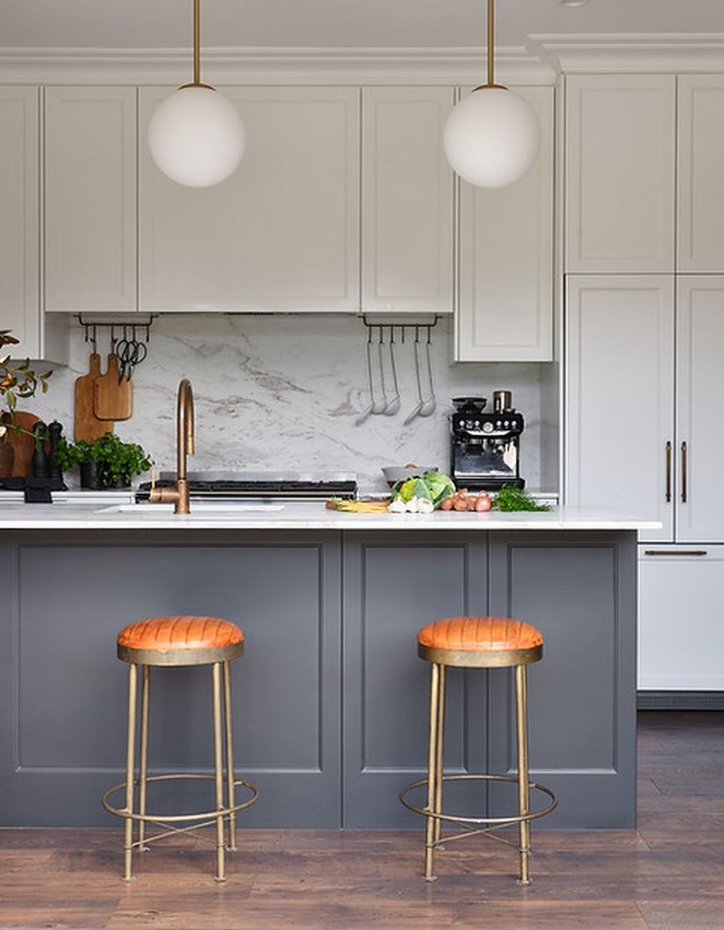
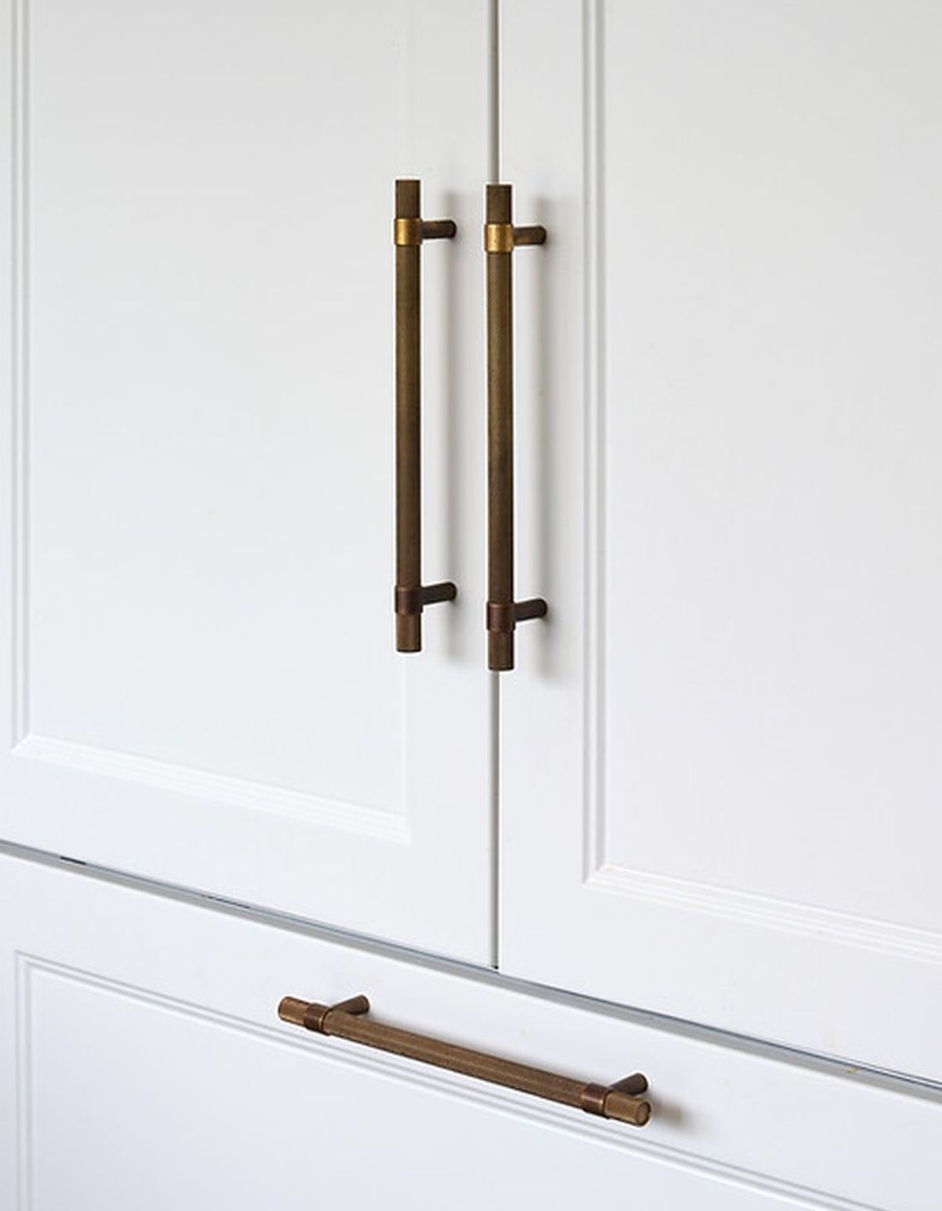
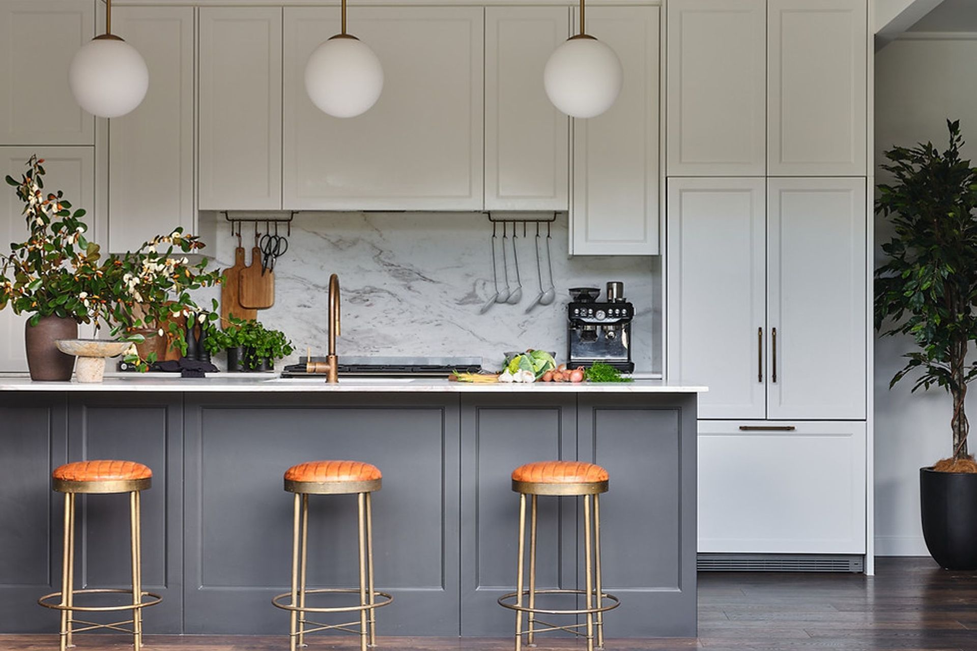
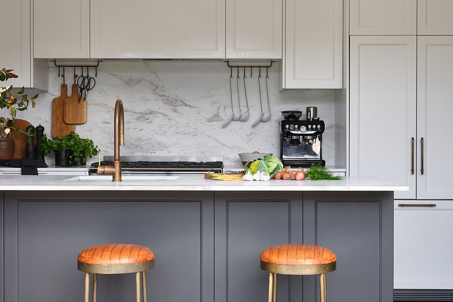
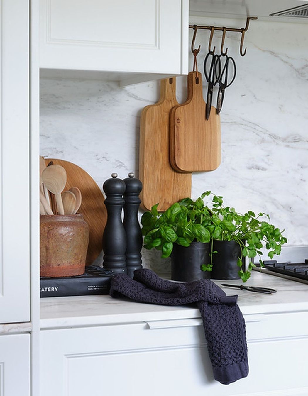
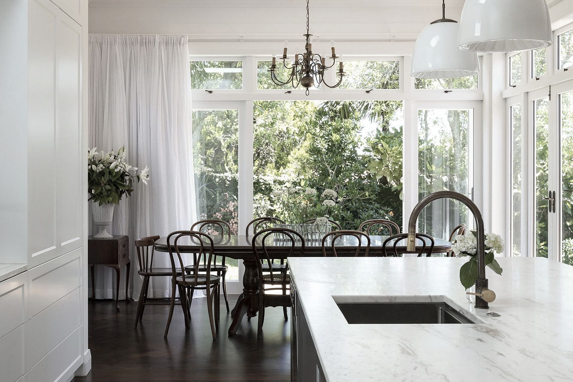
Stylistically the owners loved our Roseberry Villa shaker kitchen but wanted a mid century influence to complement their existing dining chairs and furniture pieces. The cabinetry was designed in a decorative shaker profile which echoed the detail seen in the lounge cornice. Scotia was added in the kitchen, it runs around the top of the kitchen cabinetry for a seamless look. Due to the depth of space in the kitchen, the rear wall of cabinetry was made in Satin White so that it didn’t dominate the room. The dark island anchors the space and brings focus to the kitchen’s composition. The existing deep brown floors worked perfectly with Volakas marble which blends warm white with grey and brown hues. We utilised the Volakas for the island and the splash-back as it's softness and movement provided welcomed contrast with the lineal and symmetrical cabinetry. Clean lines were intentional, so handles were powder coated to match the cabinetry colour with the exception of the beautiful knurled antique brass handles used for the on bench pantry and fridge. Due to space constraints the appliances were carefully selected to maximise storage. An integrated Fisher & Paykel fridge was a splurge for the homeowners but it achieved a streamlined result. The owner was previously a chef and loves to cook so utensil racks were incorporated for easy access whilst cooking.
DINING ROOM / LOUNGE / ENTRANCE
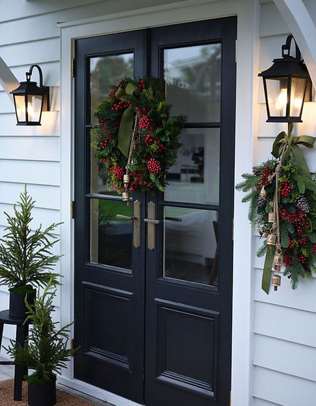
The dining room ceiling is lower and presented its challenges, however, we worked with the builders to come up with a solution to add detail whilst trying to disguise its slightly wobbly ceiling. The bolection moulding detail in the centre of the dining room creates focus around the pendant light and the centre of the dining table. The light was a new addition, it relates visually to the kitchen pendants whilst adding a mid century vibe. Two sets of glass internal sliders were added and painted to match the island. They allow for the kids and parents to be separated when required but still supervised, whilst adding another design element to the spaces. The entrance doors are painted dark like the island and they have their own identity externally to create a welcoming entrance.
Photos by Samuel Hartnett

Year Joined
Projects Listed
Abbey Lang Home.
Other People also viewed
Why ArchiPro?
No more endless searching -
Everything you need, all in one place.Real projects, real experts -
Work with vetted architects, designers, and suppliers.Designed for New Zealand -
Projects, products, and professionals that meet local standards.From inspiration to reality -
Find your style and connect with the experts behind it.Start your Project
Start you project with a free account to unlock features designed to help you simplify your building project.
Learn MoreBecome a Pro
Showcase your business on ArchiPro and join industry leading brands showcasing their products and expertise.
Learn More