Five tile choices that change how a space feels

featuring ArchiPro

© BelloCasa

  • 1.7M profile views
  • 1.4K saves

One tile tells only part of the story. Repeat it across a wall or floor, and its size, shape and layout begin to change the whole room.

Featured Professionals

Written by

  • Dressen Park
Arketipo by Cotto D'este | Floor and Wall Tiles | BelloCasa

Colour is usually where tile selection begins. That makes sense. It is often the first thing noticed in a sample and the easiest quality to imagine alongside cabinetry, paint or fittings.

But a tile is rarely seen on its own once installed. It might be repeated dozens or hundreds of times, with each edge and grout line becoming part of a much larger surface. That is when format starts to matter.

A small mosaic creates a finer rhythm. A long, narrow tile draws the eye in one direction, while a large tile allows more of the surface to be seen without interruption. The choice affects more than appearance; it can change whether a room feels calm, detailed, ordered or playful.

The Mutina Betty collection from European Ceramics begins with a familiar 20-by-20-centimetre square. On its own, the format is straightforward. The interest appears when the tiles meet.

Designed by Raw Edges, the collection includes a plain tile and four patterned variations. Lines continue from one tile to another, creating larger arrangements that can resemble grids, woven surfaces, labyrinths or optical patterns.

The square does not disappear, but it stops feeling like the whole story. Attention shifts towards the pattern unfolding across the wall or floor. A planned layout can feel precise and graphic, while a more varied arrangement brings a sense of play. It is a reminder that even a conventional tile shape can produce something unexpected through repetition.

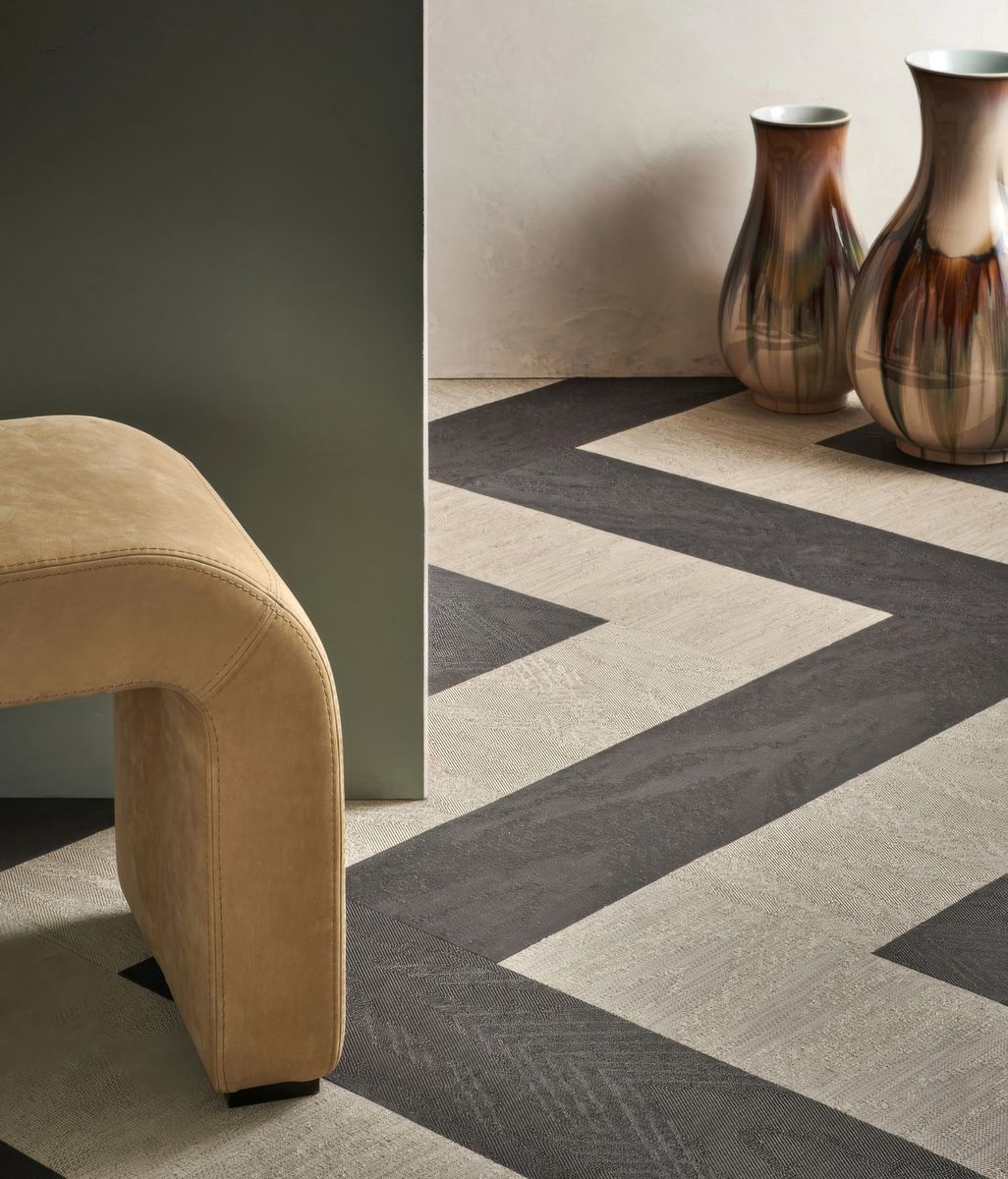
Arketipo by Cotto D’Este from BelloCasa takes almost the opposite approach. Available in formats that extend to large slabs, it reduces the number of visible breaks across the surface.

With fewer grout lines competing for attention, its texture has more room to be noticed. Sand, flakes and cement-like elements come together across the tile, giving it variation without trying to imitate one specific natural material.

In a smaller room, the larger format can make the surfaces feel less divided. Across a generous floor or wall, it creates a quieter backdrop that still has depth when seen up close. The effect is calm rather than plain.

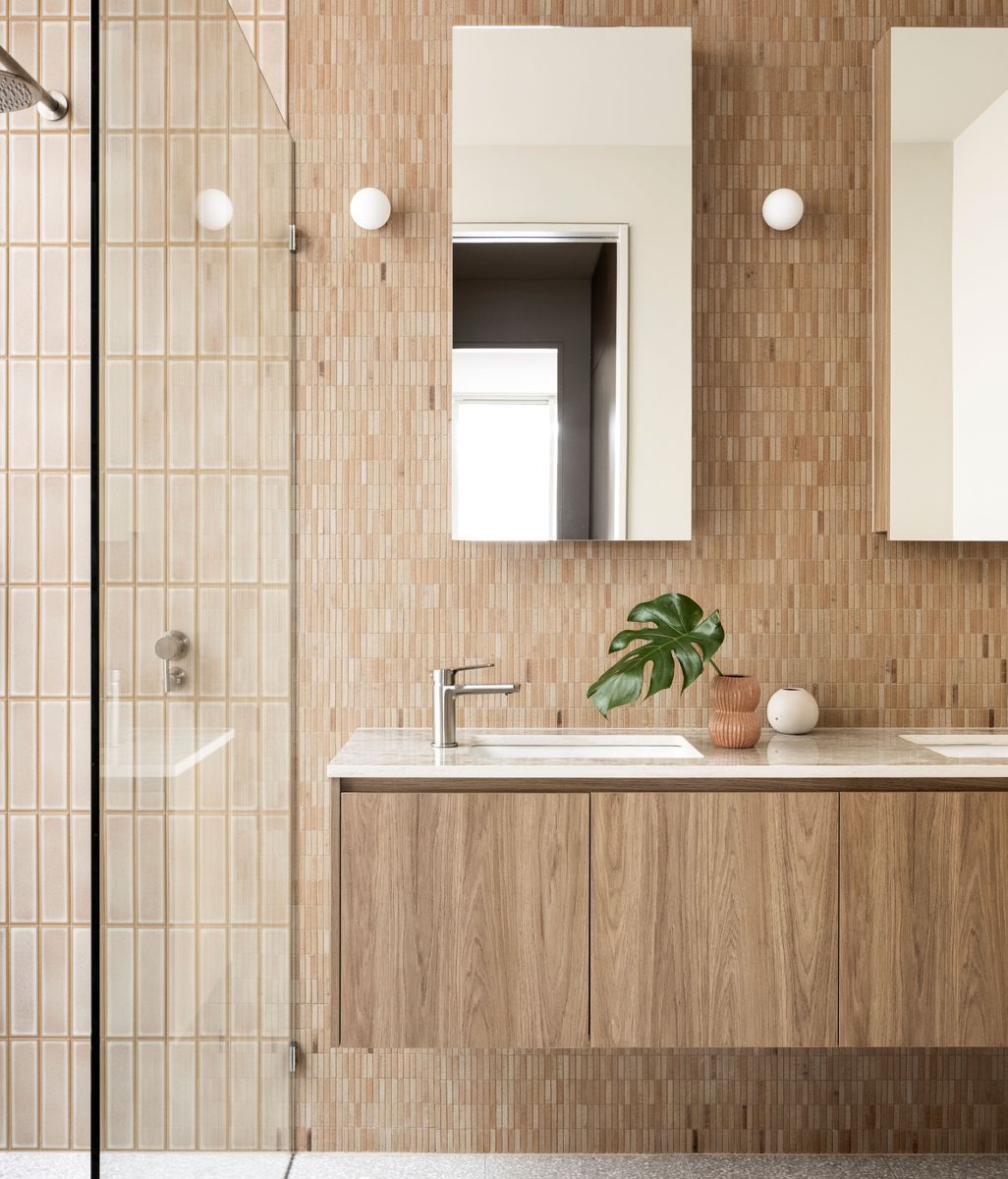
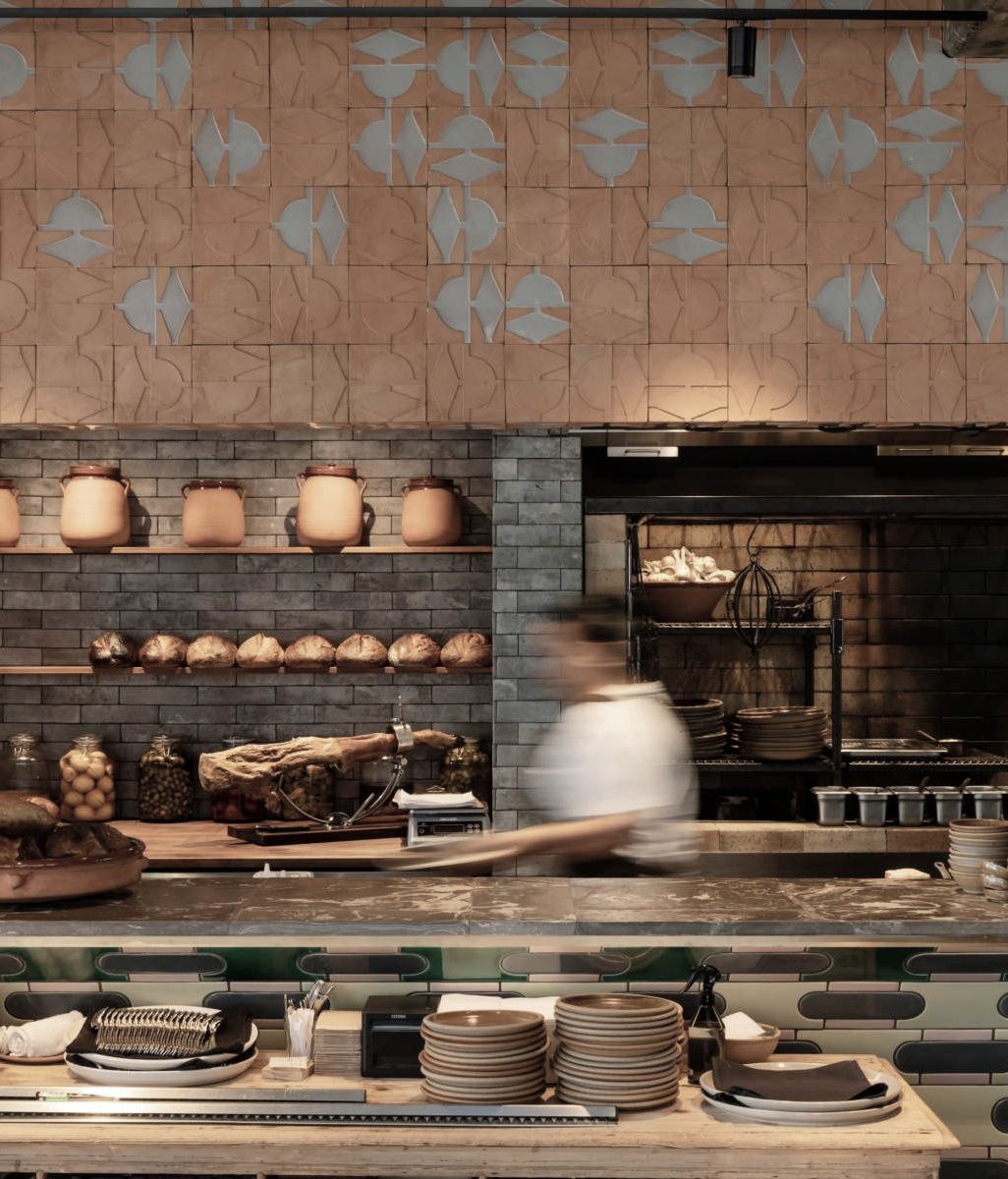
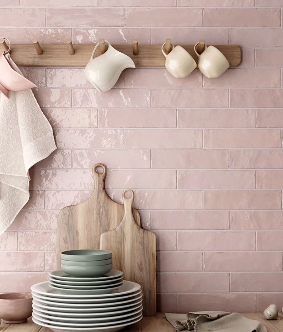
Savoir Faire from Tile Depot finds a middle ground between order and imperfection. Its tiles are long and slender, creating rows that can carry the eye across a wall or upwards through a room.

A glossy finish gives the surface movement as the light changes, while uneven edges and variations between individual tiles prevent those rows from looking too exact. The layout establishes a clear rhythm, but the tiles retain the character of something made by hand.

That slight irregularity makes the collection feel easier and more relaxed. It can bring structure to a kitchen splashback or bathroom wall without making the surface appear rigid or overly controlled.

The Arctic Tundra Ivory Matt Square Mosaic from Tile Space works on a much smaller scale. Its 48-millimetre squares create a close grid in which the grout lines become a visible part of the finished surface.

Rather than trying to hide that repetition, the mosaic makes use of it. The small squares add detail, while the ivory stone look and matt finish keep the overall effect soft. Natural-looking variation between the tiles stops the surface from feeling completely uniform.

This kind of scale can make a contained area feel more considered, particularly beside a larger or plainer surface. It shows that a neutral tile does not have to disappear. Format alone can give it character.

The Porta Nuova collection from Quantum returns to the elongated brick, but with a cleaner and more graphic personality.

Its smooth surface and slim proportions create a strong sense of direction. Laid in simple rows, the tiles can bring order to a wall. Arranged differently, they can create something more lively. The collection’s matt and gloss finishes also change the way the shape is perceived, with gloss catching and shifting light across the surface.

Porta Nuova feels playful without depending on a complicated pattern. Its character comes from the combination of colour, reflection and the repeated brick form.

Credits

Discover More Readingin Texture

Discover More Readingin Tile

Next Article

Keep scrolling
The many moods of Faradays