Colour gets personal in Dulux’s 2027 forecast

Written by
07 September 2026
•
3 min read
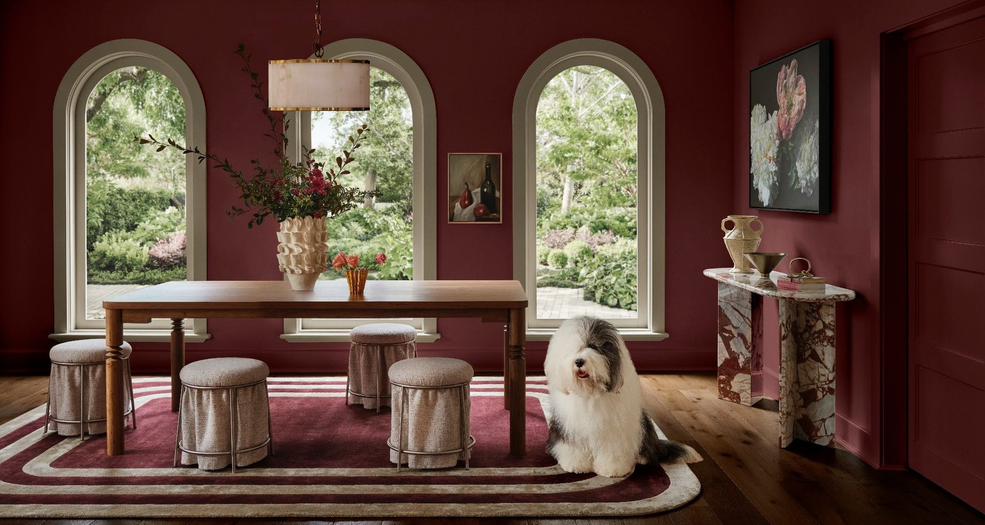
After years in which restraint has shaped much of the interior conversation, colour is becoming more personal. Not necessarily louder, but more layered, tactile and closely connected to how people want their homes to feel.
The newly released Dulux Colour Forecast for 2027 captures this shift across three palettes; Play, Treasure and Sensory. Together, they move between calming blues, botanical tones, warm neutrals and deeper jewel-like shades, reflecting what Dulux identifies as a growing desire for authenticity and meaningful connection amid digital saturation, economic pressure and wider uncertainty.
We’re seeing a shift towards interiors that tell a story and reflect who we are,” says Dulux Colour Specialist Davina Harper. “The 2027 palettes celebrate self-expression, everyday rituals and the power of colour to create emotional connection.
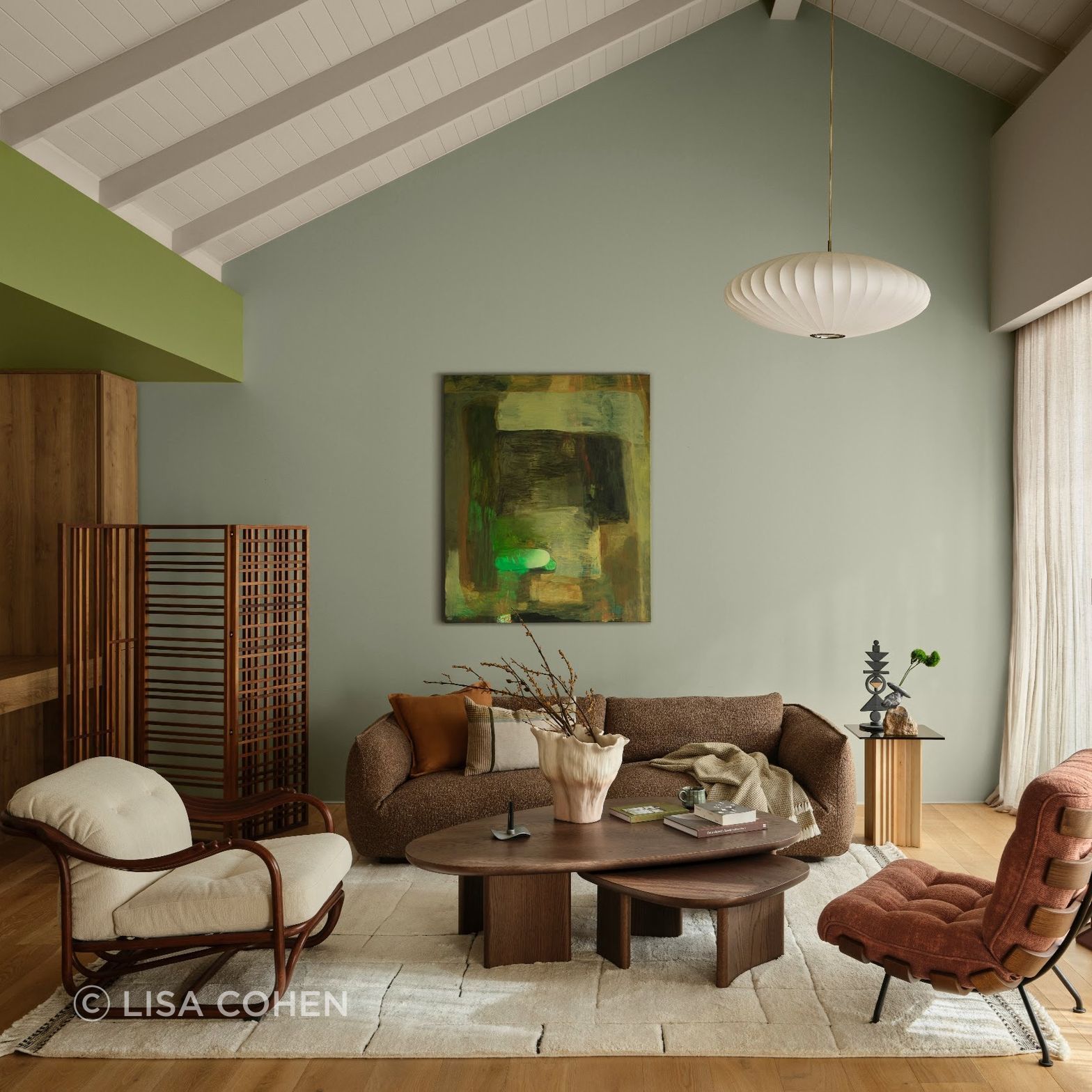
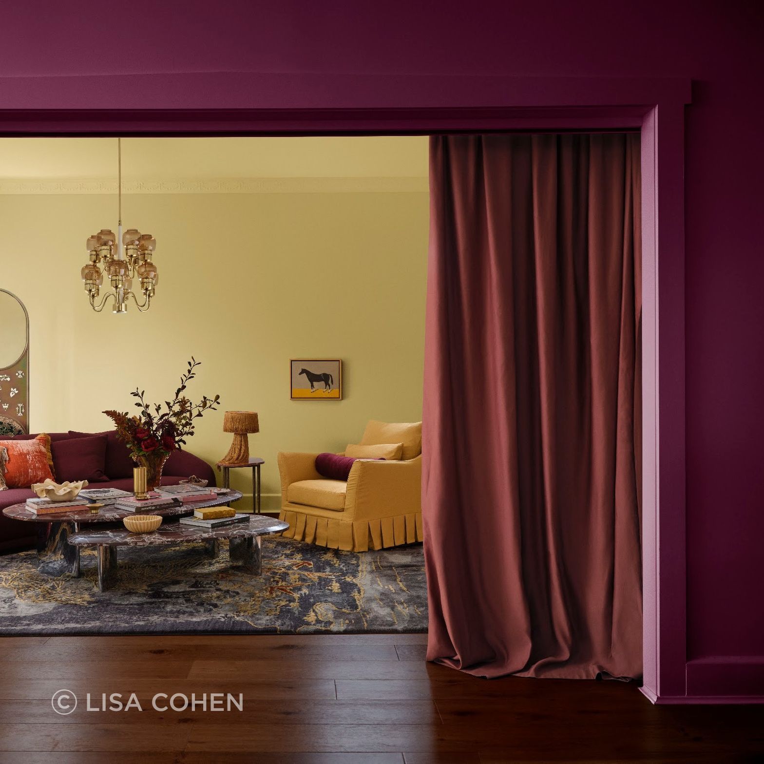
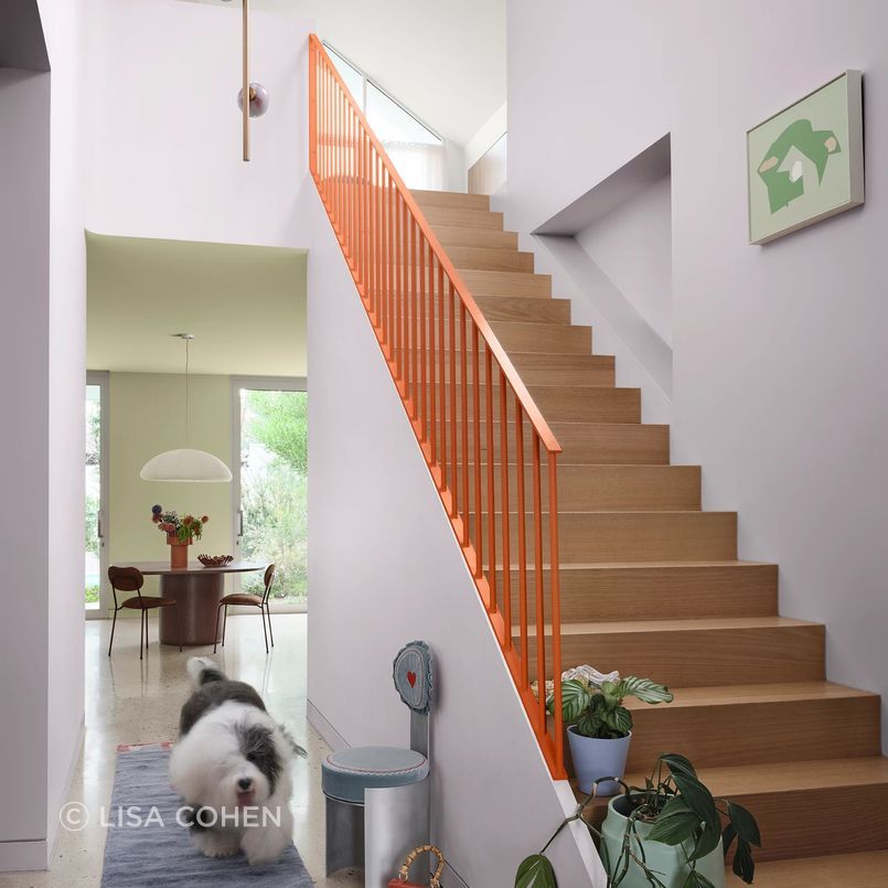
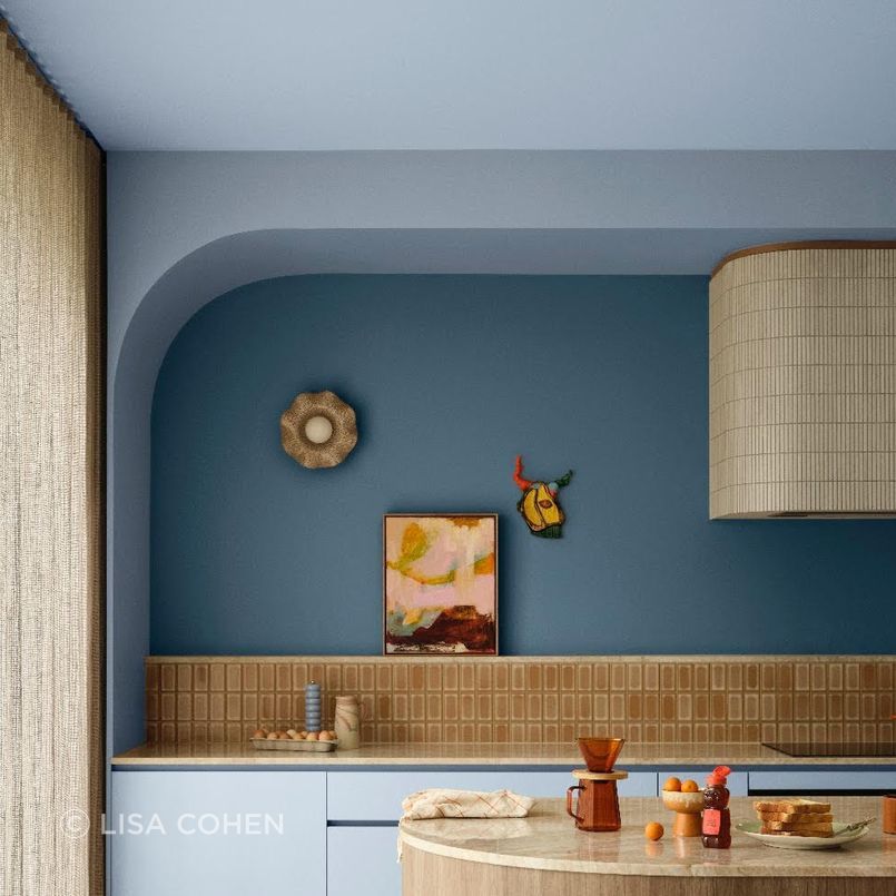
Rather than proposing one dominant colour direction, the forecast points towards greater freedom in how interiors are assembled. Orange is emerging as an accent in place of red, blues range from deep navy to softer hues and berry and cherry shades introduce moments of optimism. Stark minimalism gives way to what Dulux describes as “restrained maximalism”, where colour, material and objects are layered with greater intent.
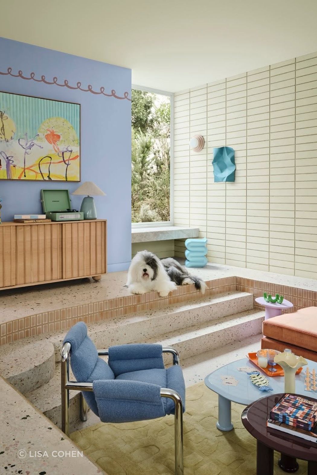
Play: permission to loosen up
Play is the most spontaneous of the three palettes, drawing on analogue experiences, imperfect forms and the pleasure of making things personal. Muted lilacs, soft blues and spearmint greens are interrupted by orange and berry accents, while modular forms, contemporary timbers and hand-drawn details encourage interiors that feel less prescribed. It is colour approached with flexibility rather than rigid rules.
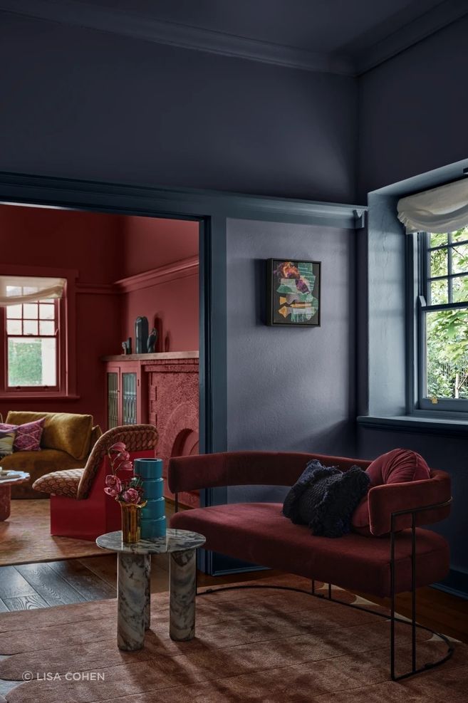
Treasure: a move towards depth
Where Play embraces spontaneity, Treasure looks to accumulation. Deep blues, crimson and berry shades sit alongside expressive marble, mixed metals, rich timber and high-gloss finishes. The palette reflects a move away from sparse minimalism towards interiors that reveal something about their occupants, where objects, materials and colour can build a sense of history over time.
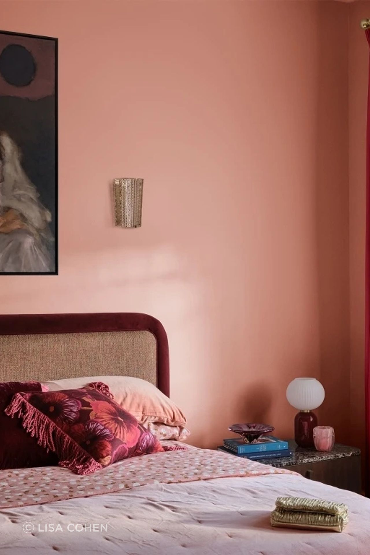
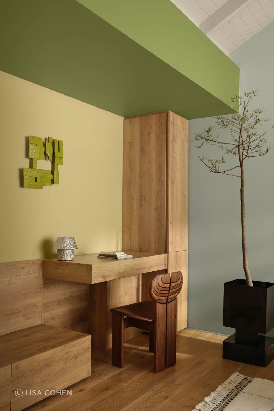
Sensory: colour as a grounding influence
Sensory takes a quieter position. Warm neutrals, layered greens, muted blues and near-black browns are paired with honed stone, smoked glass, aged brass and tactile textiles. Japanese influences appear through gentle grids, latticework and an emphasis on everyday ritual. Rather than removing colour to create calm, the palette considers how softened colour and natural materiality can produce spaces that feel restorative and grounded.
Across all three, the more interesting forecast may be behavioural rather than chromatic. Colour is being used less as a finishing gesture and more as a way to establish identity, atmosphere and connection within the home.
Explore Dulux on ArchiPro and browse related Interior Paints and Coatings to consider how emerging colour directions can translate into material palettes for upcoming projects. Alongside products and completed interiors, ArchiPro offers a wider view of how architects and designers are using colour as part of the architecture rather than simply applying it afterwards.
Styling: Bree Banfield
Photography: Lisa Cohen